


Bringing clarity to complex financial situations. Plus1 helps people move forward through debt by creating structure, trust and long-term stability.
Year
2025
Scope
Strategy
Visual Identity
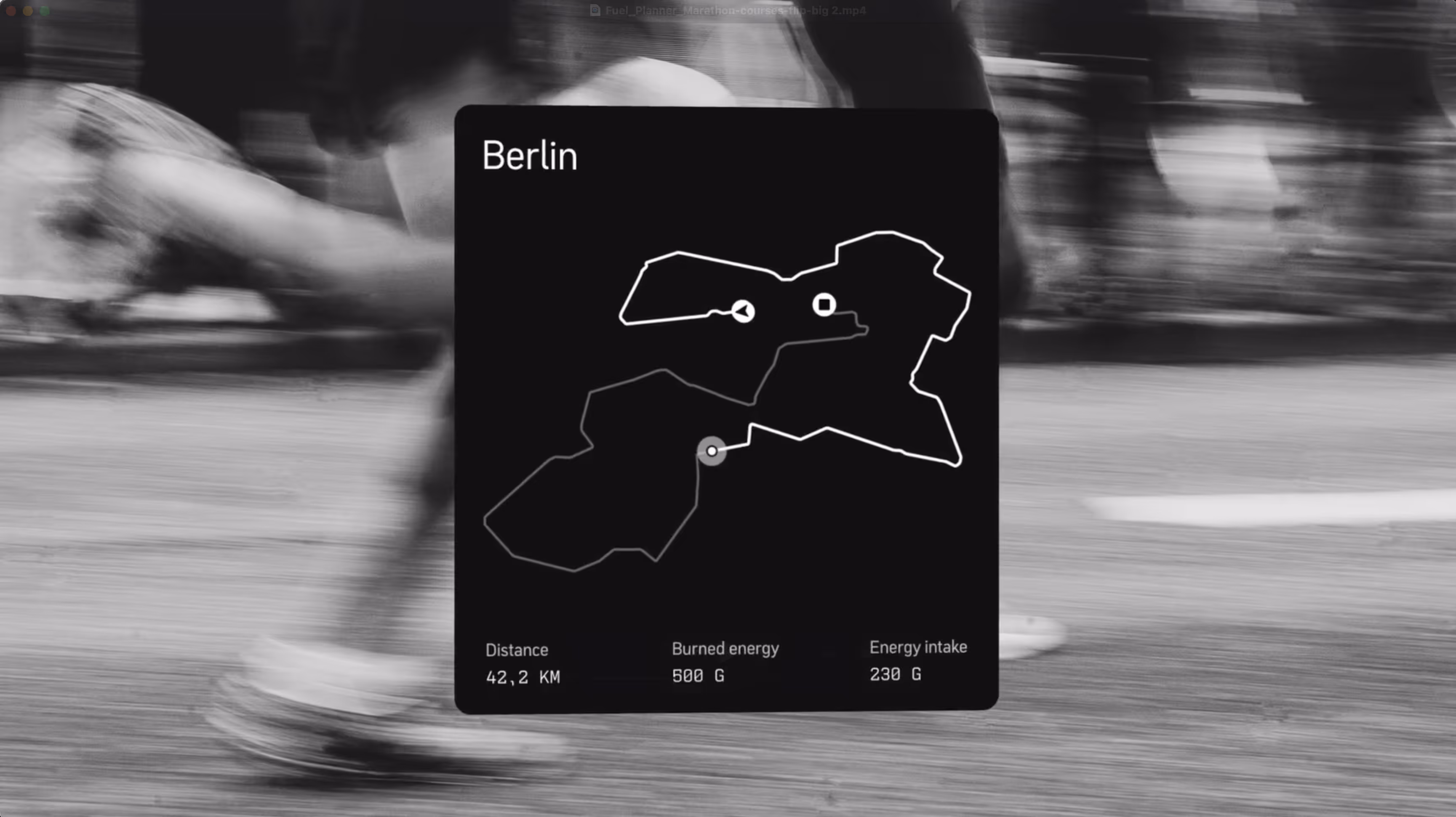
Web Design & Development
Motion
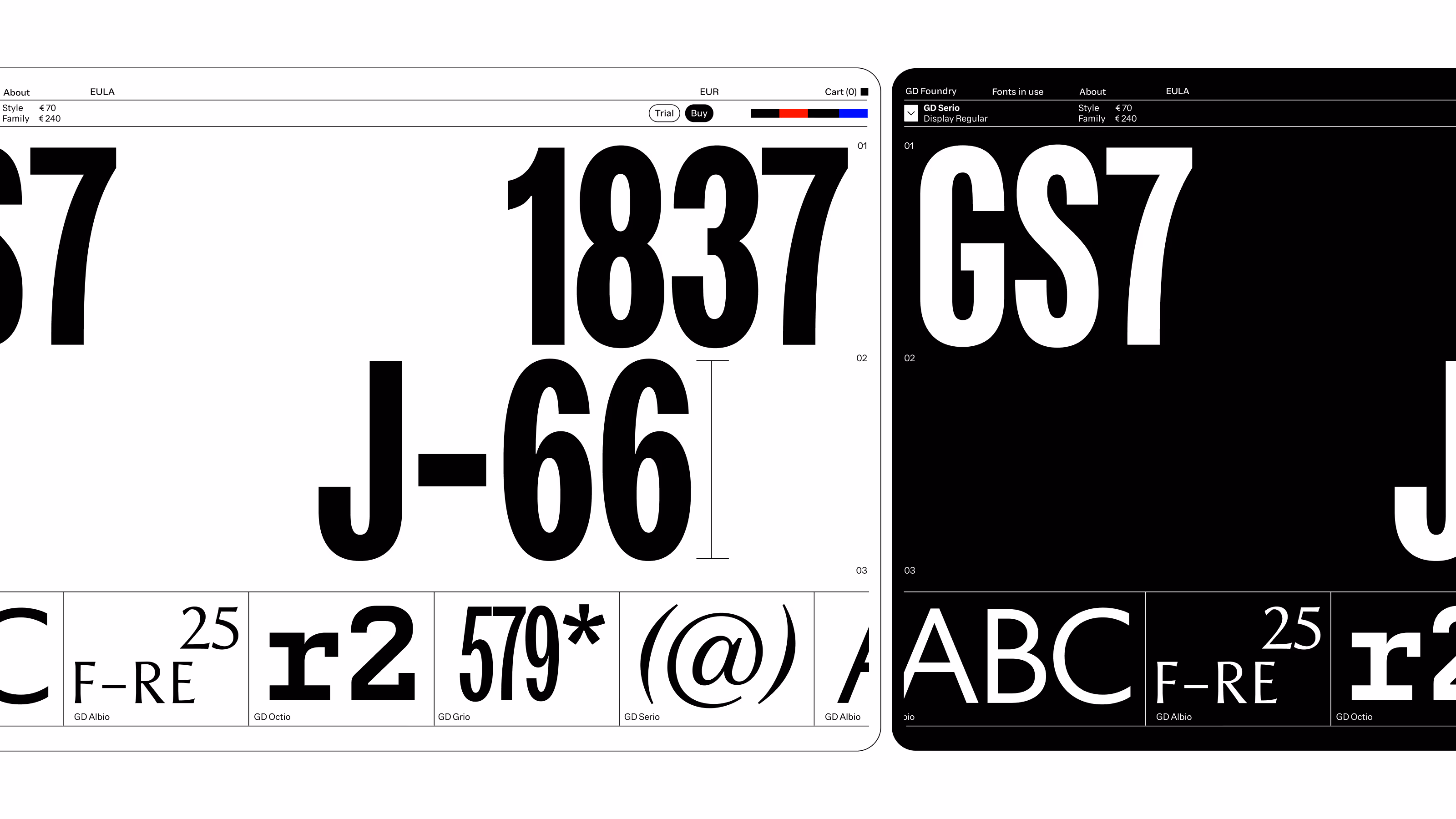
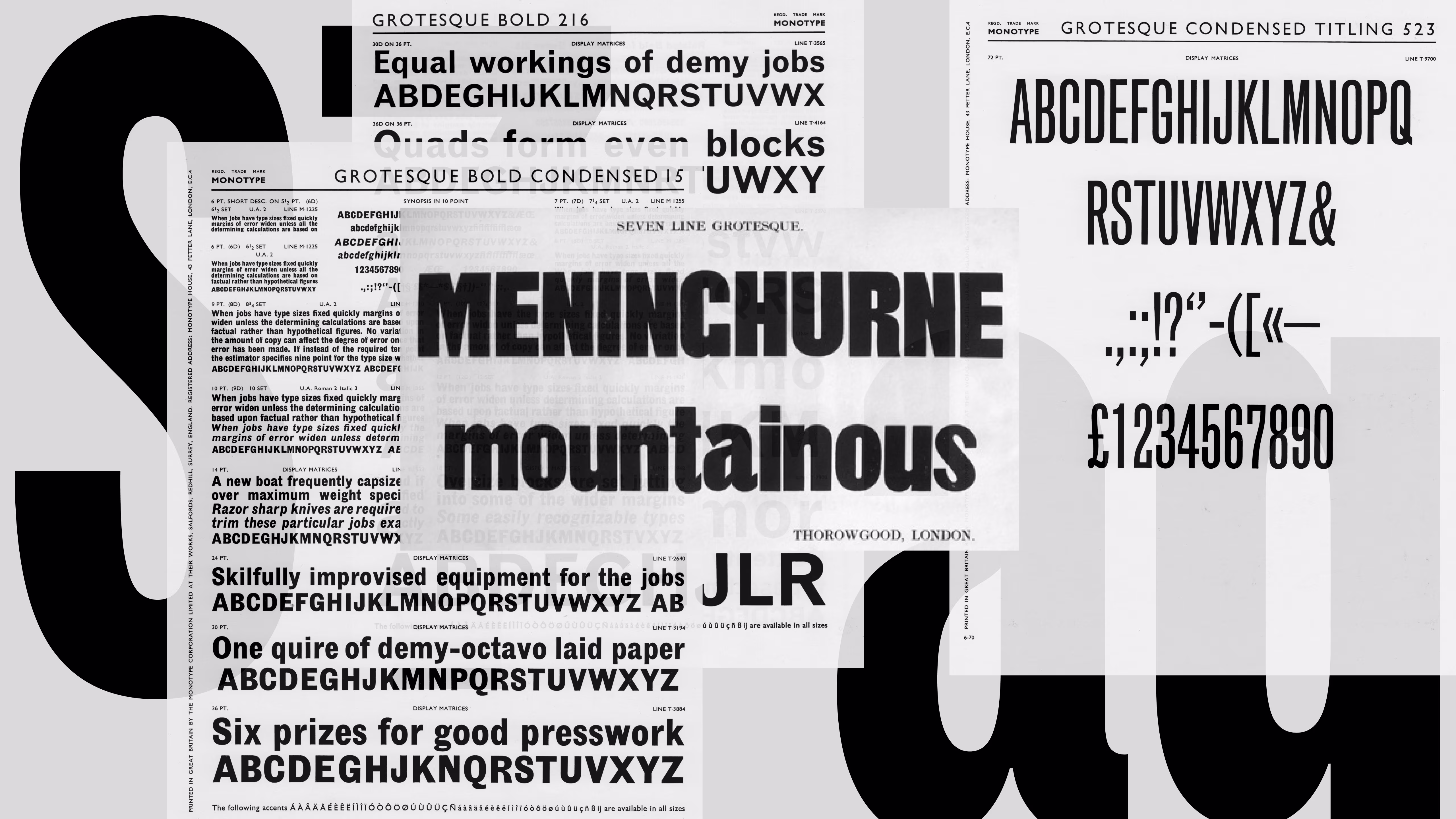
Type Design
Info
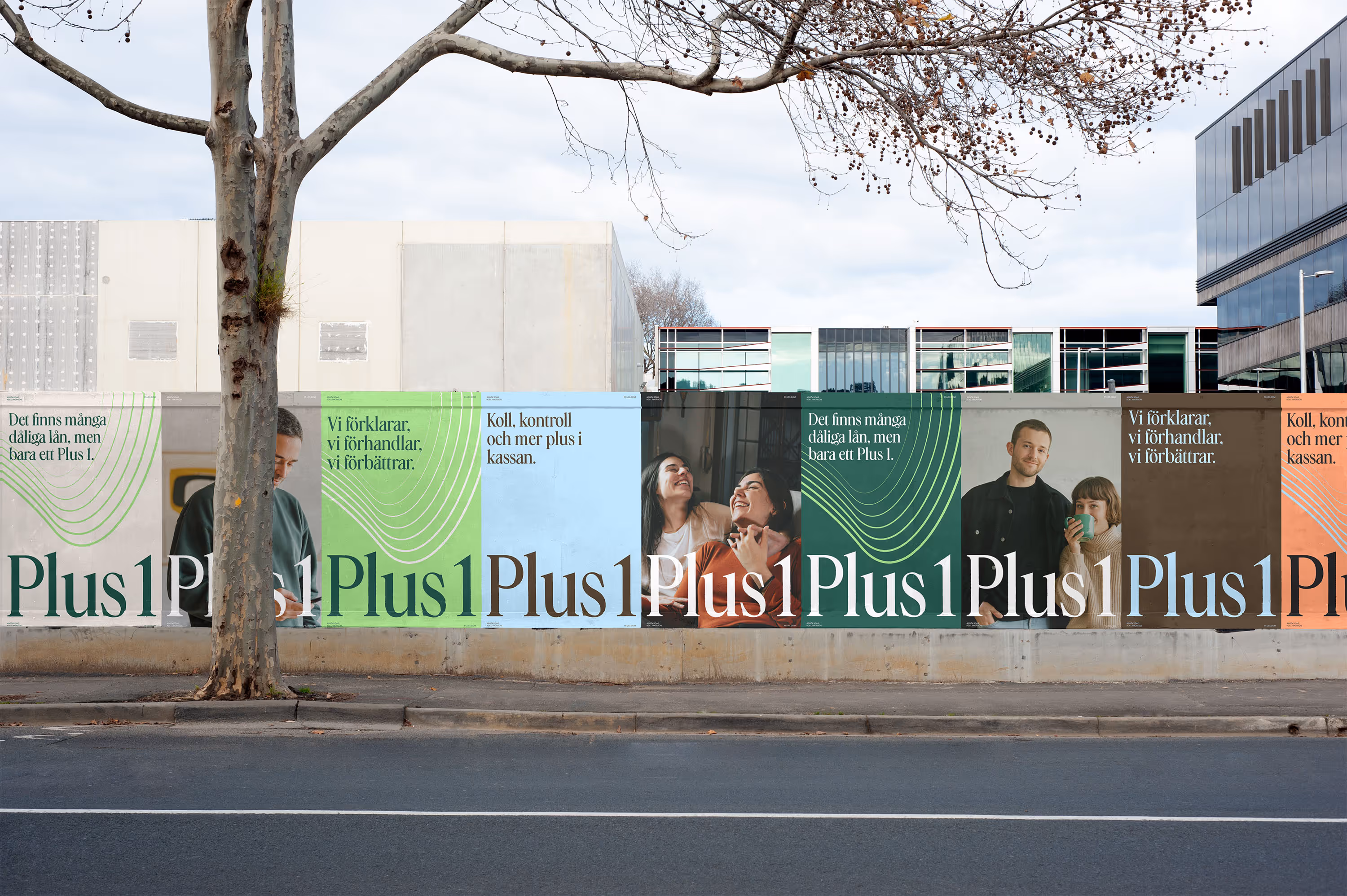
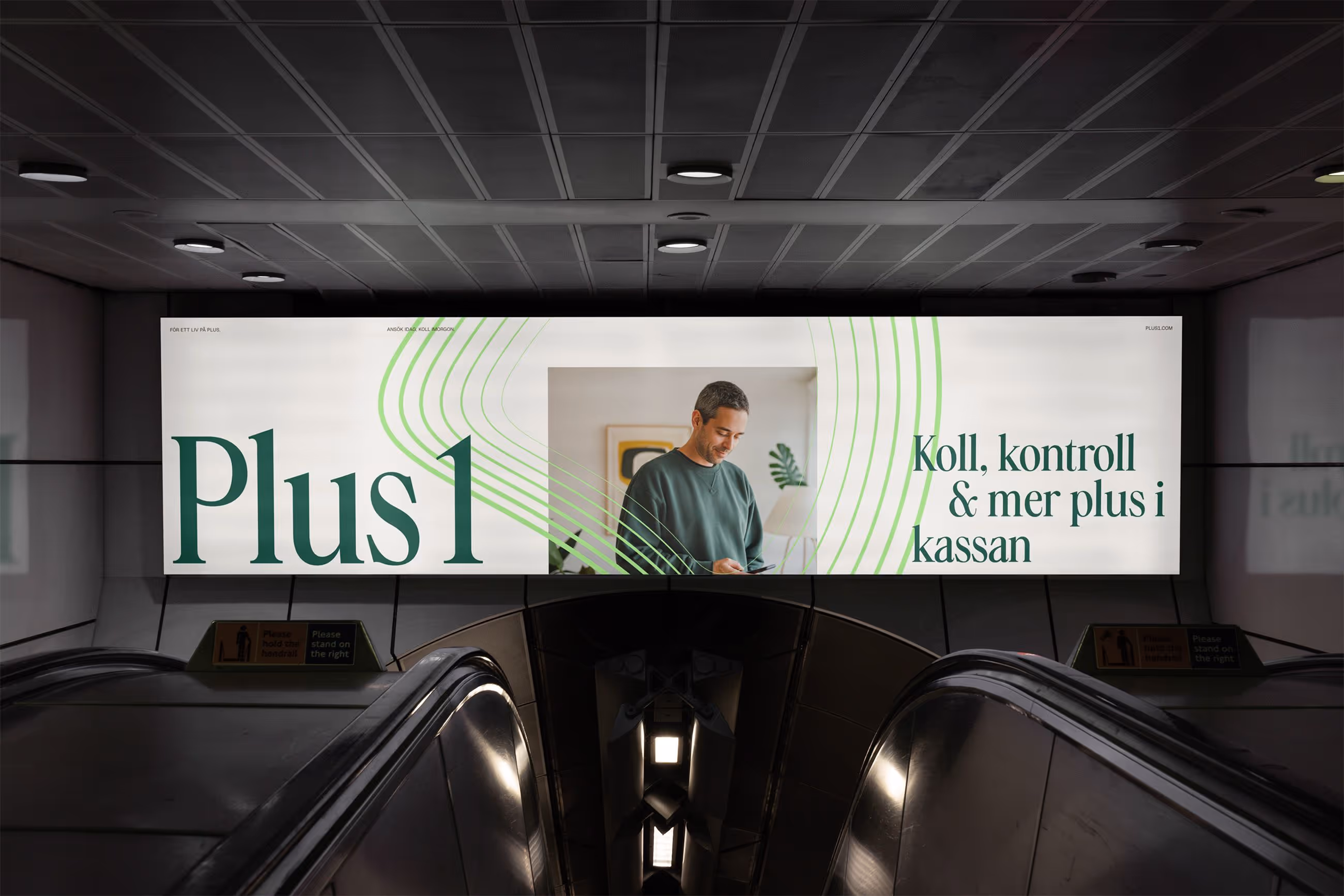
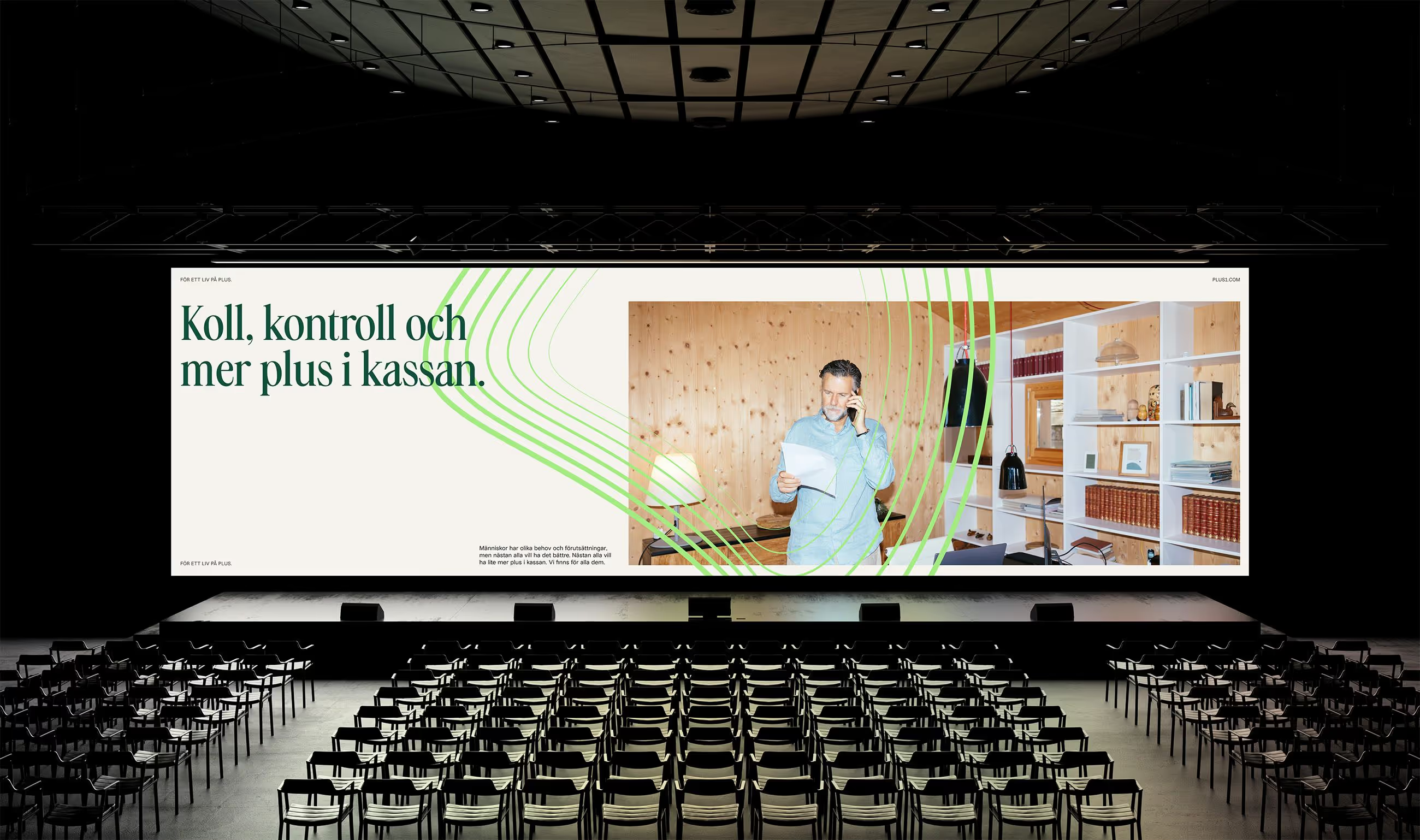
Plus1. One step further. And often another.
Plus1 helps people untangle complex debt situations by negotiating, consolidating loans and creating better financial terms. For nearly a decade, they have worked where situations are often at their most stressful, helping people move forward when others have reached the end of the road.
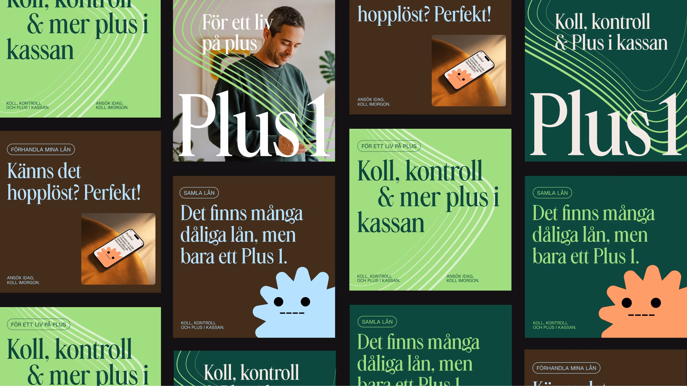
When developing the visual identity, we focused on bringing warmth, clarity and a sense of calm to a subject many experience as heavy and complicated. Through a soft color palette, authentic photography and a close, human perspective, the identity aims to reduce drama and create a feeling of trust and reassurance.
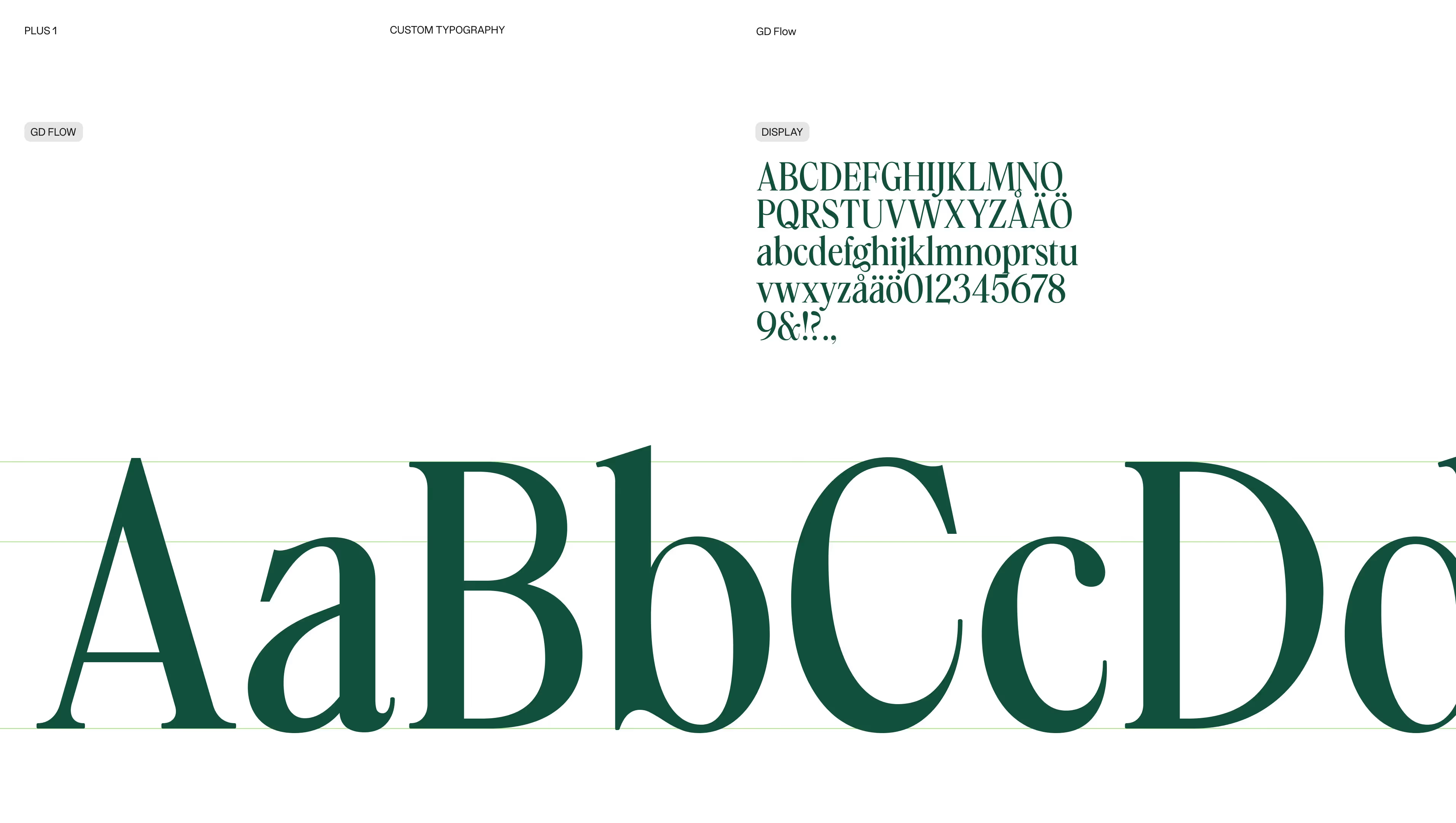
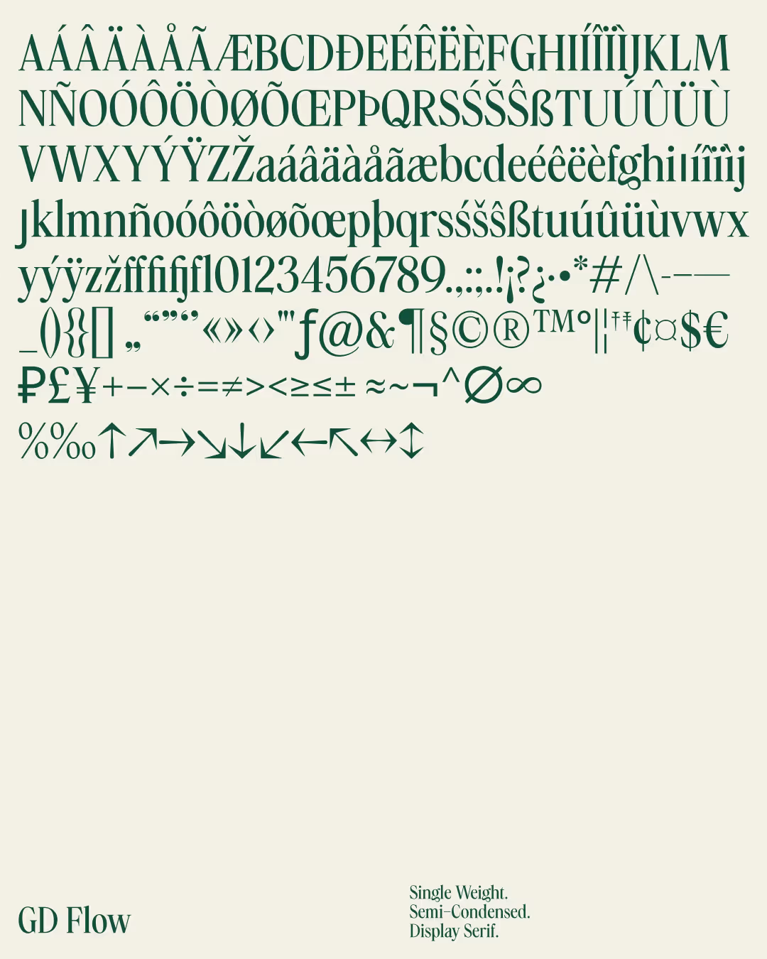
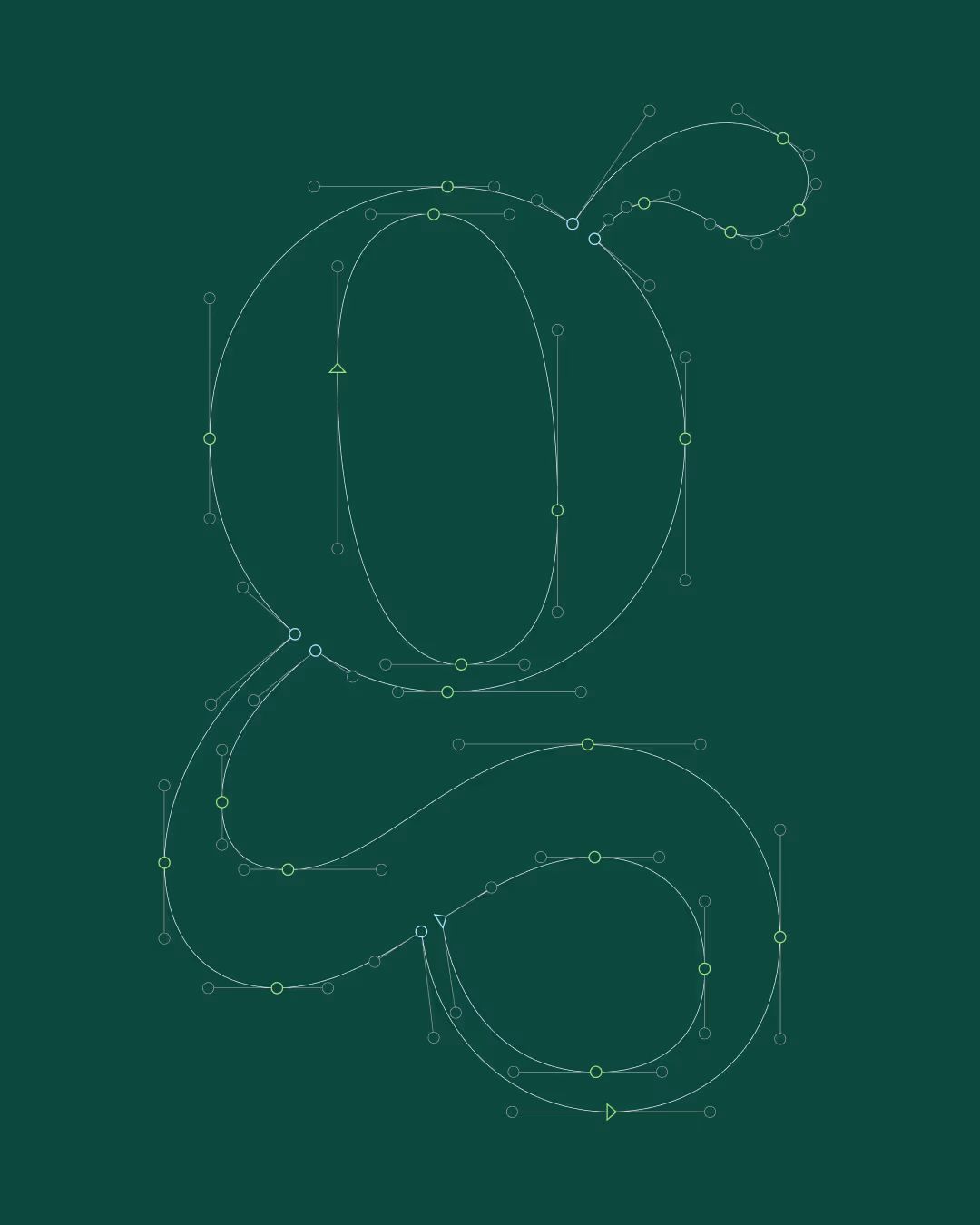
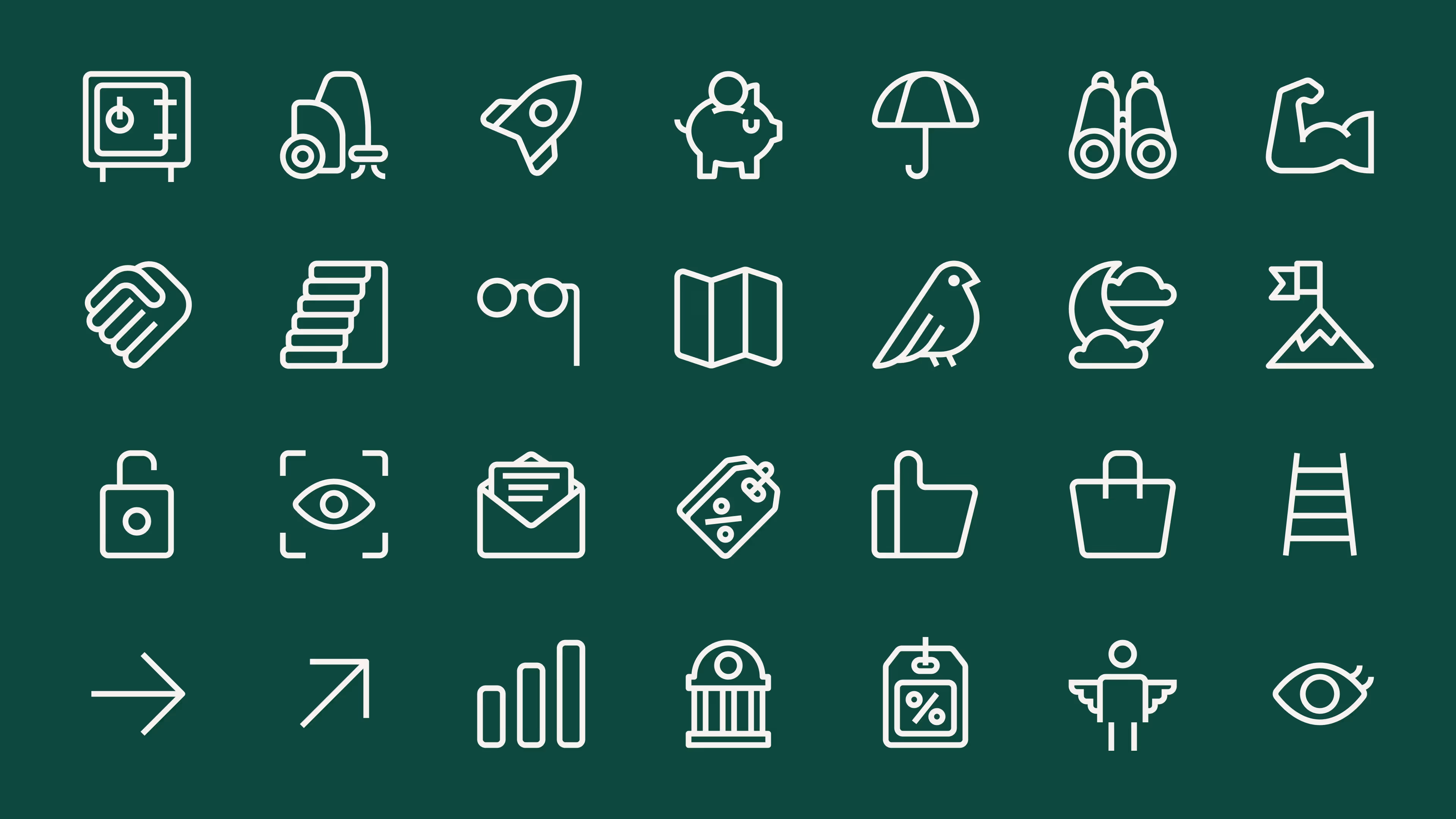
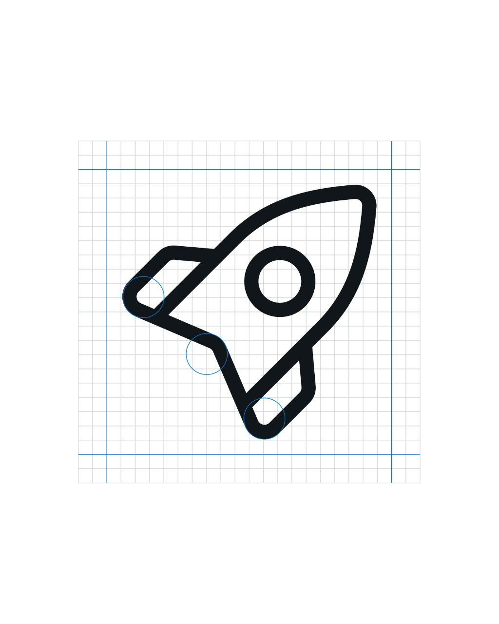
At the center of the system are the concentric rings – a simple graphic element symbolizing how Plus1 surrounds and supports its customers over time. Like the growth rings of a tree, they represent continuity, progress and the quiet work of moving forward step by step. To strengthen the brand voice, we further developed and expanded our bespoke headline typeface GD Flow. Inspired by the clarity and authority of classic newspaper typography, it combines professional credibility with a subtle human warmth. We also introduced a set of illustrations and pictograms to further clarify services and bring additional lightness and accessibility to the brand.
Together, the typography, imagery and graphic system create an identity that feels approachable, supportive and optimistic – reflecting how Plus1 helps people regain control of their financial situation.
Typefaces
GD Flow
GD Gaio ↗