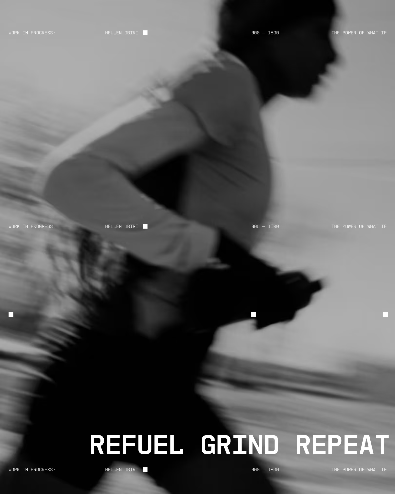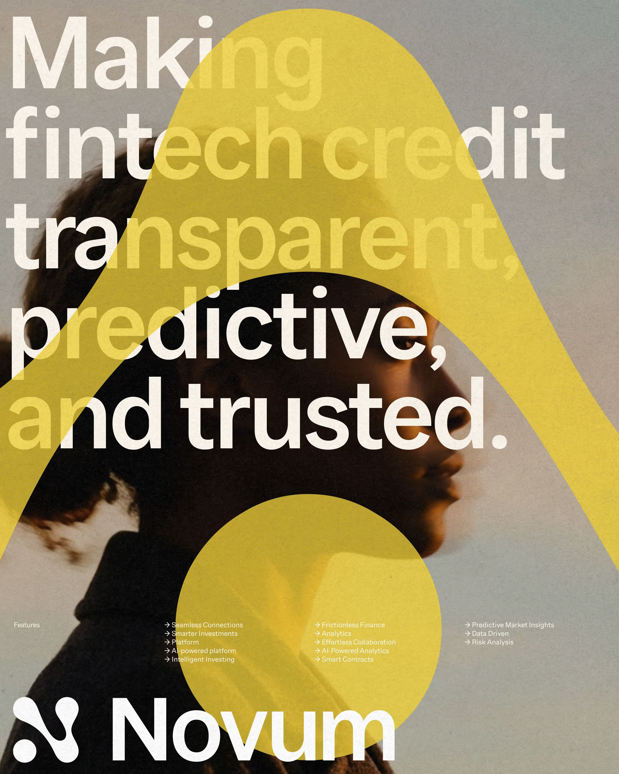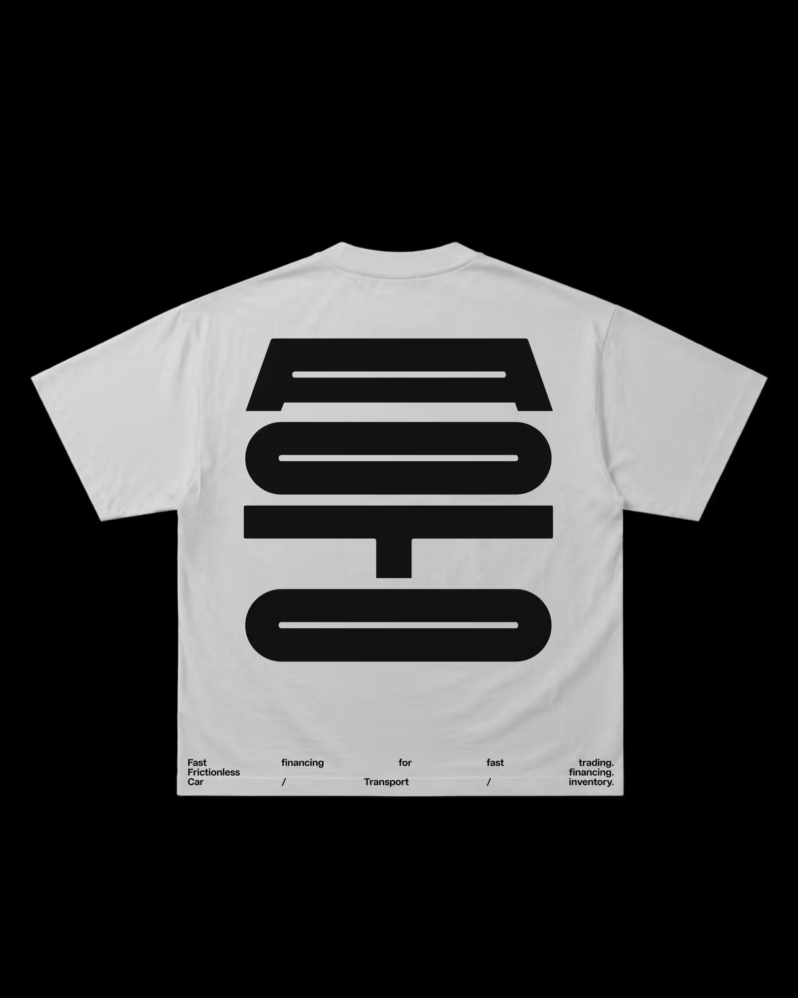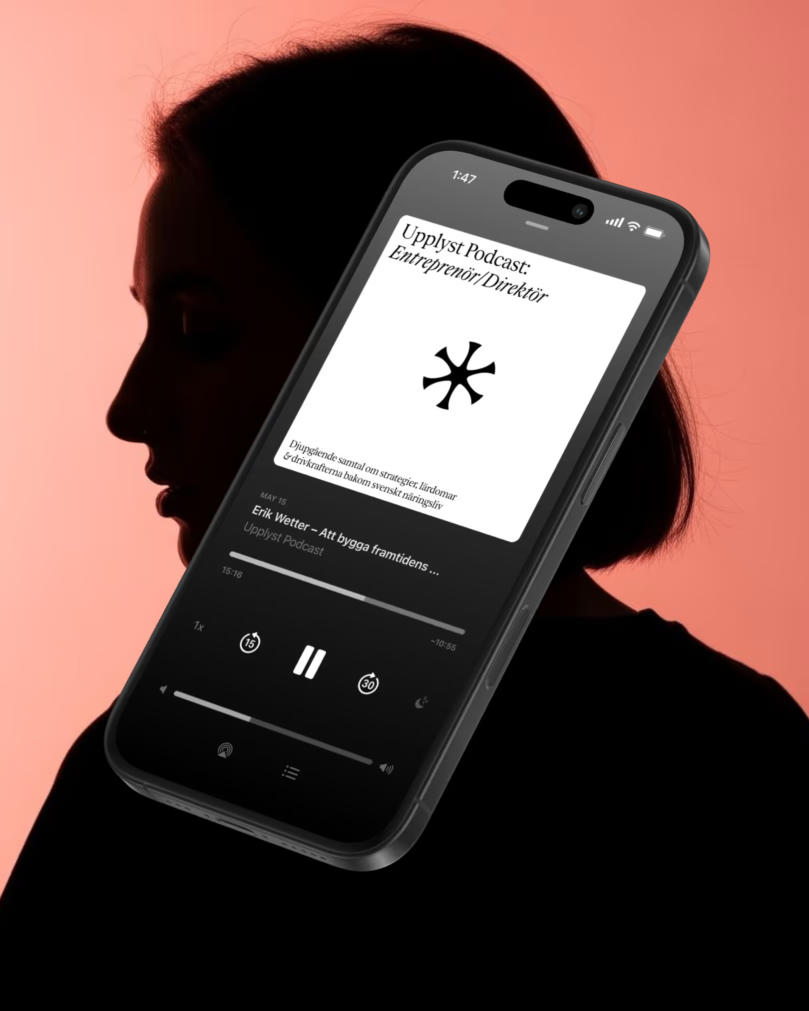






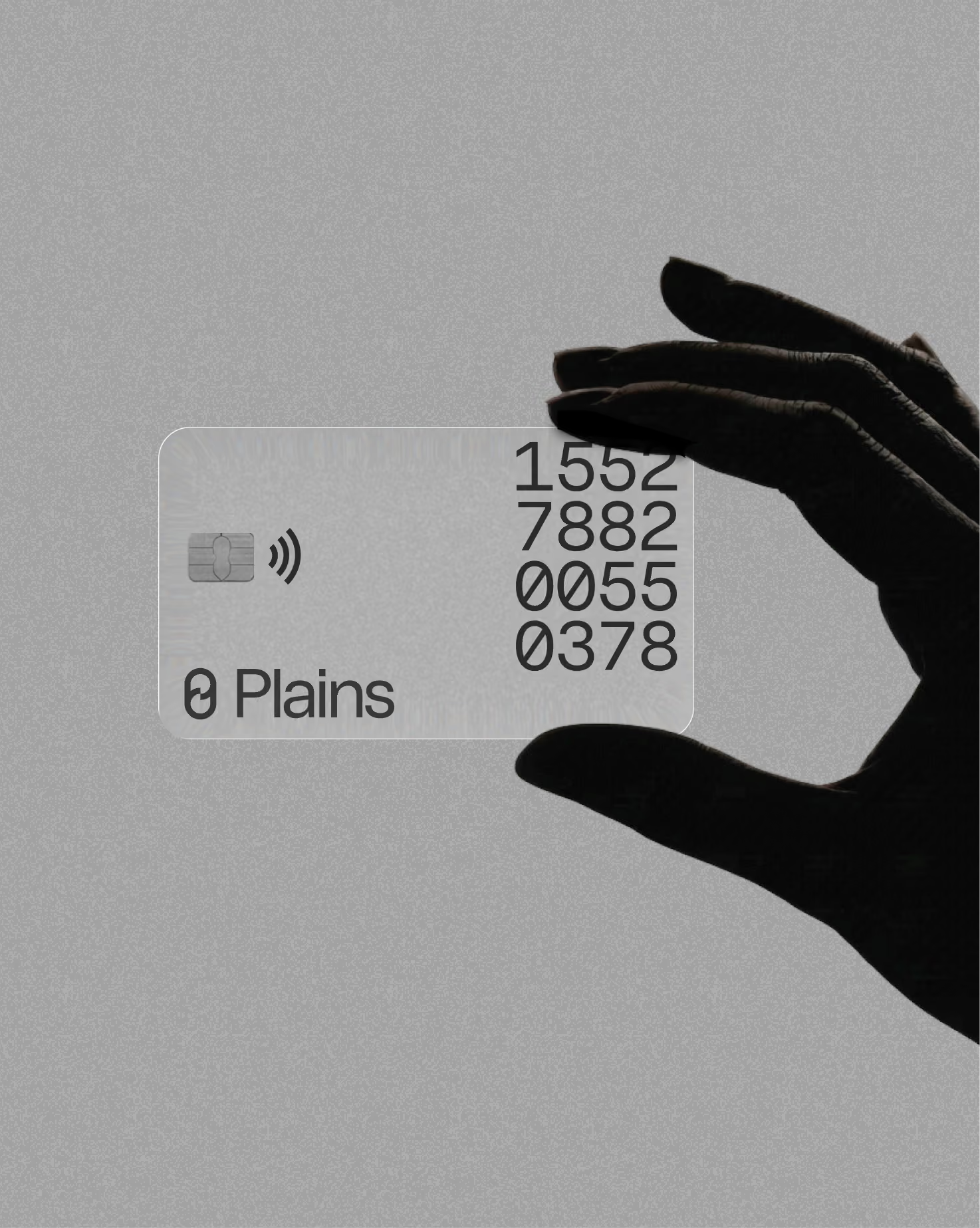
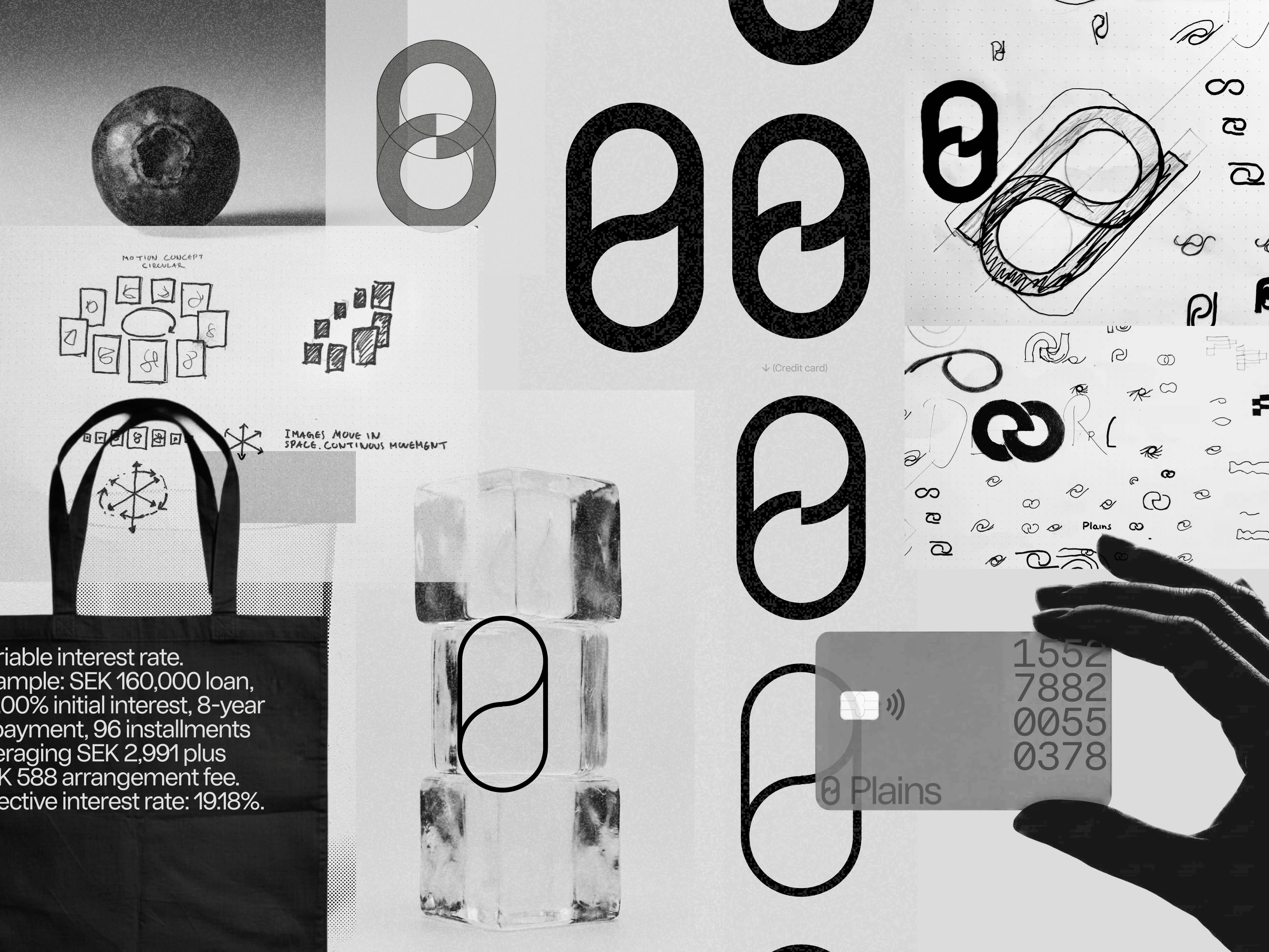
Back to Zero. Plains has one simple promise: to be clear, visible and understandable for everyone. Plains doesn't want to keep people in debt. It wants to help them get back to zero as quickly as possible. That simple idea runs through the whole identity, from a symbol that joins a zero with a P to a motion concept that always comes back to where it started.

Info
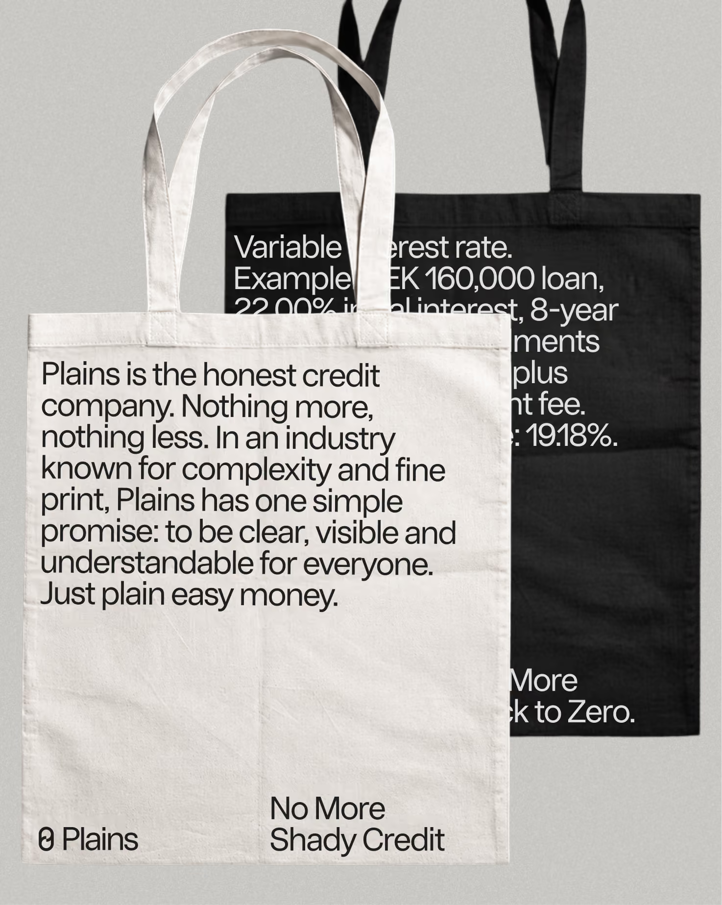
Plains is the honest credit company. Nothing more, nothing less. In an industry known for complexity and fine print, Plains has one simple promise: to be clear, visible and understandable for everyone. Just plain easy money.
With honesty as the core idea, we built the whole brand on restraint. We took out anything that didn't need to be there, so every part of the identity could do its job clearly. Plain means simple, clear and honest. A plain white shirt. Plain English. Just plain good.
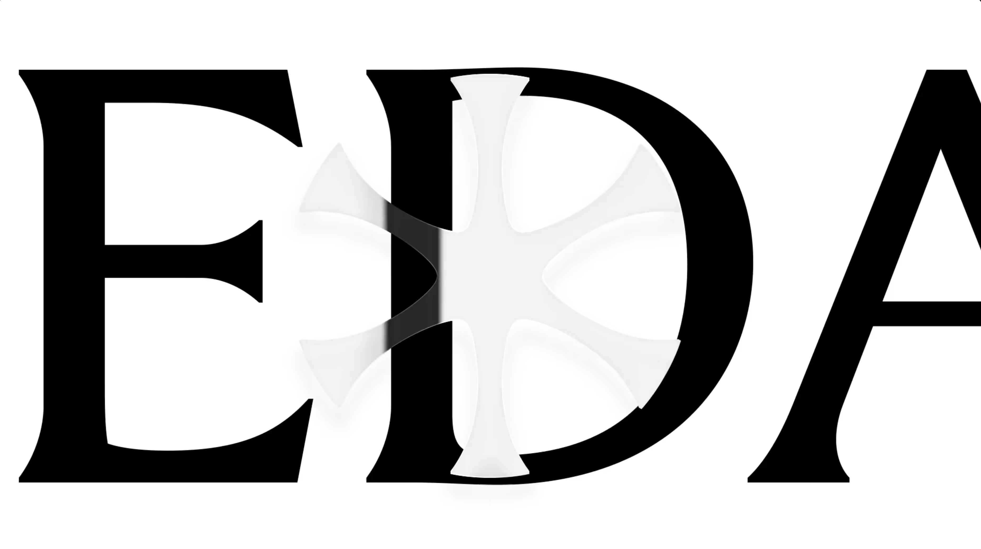
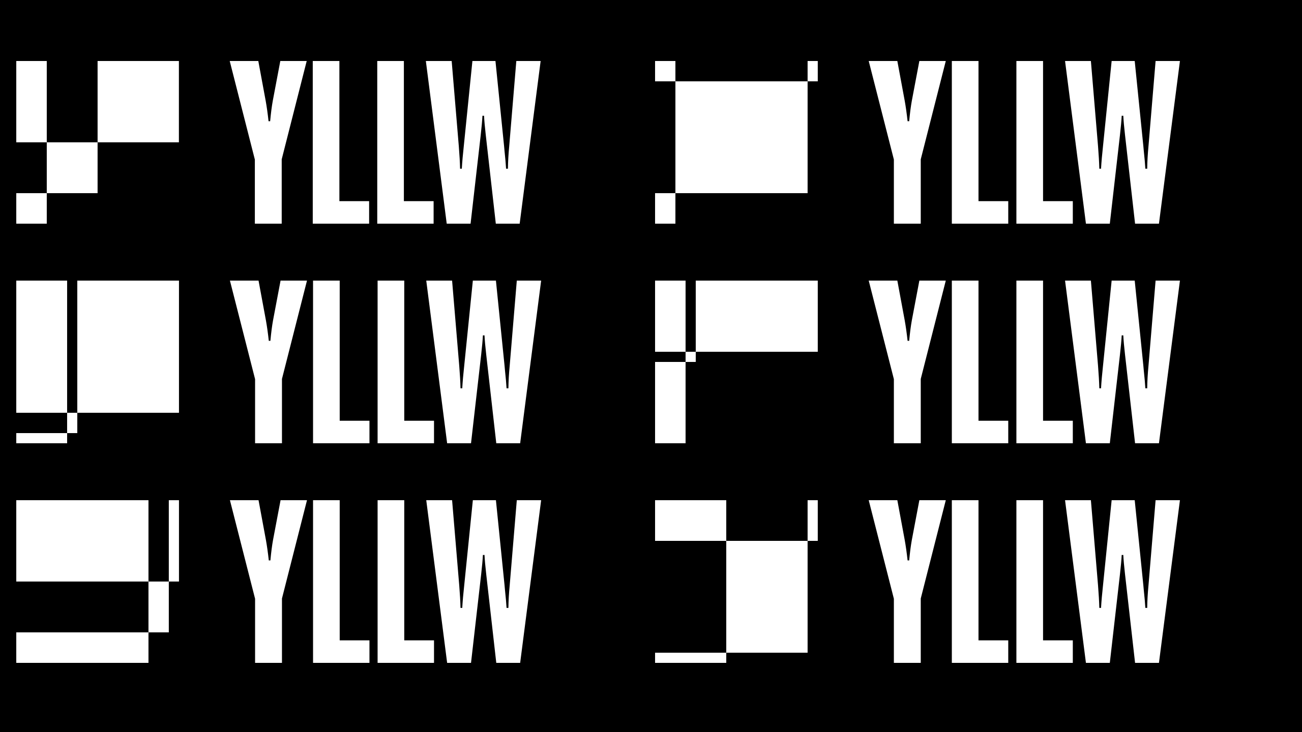
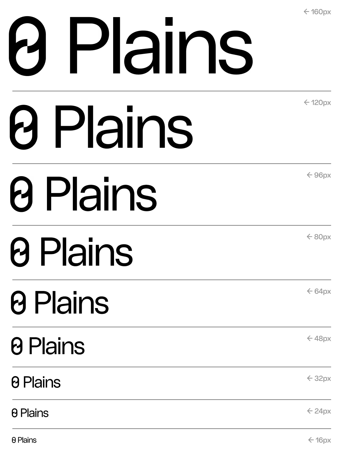
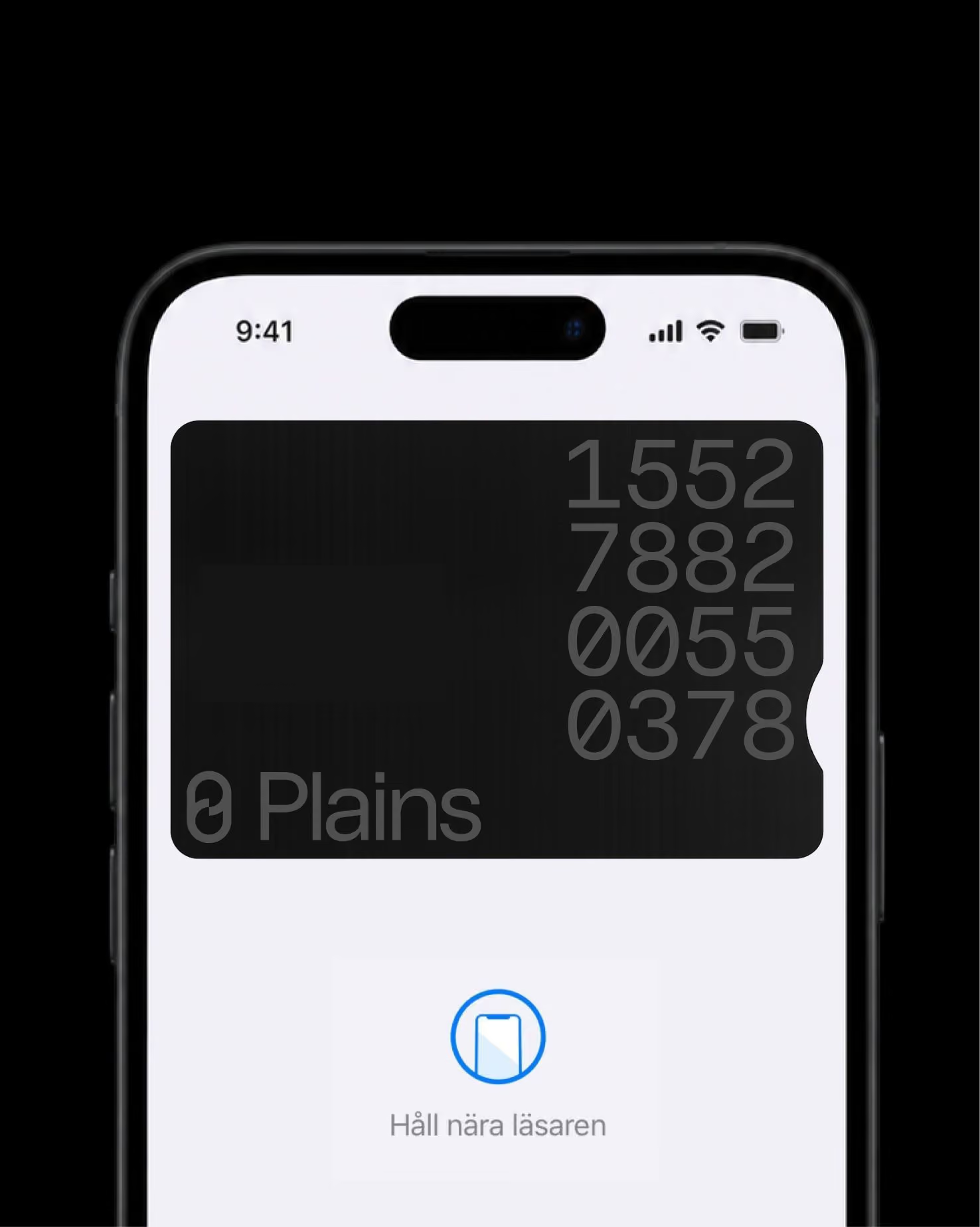
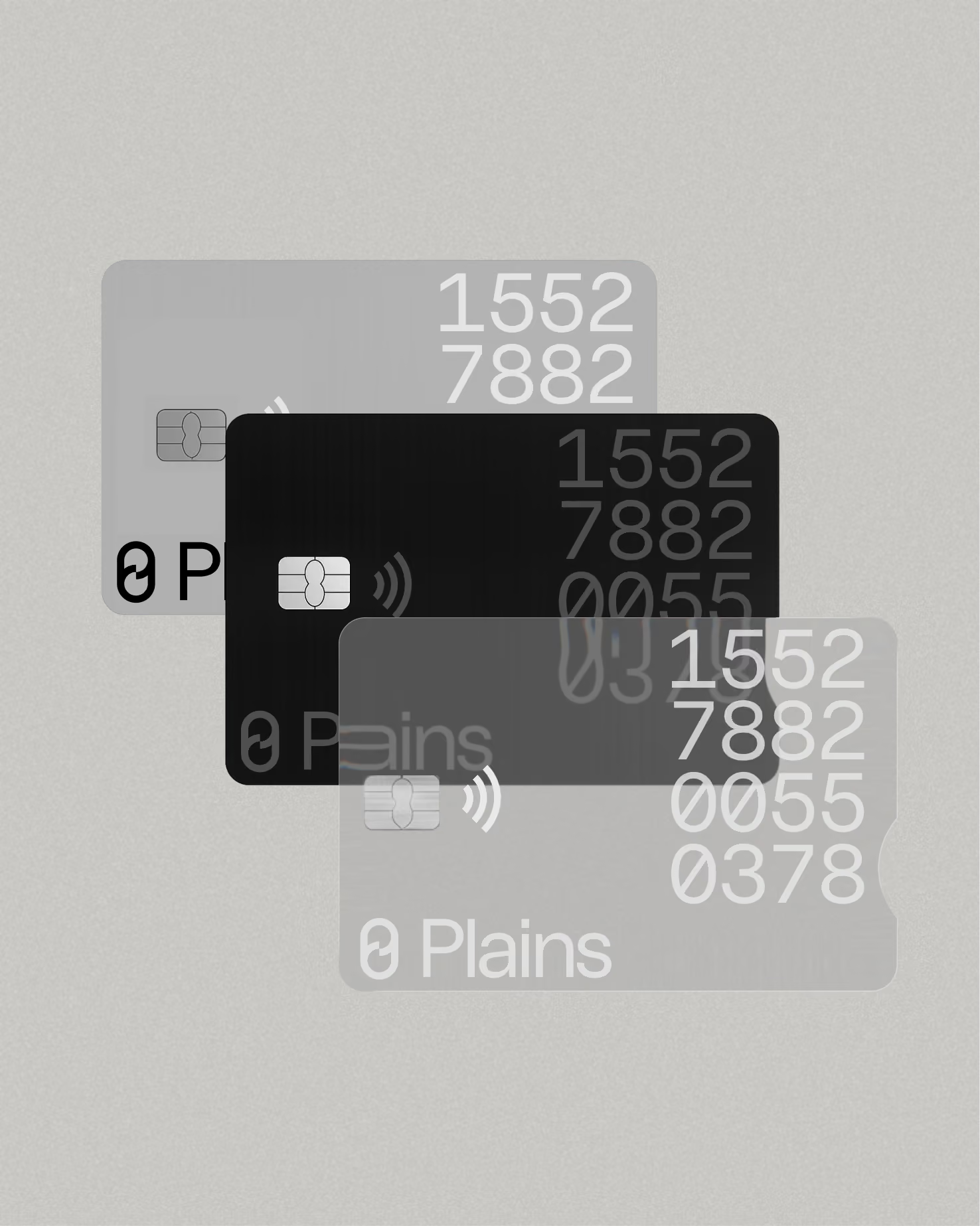
The symbol is a zero joined with the letter P. Zero is where Plains wants its customers to be. Plains helps them cover unexpected expenses and get back to zero as quickly as possible. So the symbol carries the company's whole purpose: not to keep people in debt, but to help them get out of it.
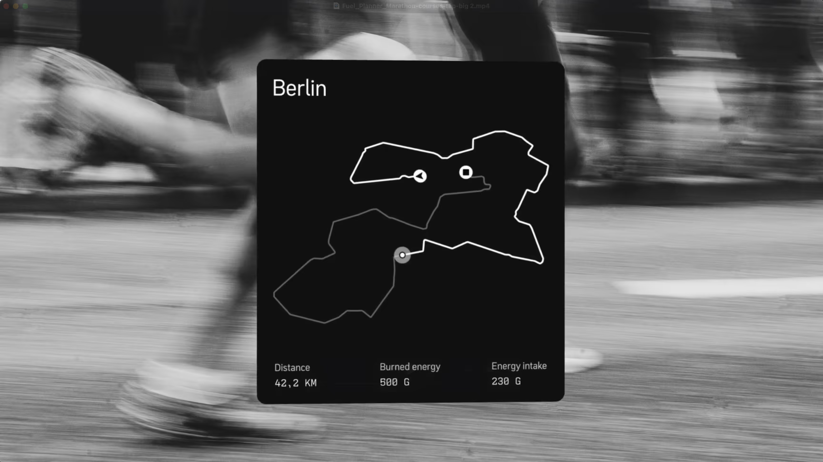
The motion concept tells the same story. You spend on your card, and then you find your way back to zero. That cycle is the circular motion at the heart of the identity. Elements move out and always return to where they started, and they can do it in all six directions: up, down, left, right, toward the viewer and away from them. The result is a motion language that feels fluid, calm and recognizable, with a clear message: whatever you spend, Plains helps you get back to zero.
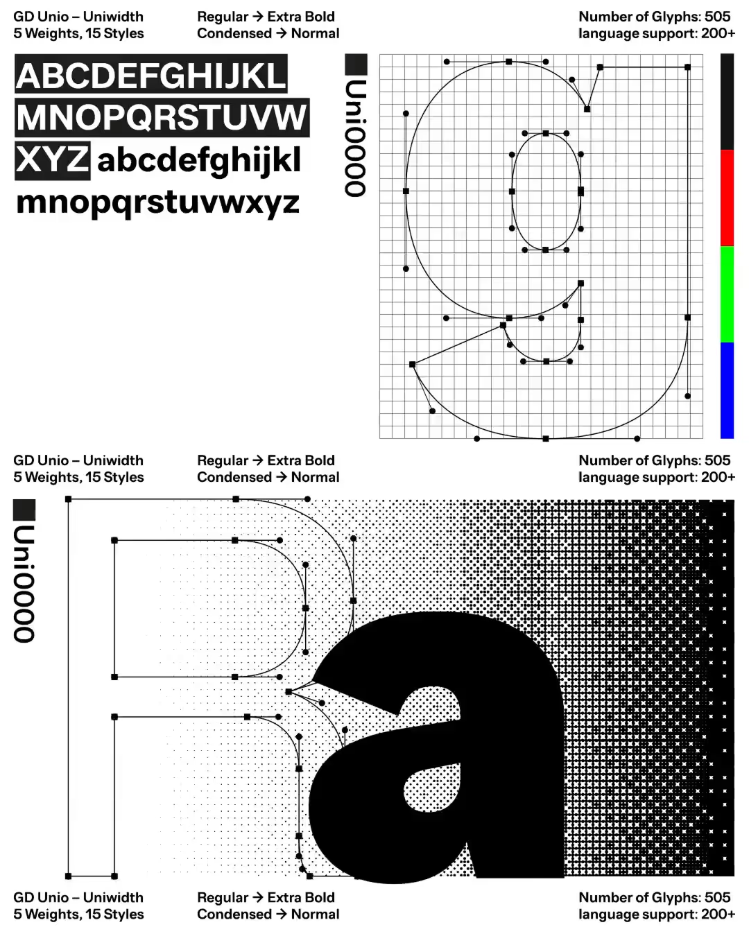
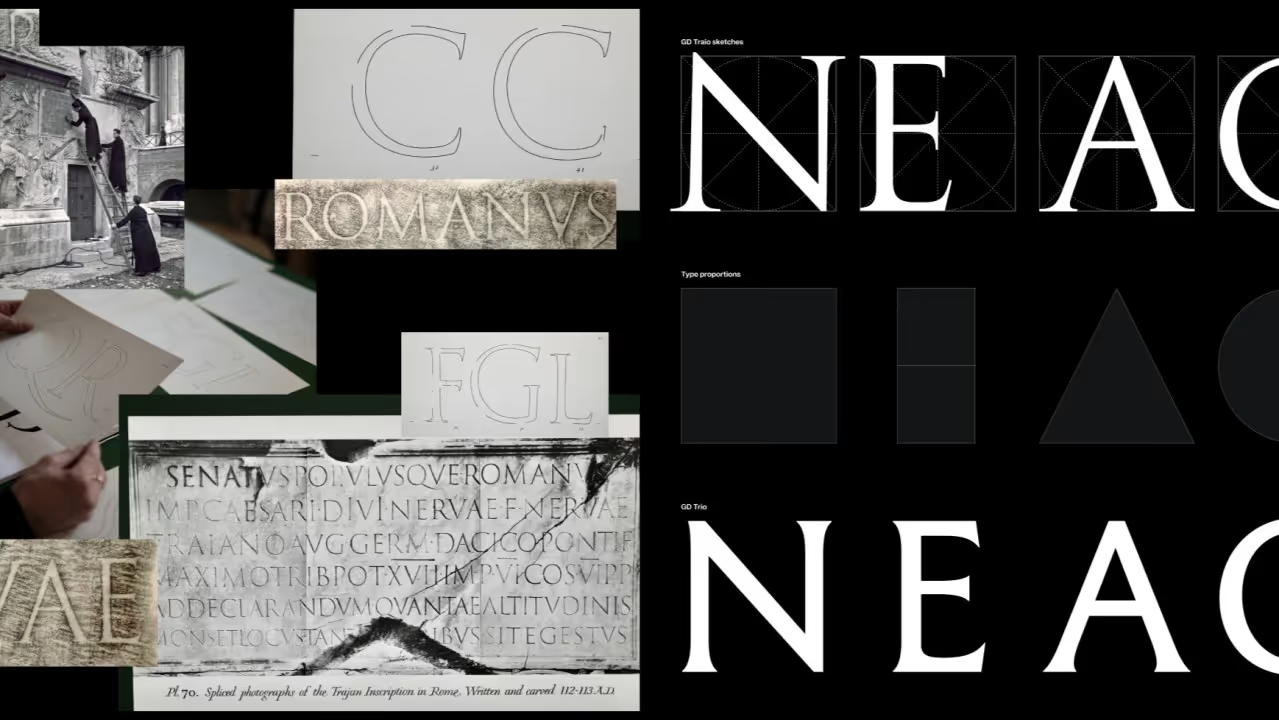
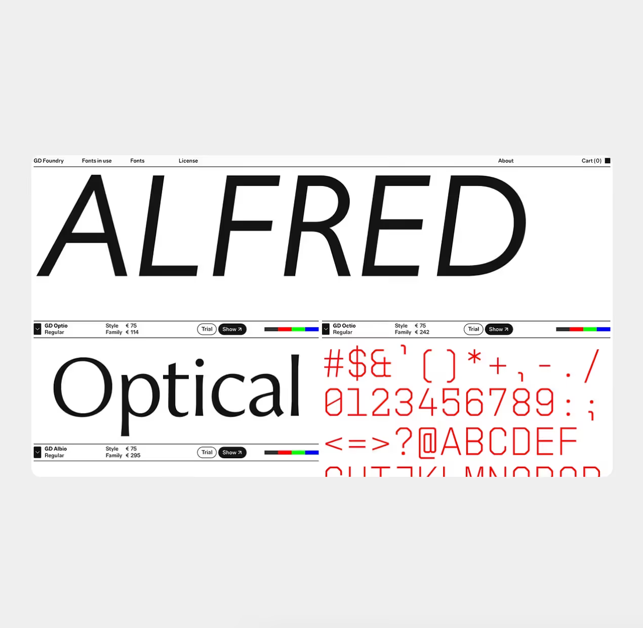
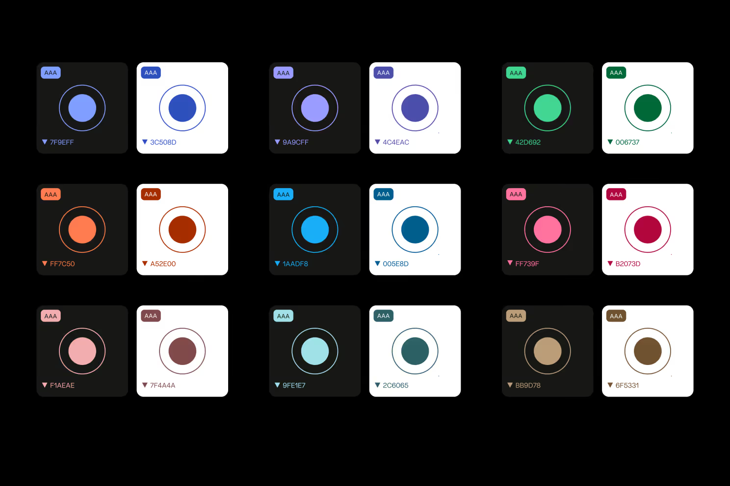
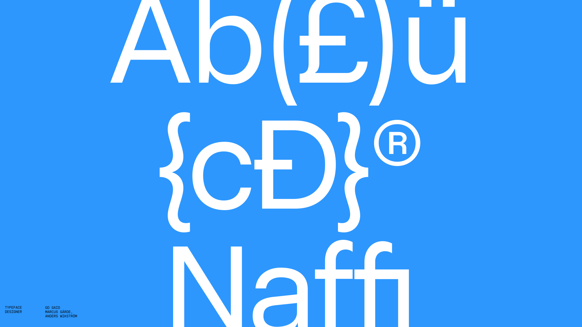
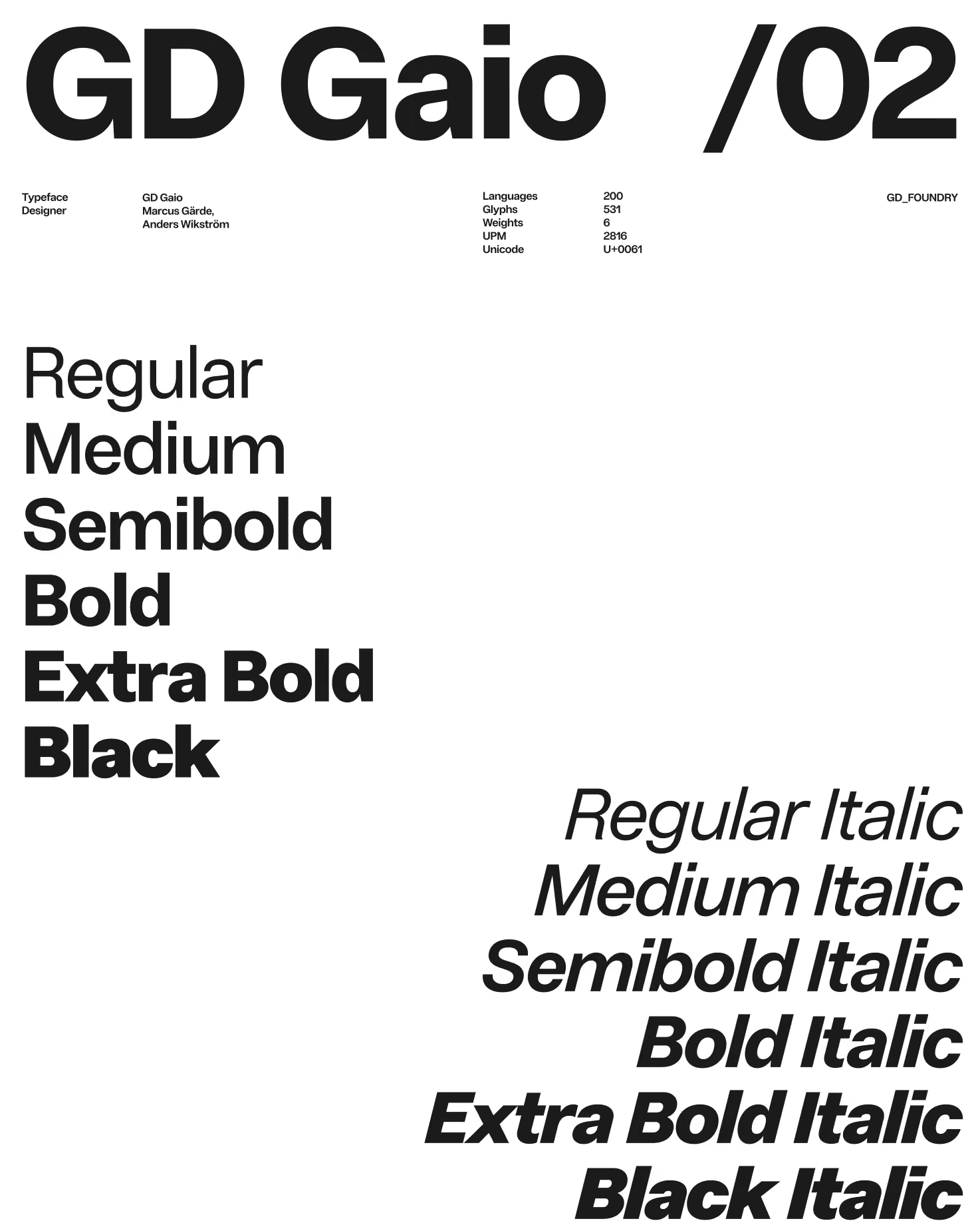
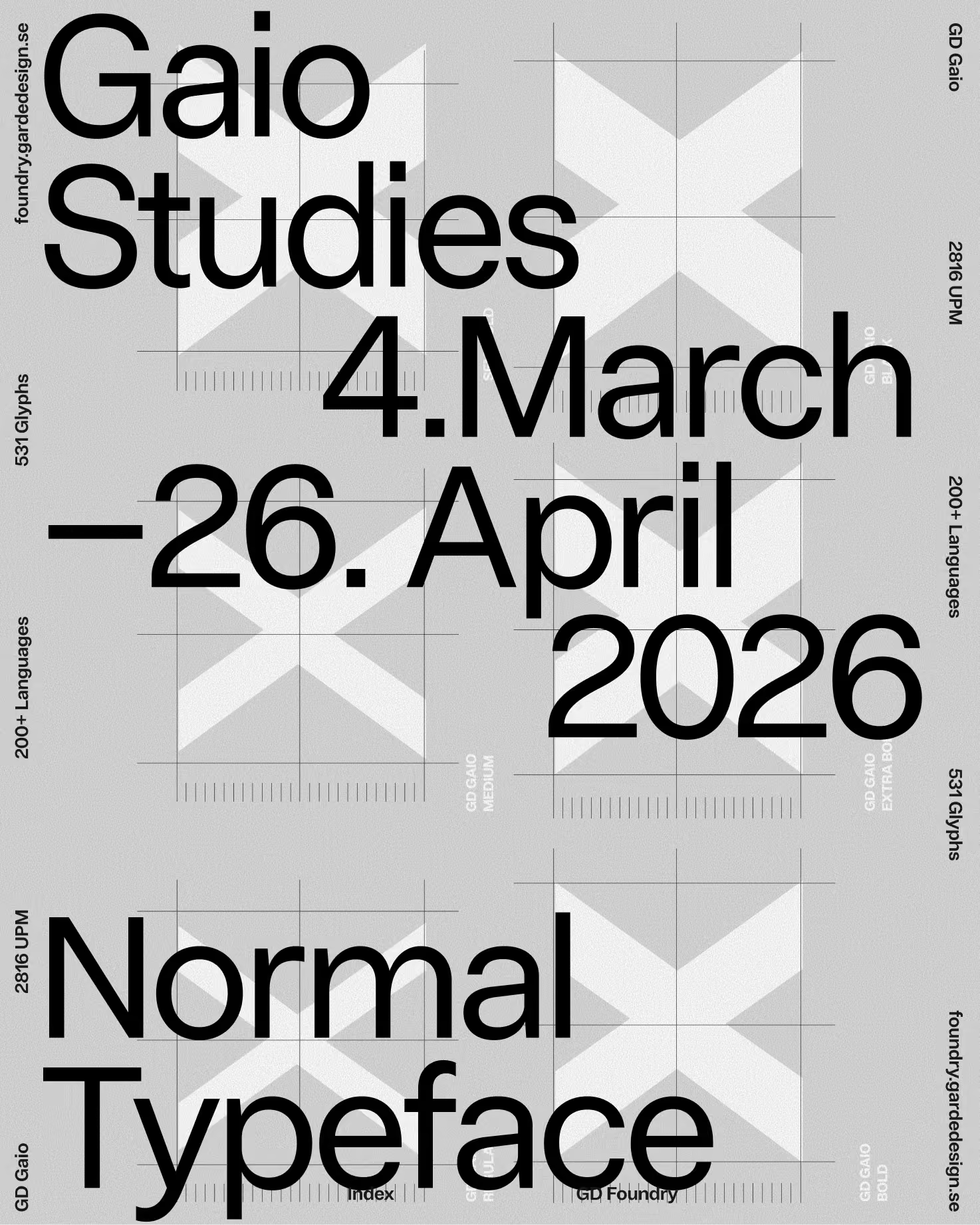
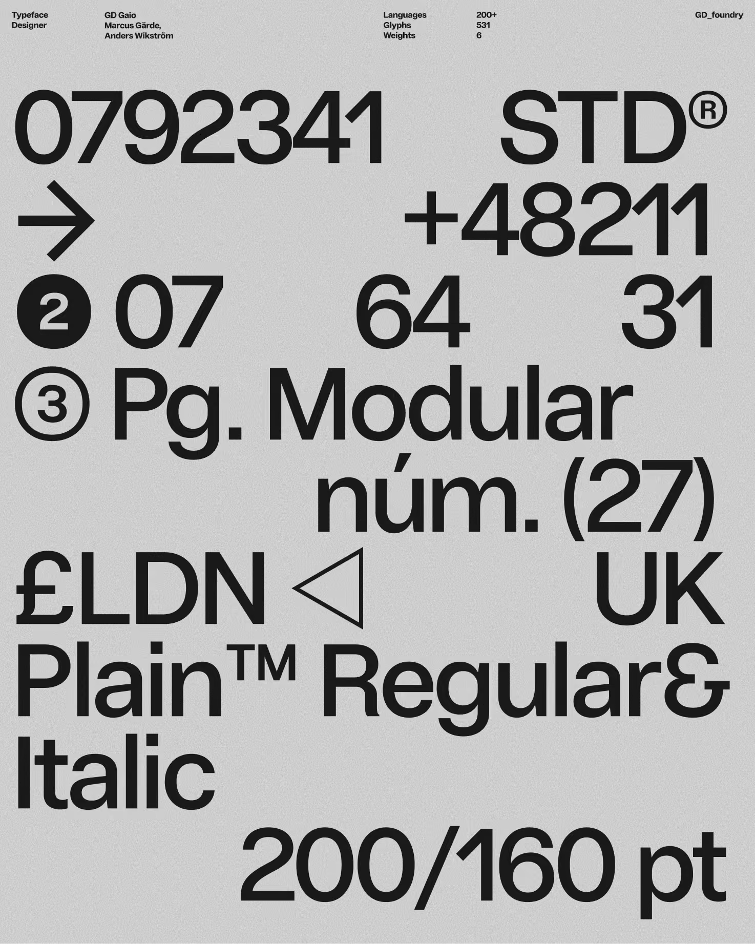
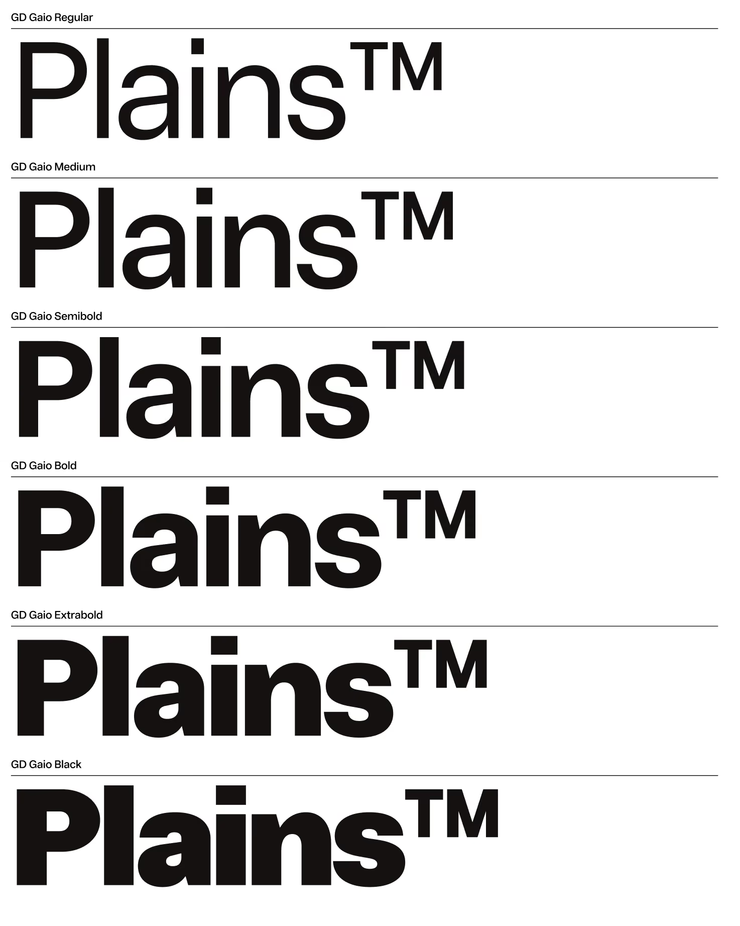
At the center of the identity is GD Gaio, a highly legible, neutral sans serif with open forms and balanced proportions. We paired it with a black and white palette. Together they let Plains communicate with transparency, confidence and simplicity.
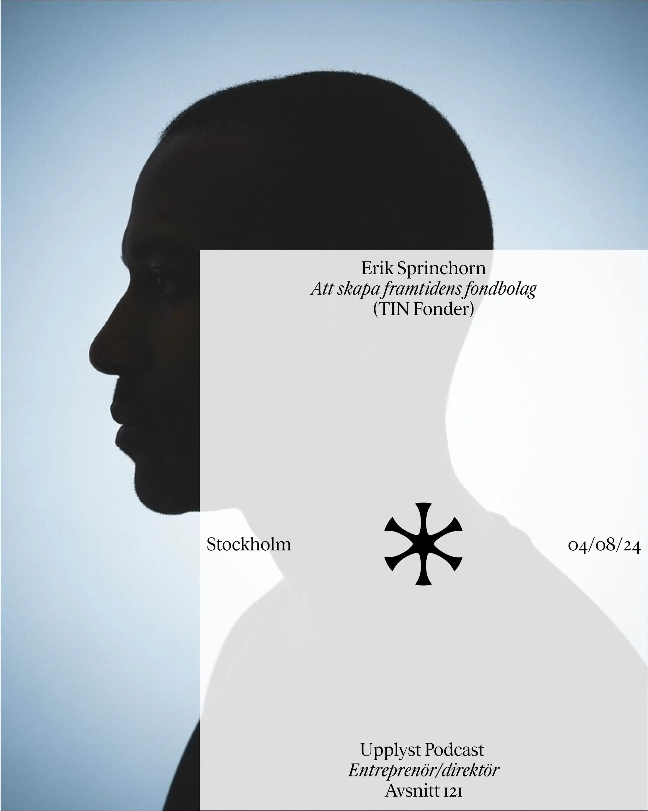
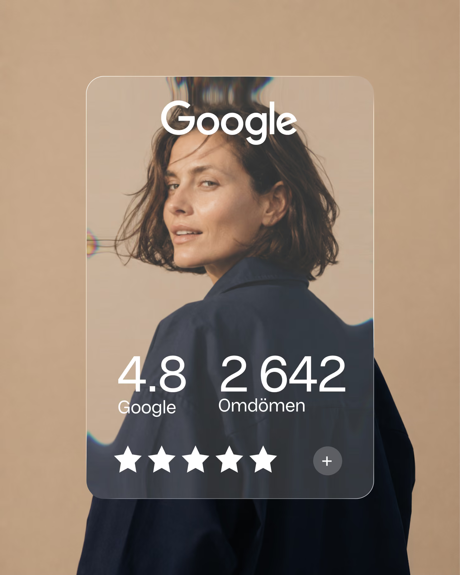
The layout system follows one simple rule: one font size and one font weight. Clarity comes from spacing, rhythm and structure. Calm still-life photography shows everyday objects exactly as they are, because a plain coffee is simply a plain coffee. Plains works the same way: what you see is what you get.
Typefaces