


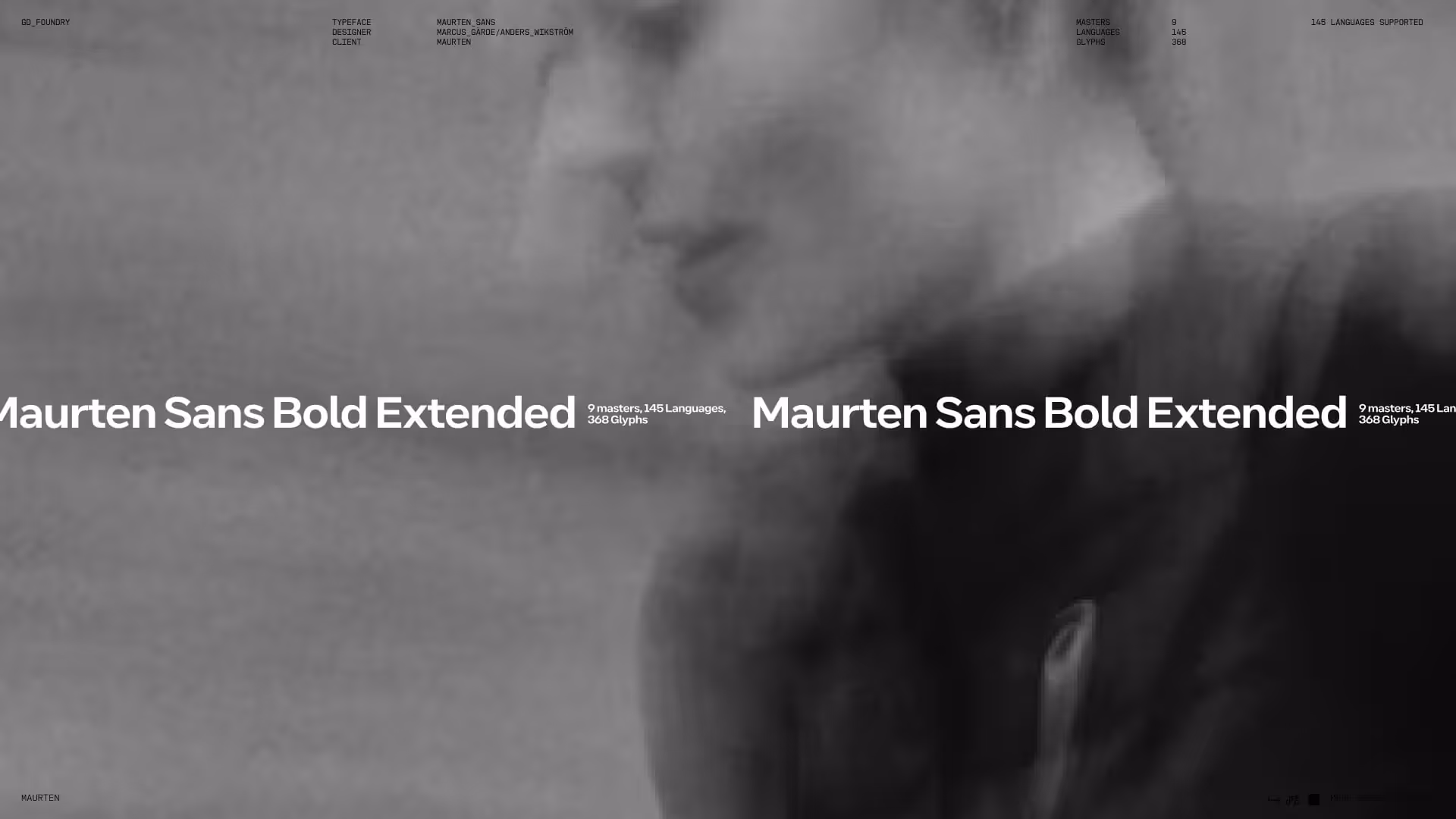
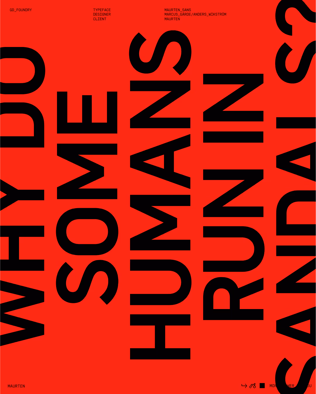
A bespoke type system built for scale. Maurten’s typeface refined and extended with a monospaced companion and custom pictograms.


Info
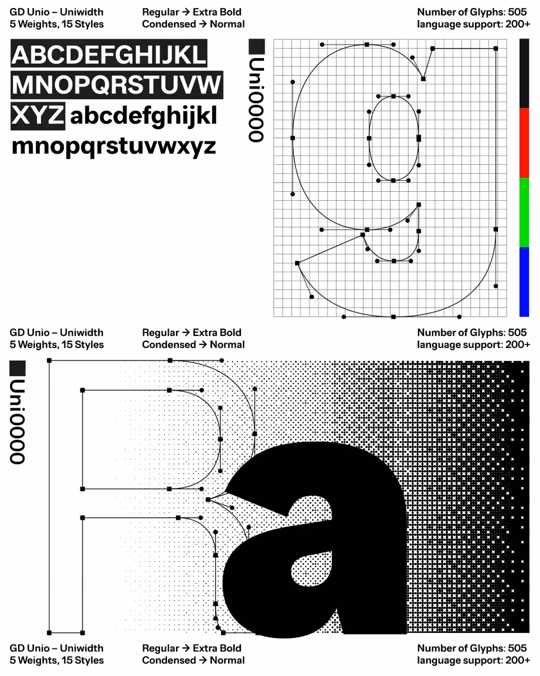
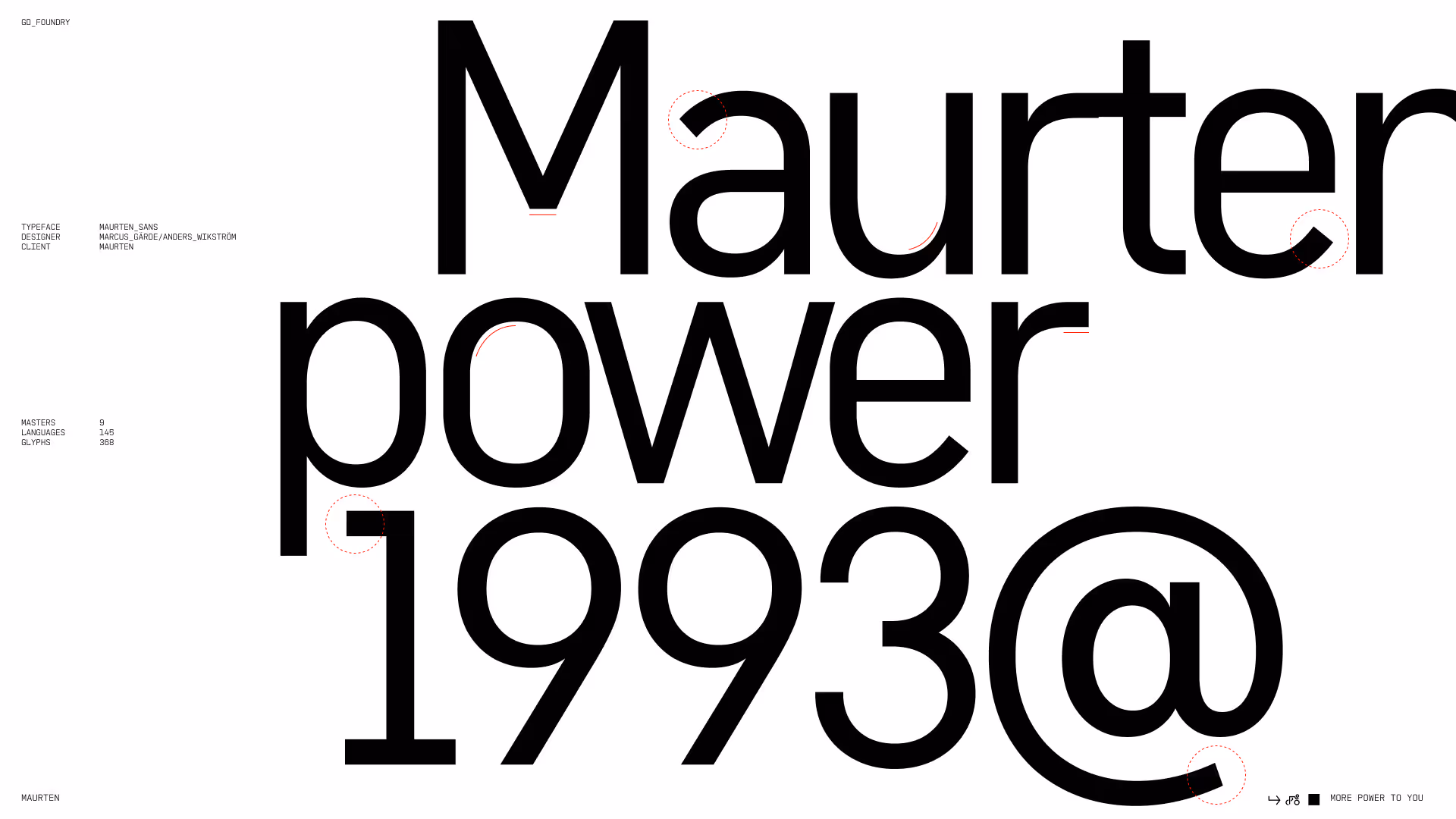
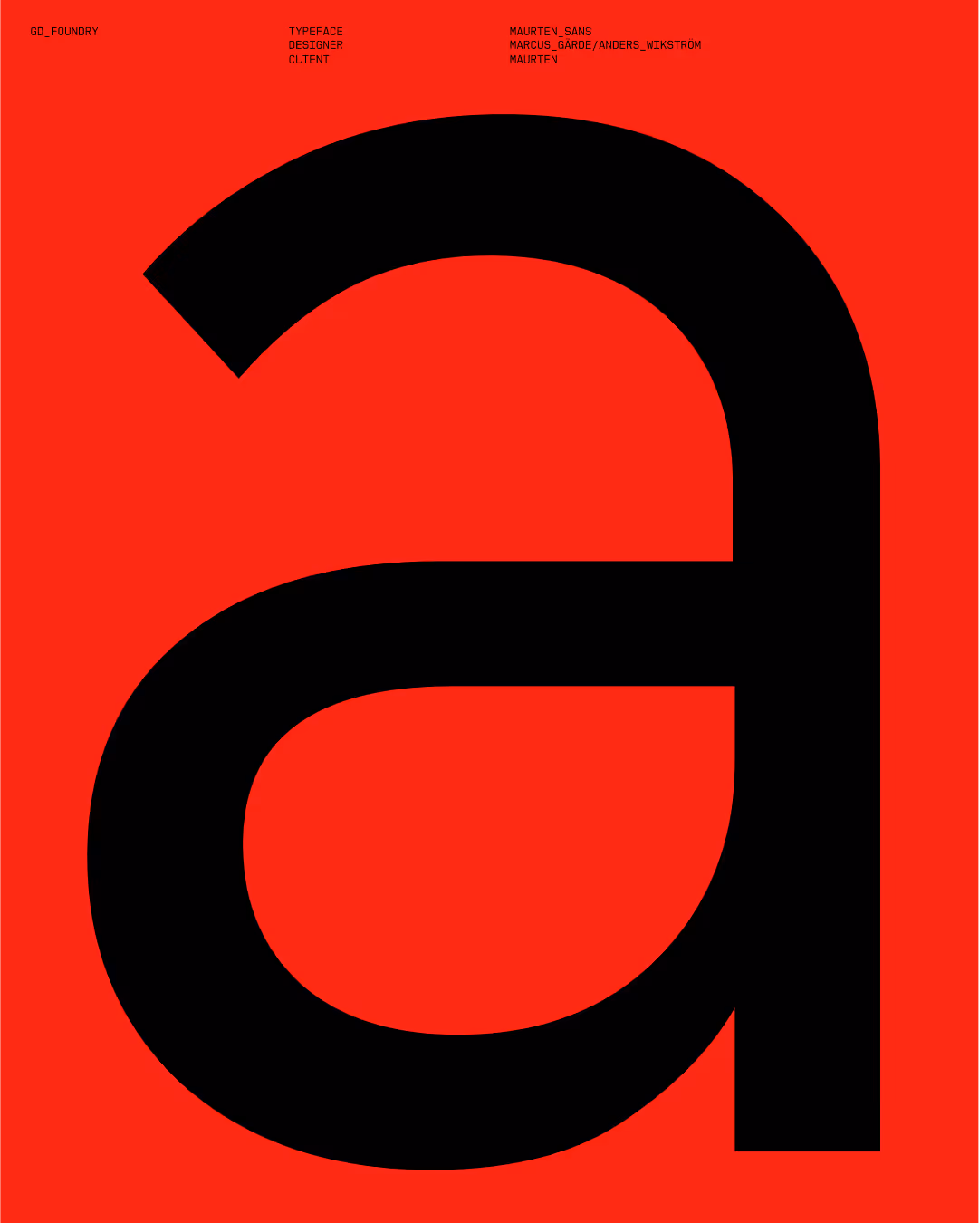
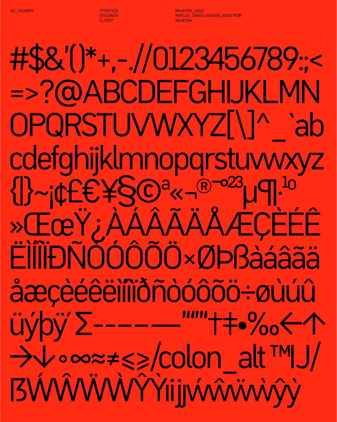
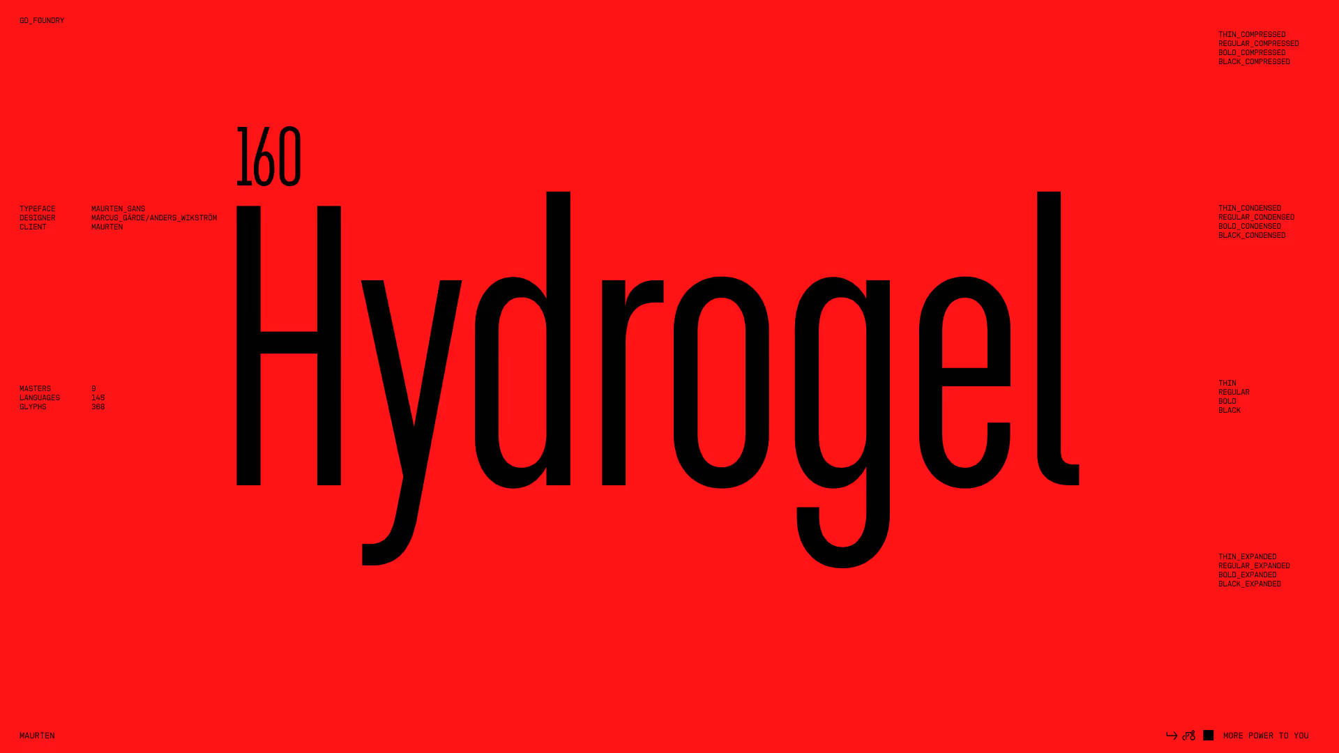
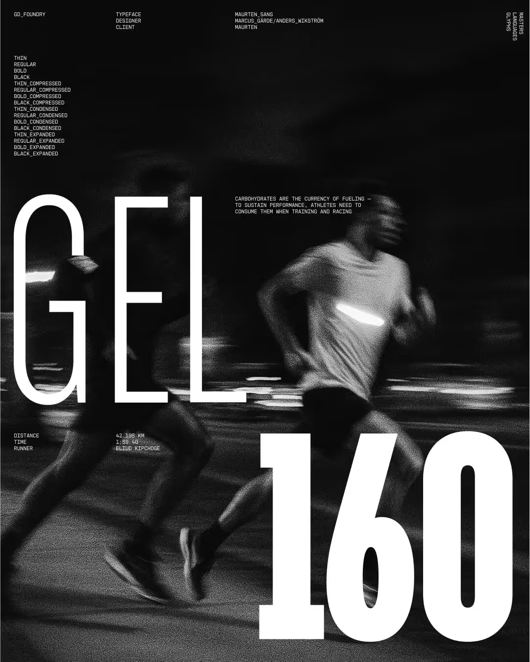
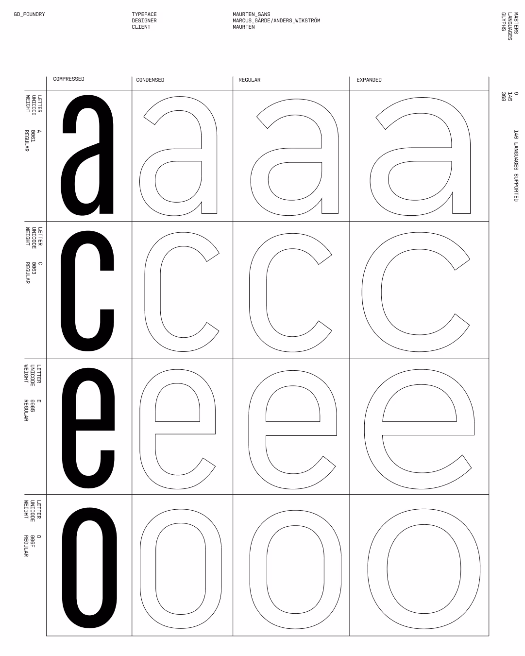
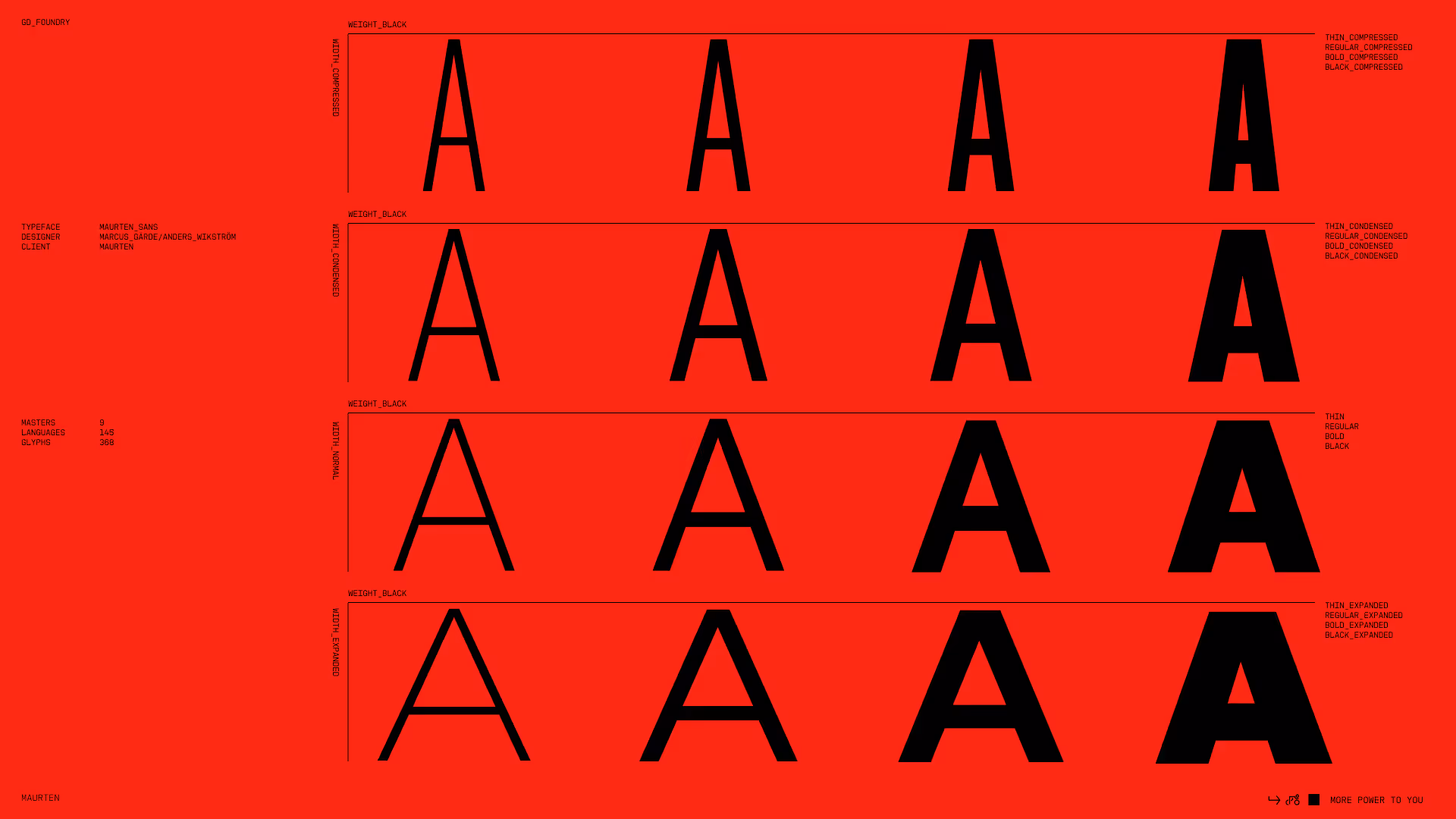
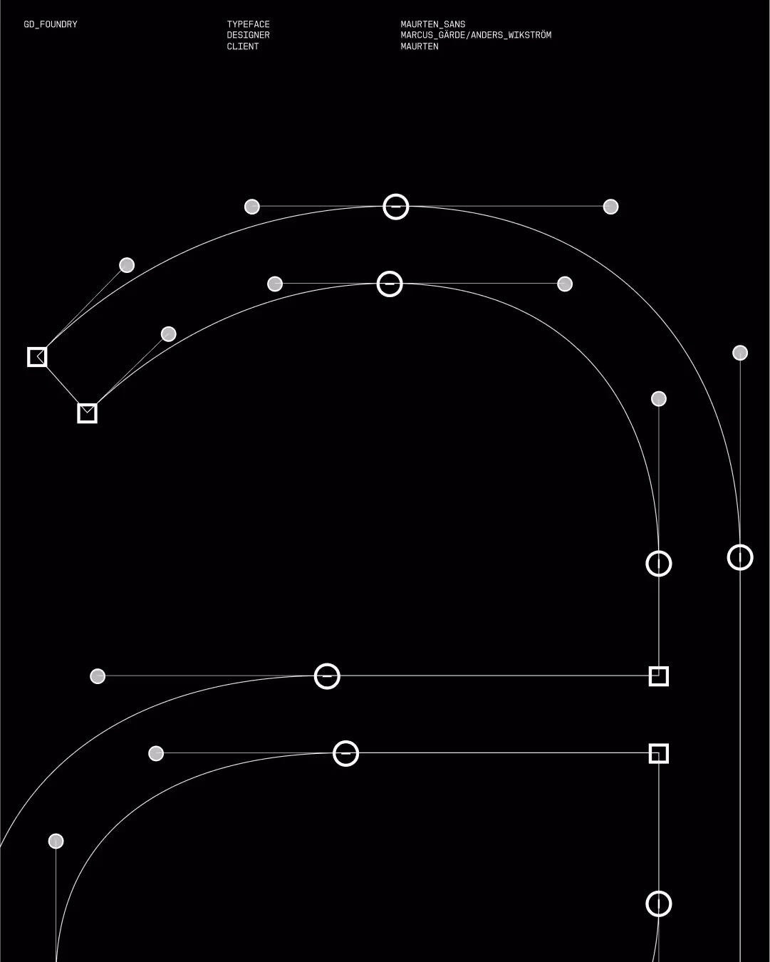
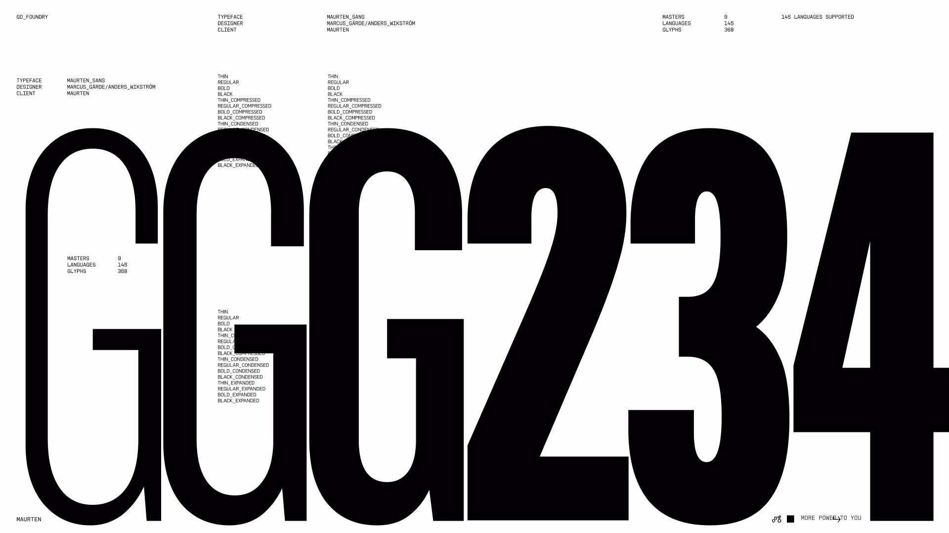
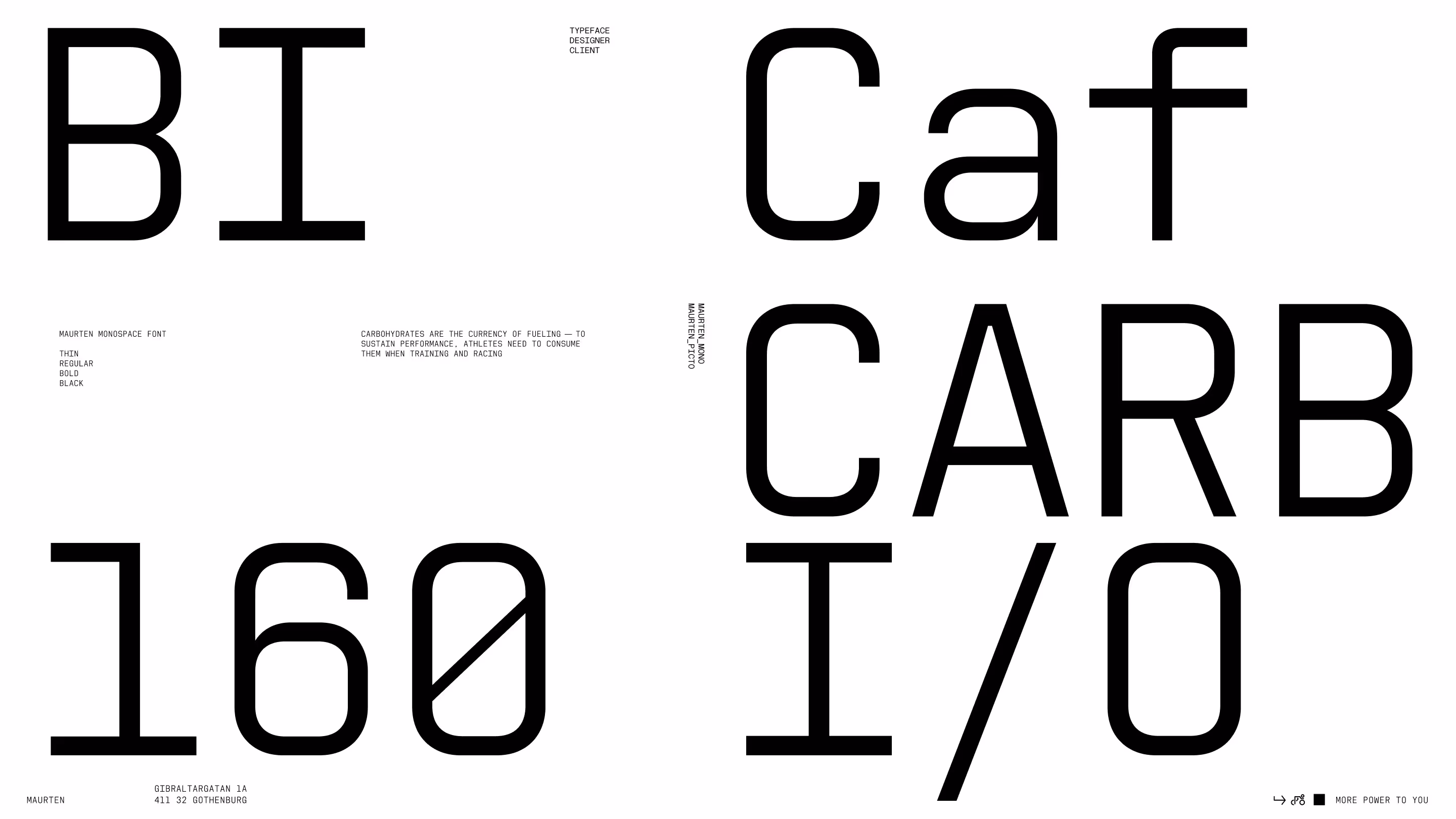
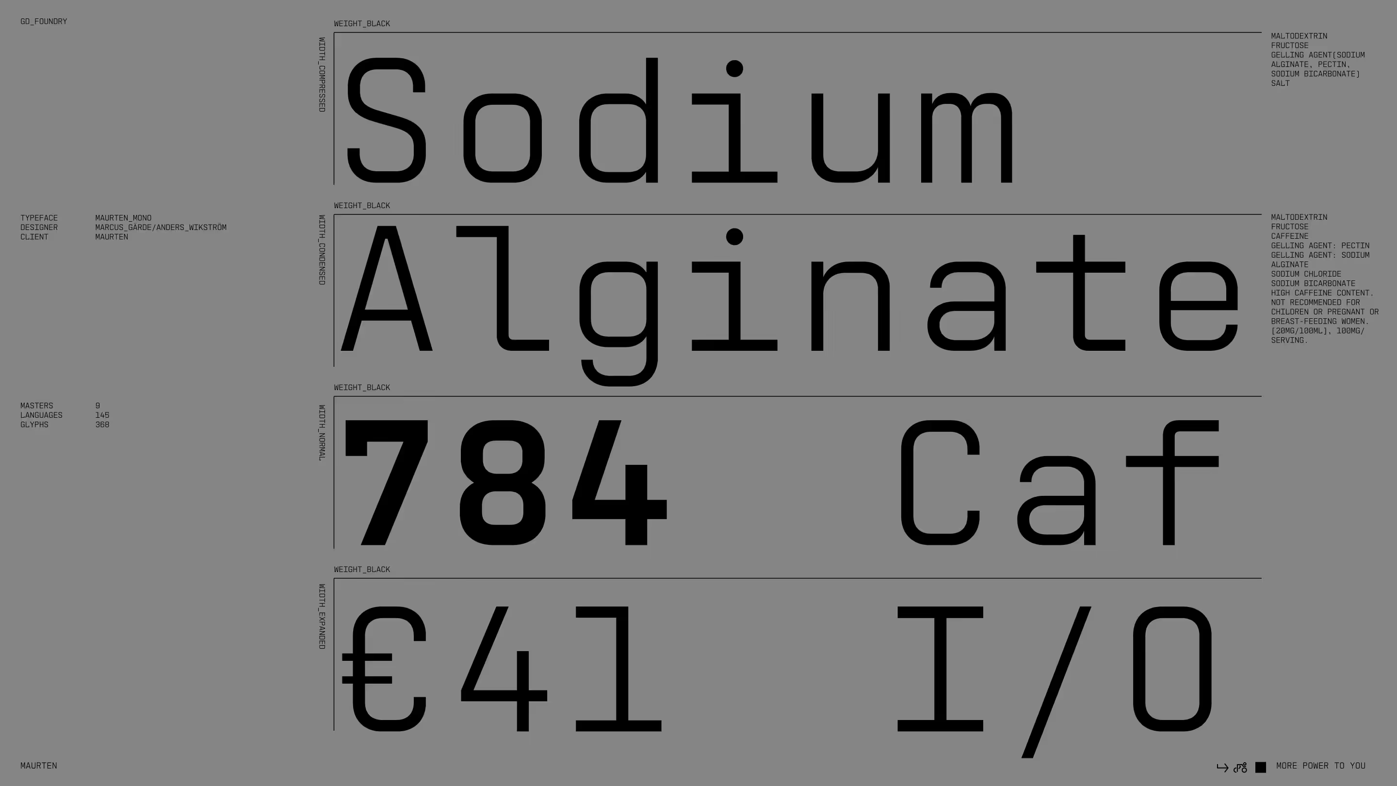
To support Maurten’s evolving brand, we expanded their existing typeface into a more flexible, bespoke system. The update introduced two new weights, Light and Black, along with additional styles across Condensed and Wide widths. Each variant was carefully refined to ensure consistency, with subtle adjustments for balance and clarity. The system was rigorously tested to perform seamlessly across all platforms.
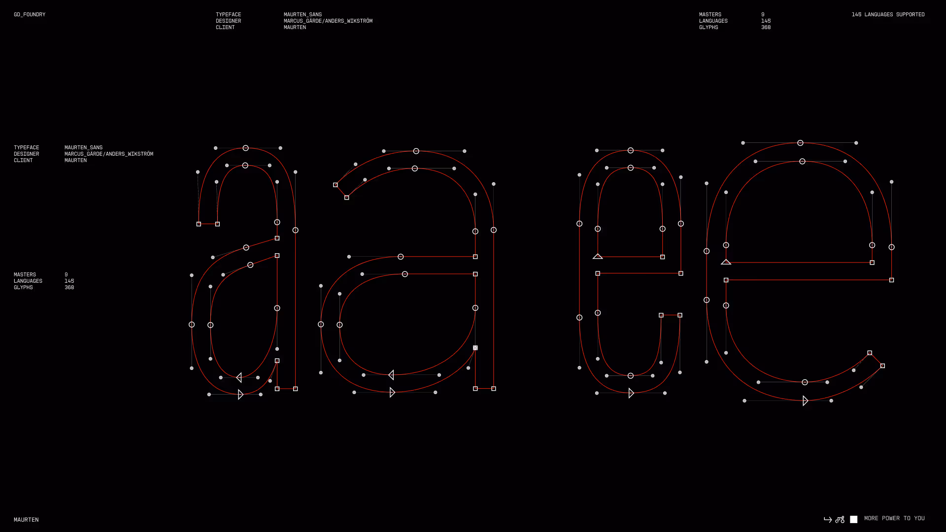
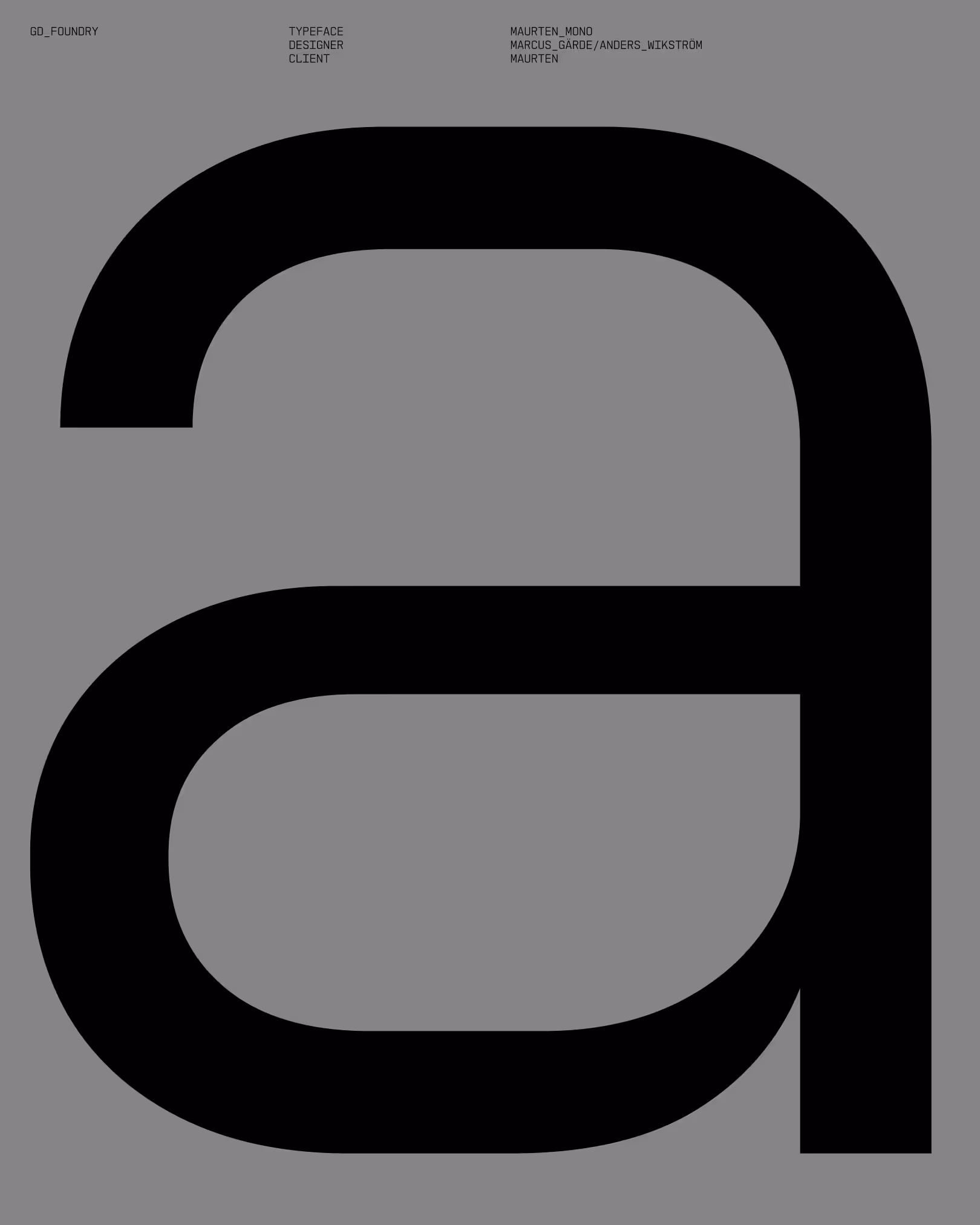
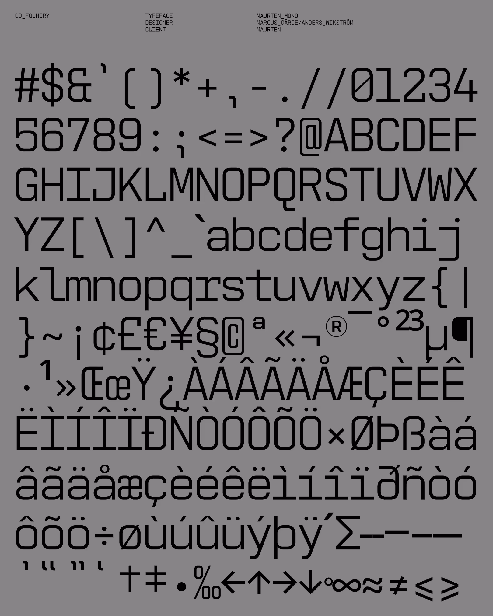
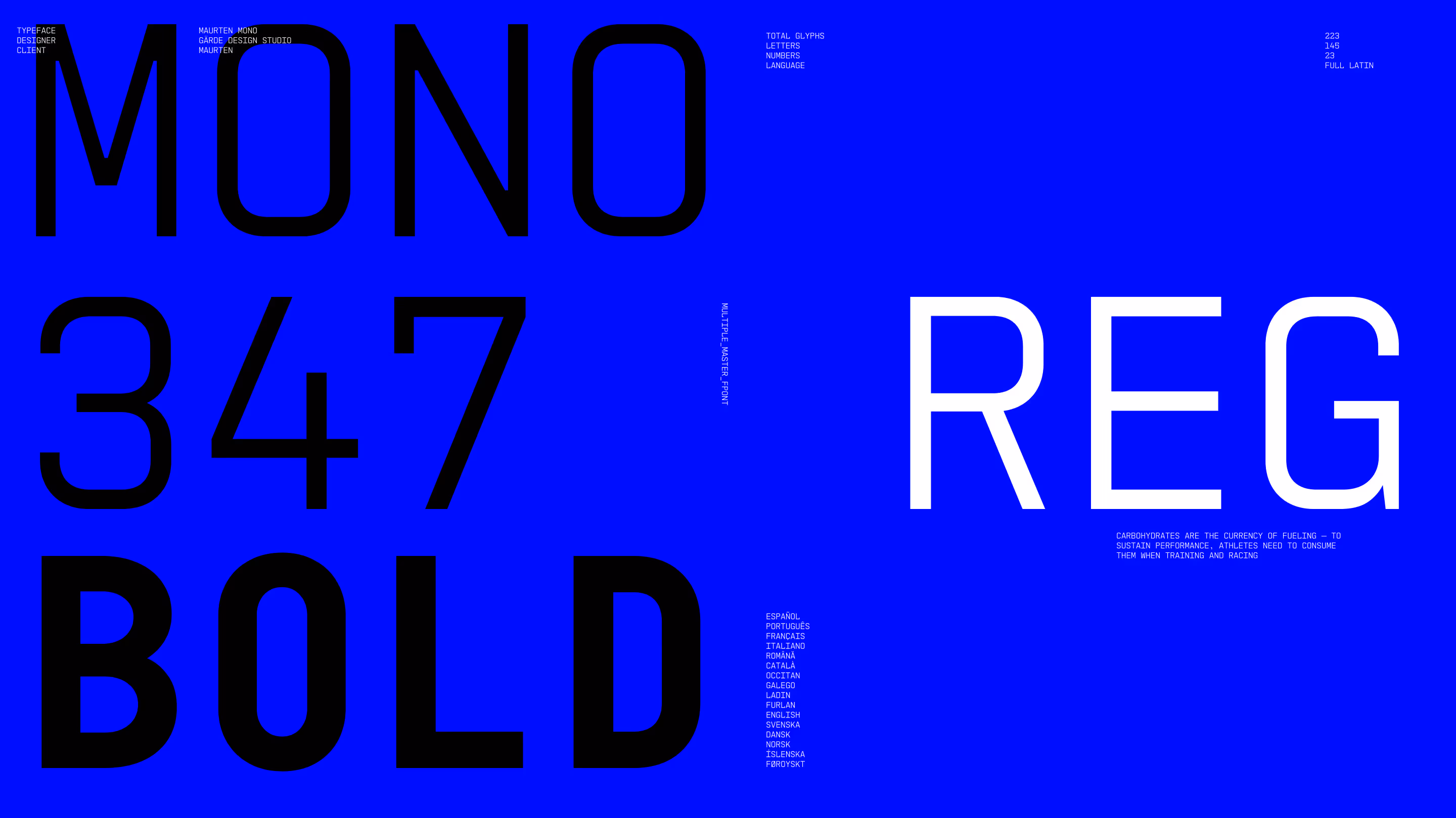
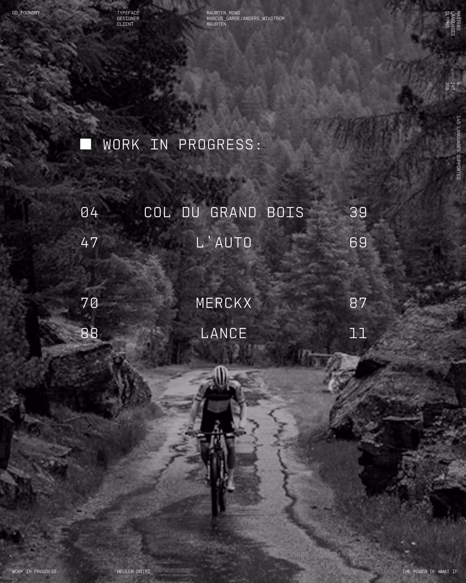
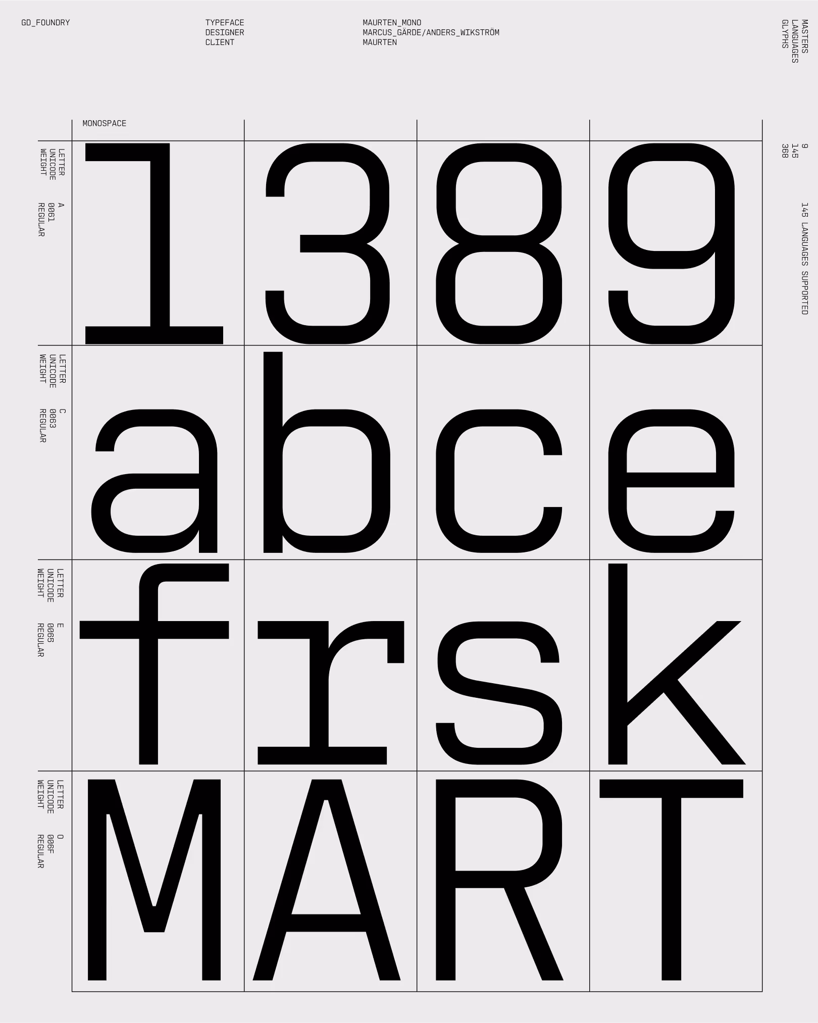
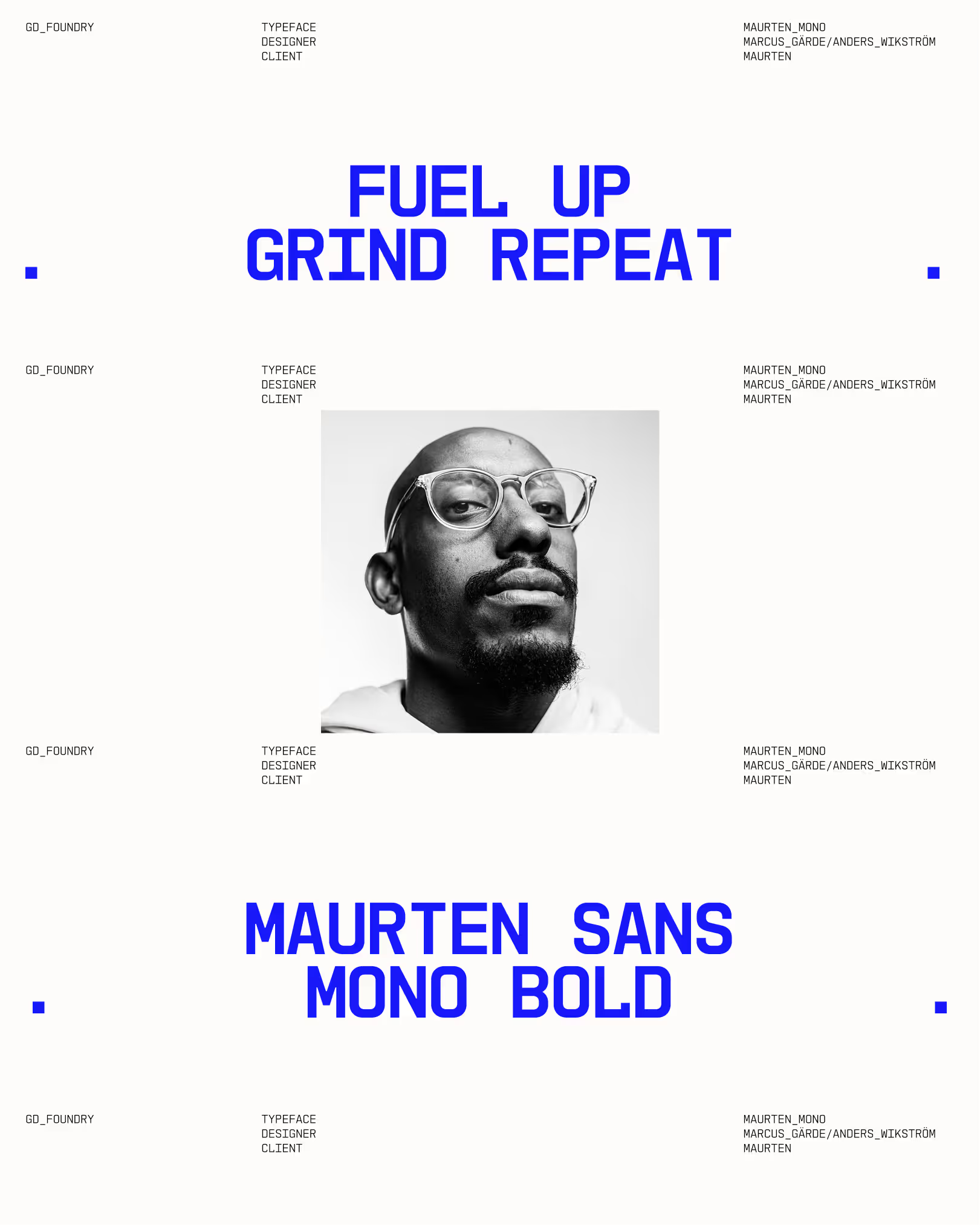
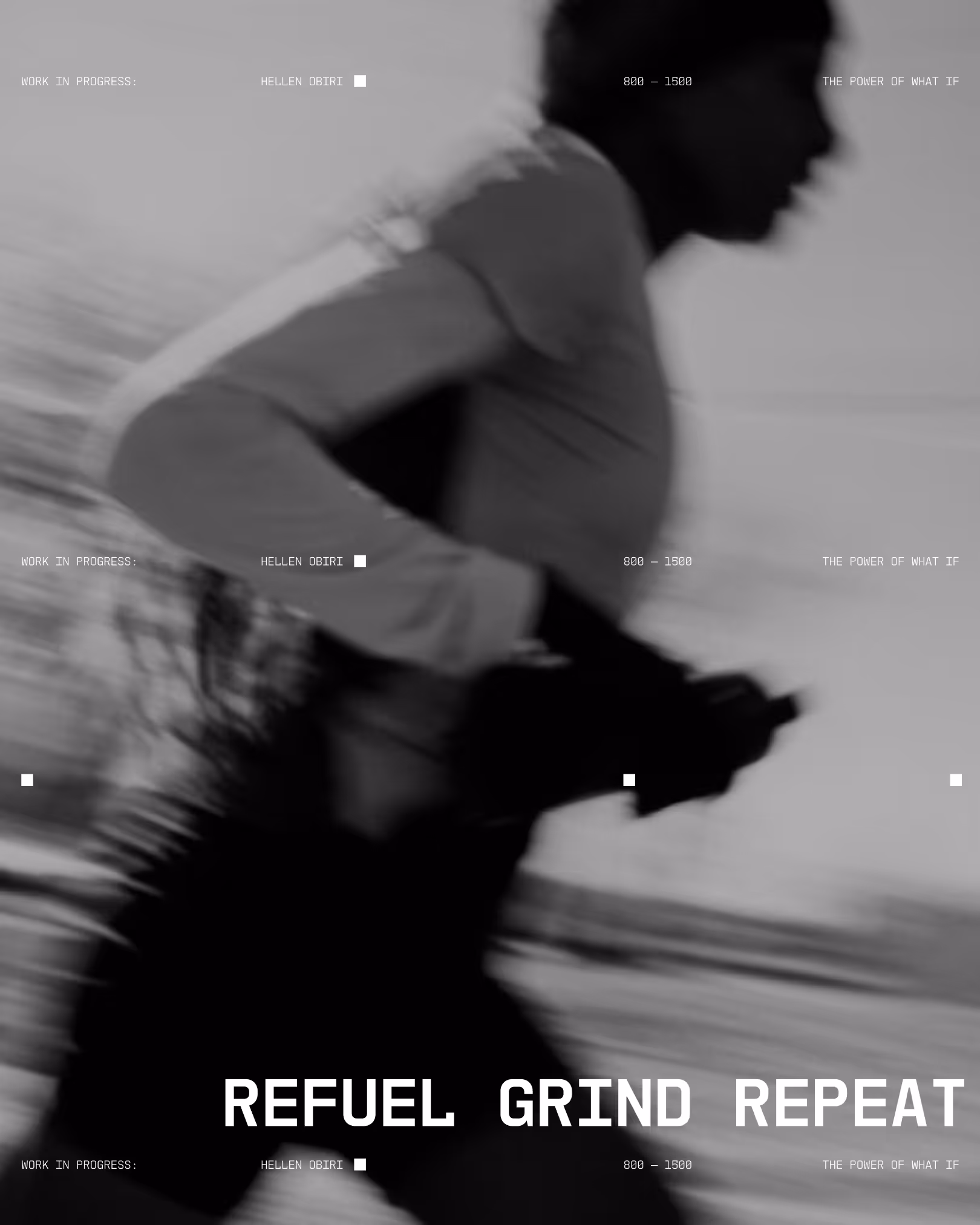
Building on this foundation, Maurten Mono was developed as a bespoke monospaced typeface in Regular and Bold, designed to meet functional demands while maintaining a modern, technical expression aligned with the brand.
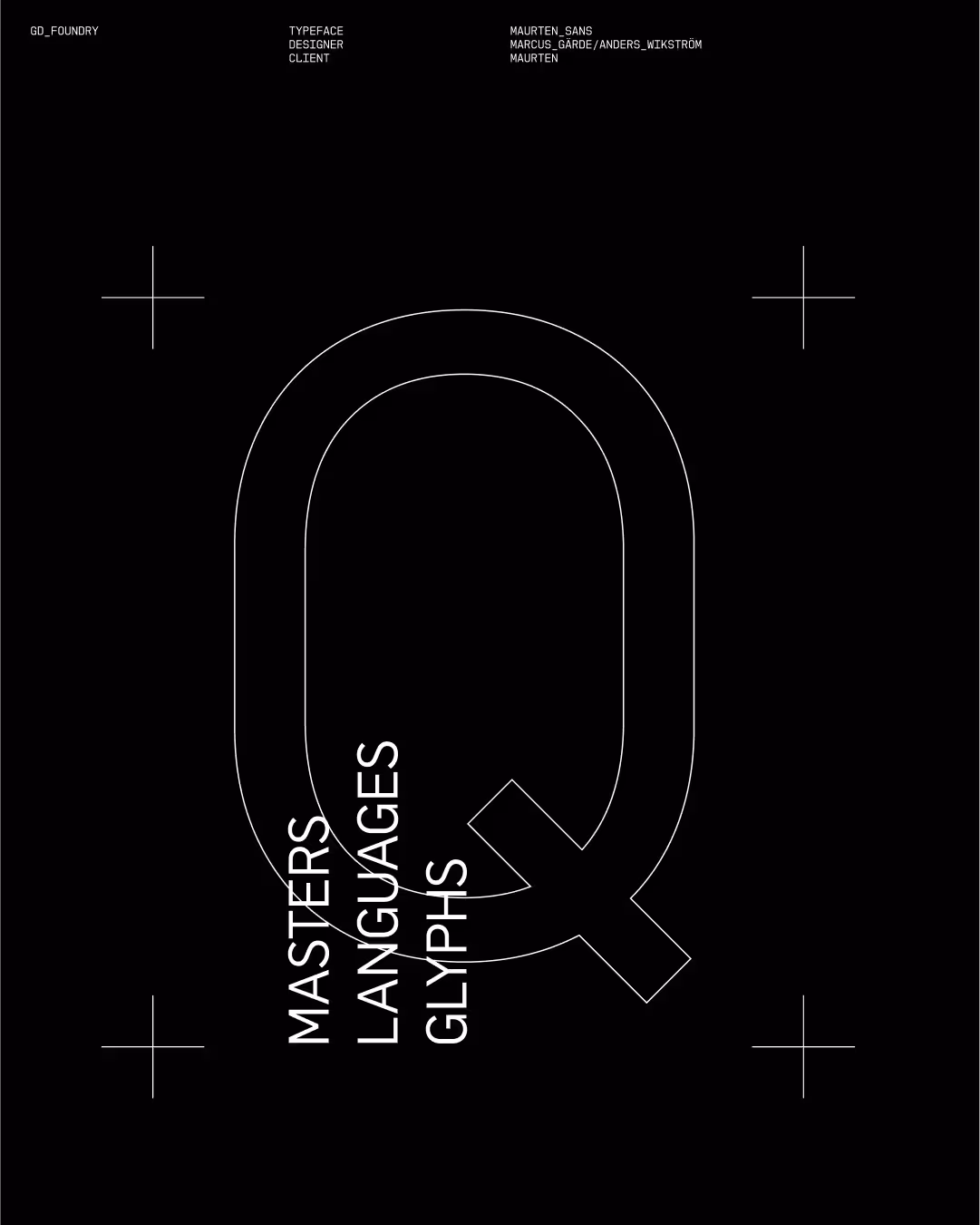
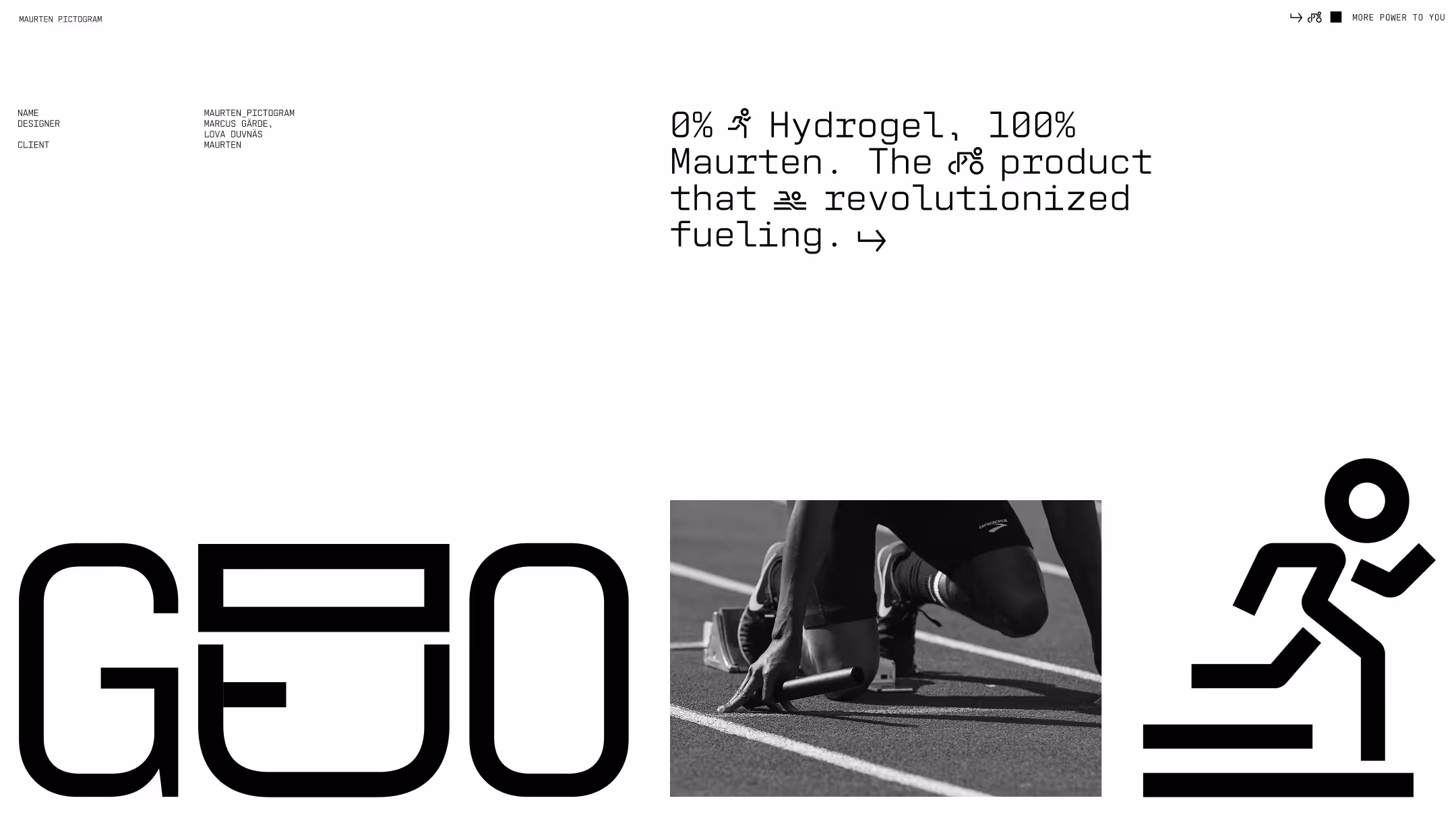
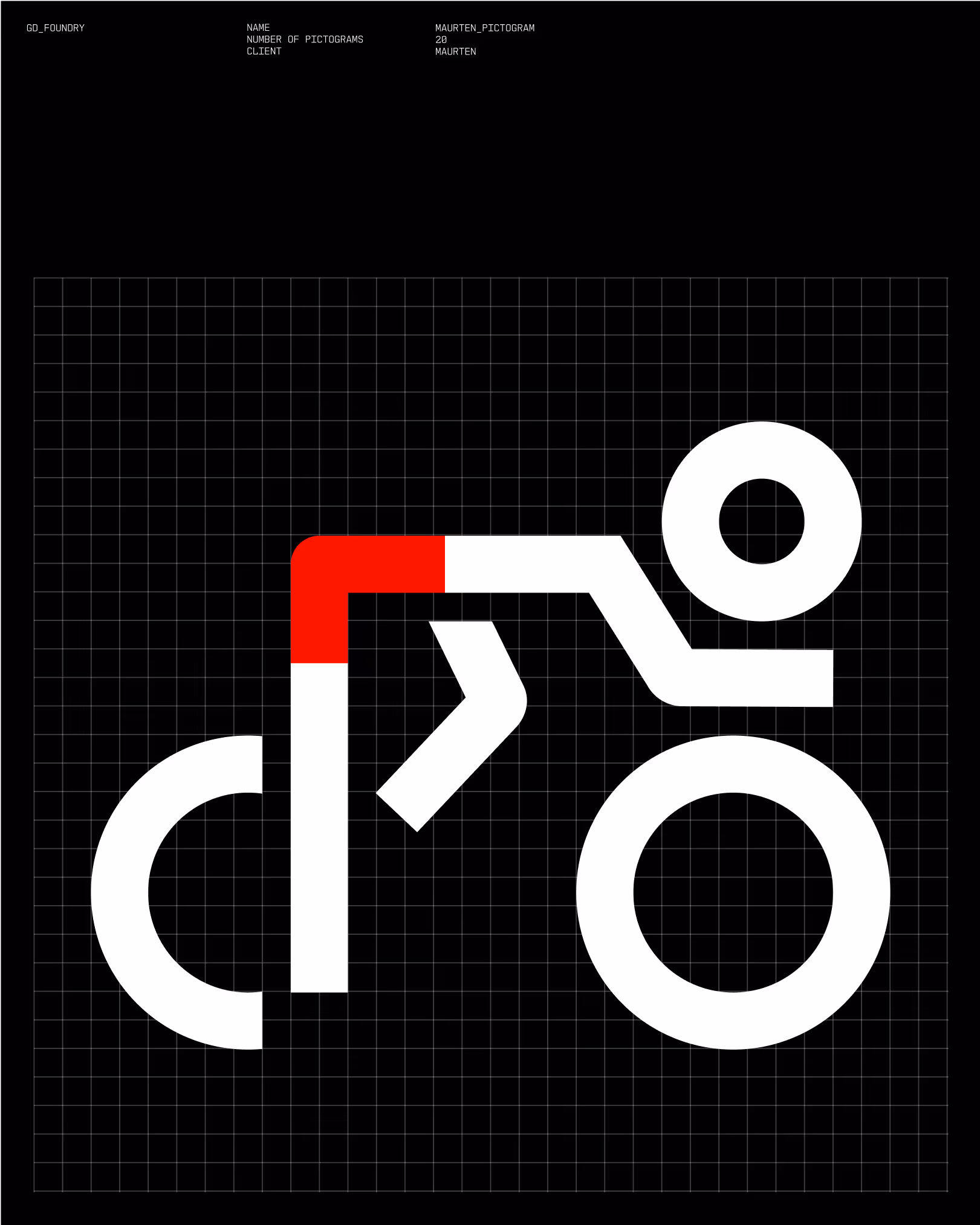
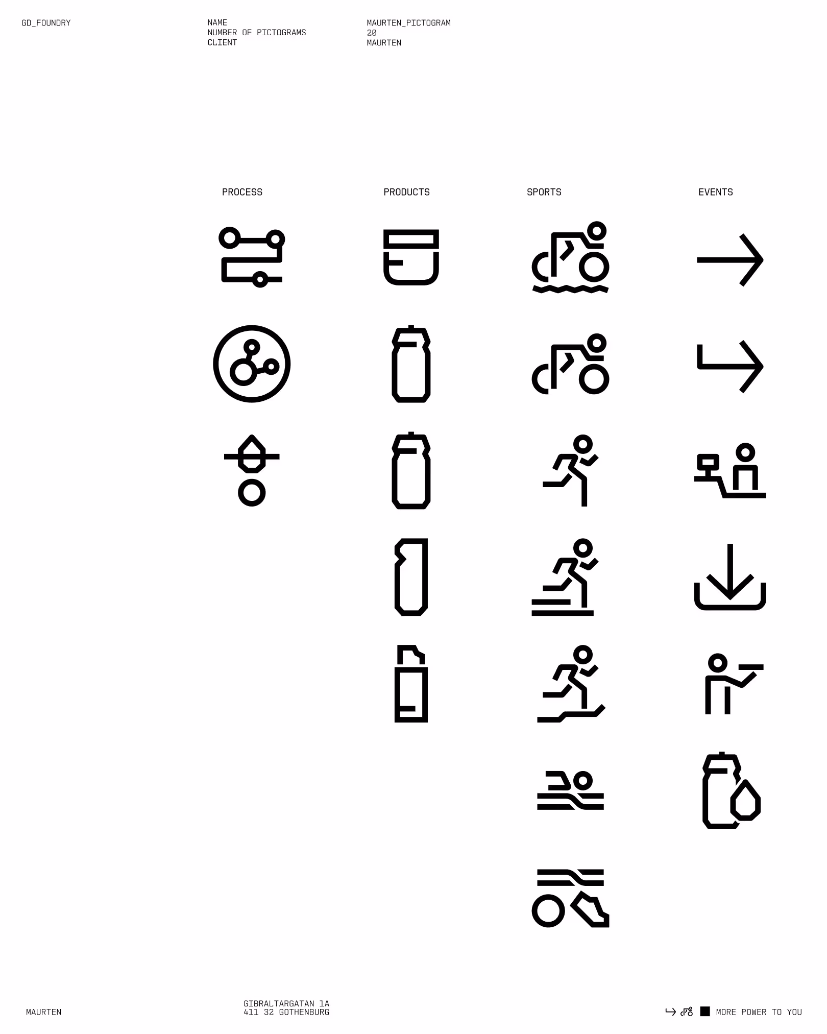
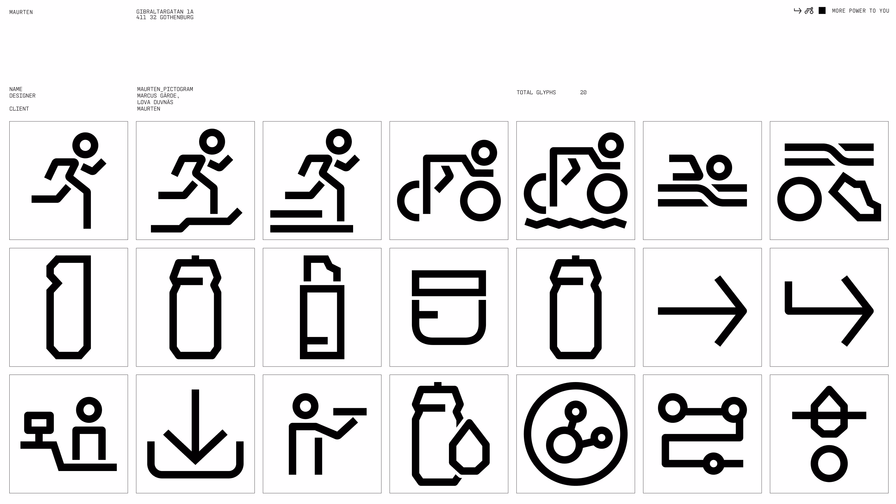
The system is further extended through a tailored set of pictograms, built on the same design logic. Constructed using the geometry and angles of Maurten Mono, the icons integrate seamlessly with the type system and support clear, consistent communication across contexts.
Typefaces