





Rethinking corporate learning. Uniplay transforms training from a static system into an interactive, engaging and rewarding experience.
Year
2025
Scope
Strategy
Visual Identity
Web Design & Development
Motion
Features



Info
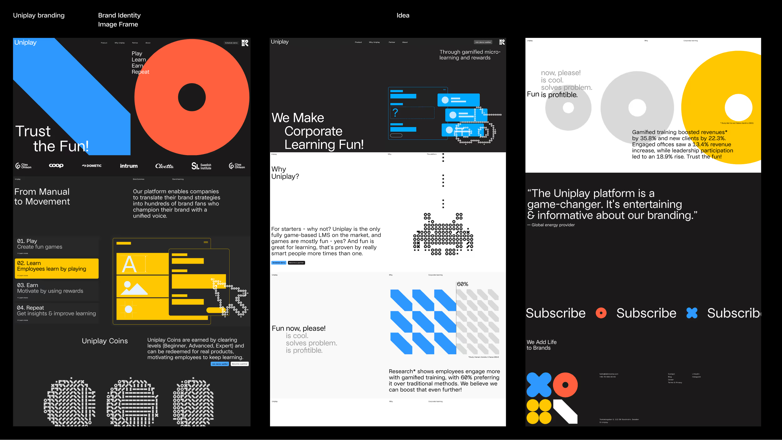
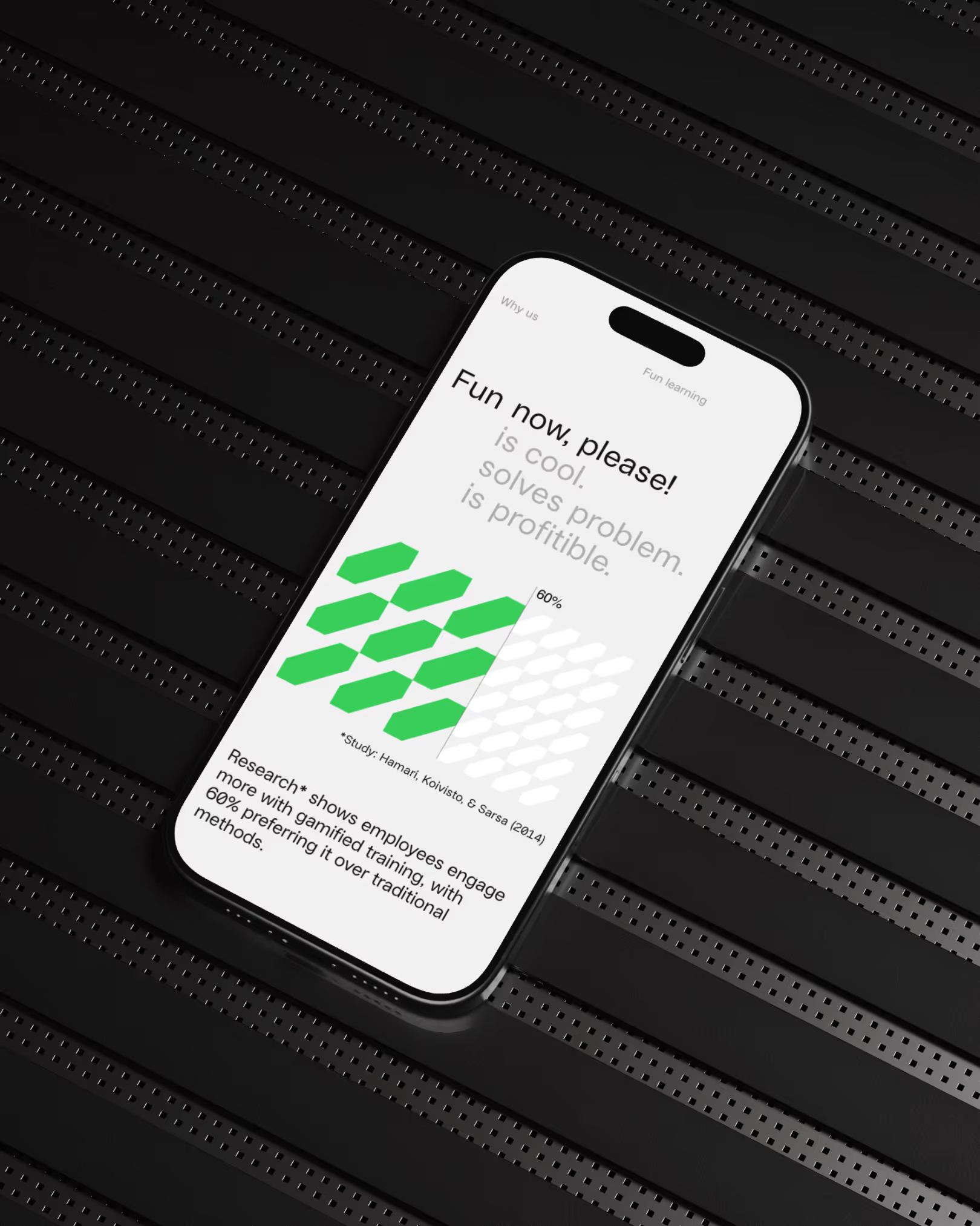
Uniplay was created to rethink what a learning platform can be. Instead of a static archive for downloading brand assets, it puts engagement and interaction at the core. Built on the belief that it’s time to unlearn corporate learning, Uniplay transforms training from a checklist into something interactive, rewarding, and genuinely enjoyable — a game with real incentives that employees actually want to return to.
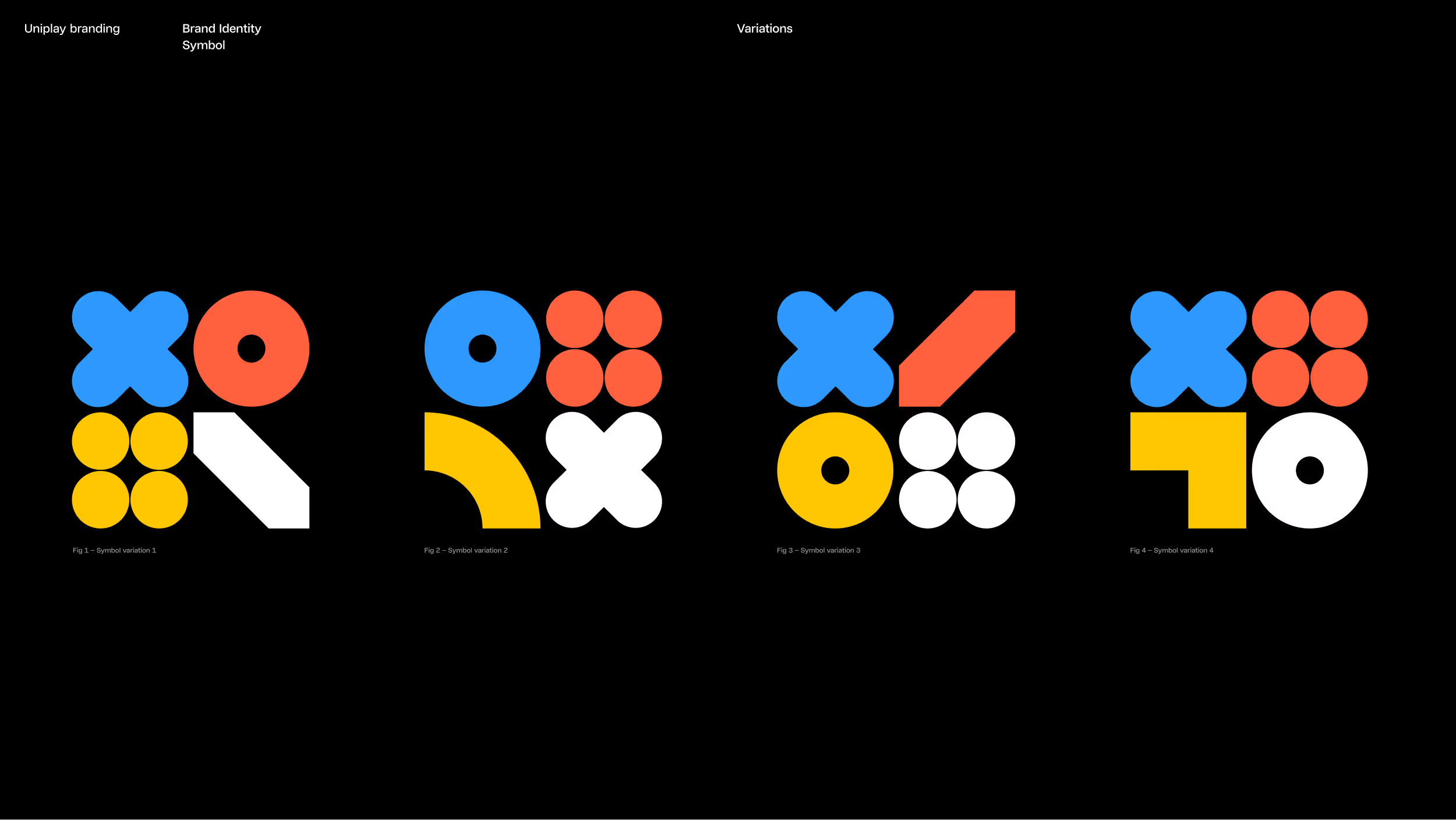
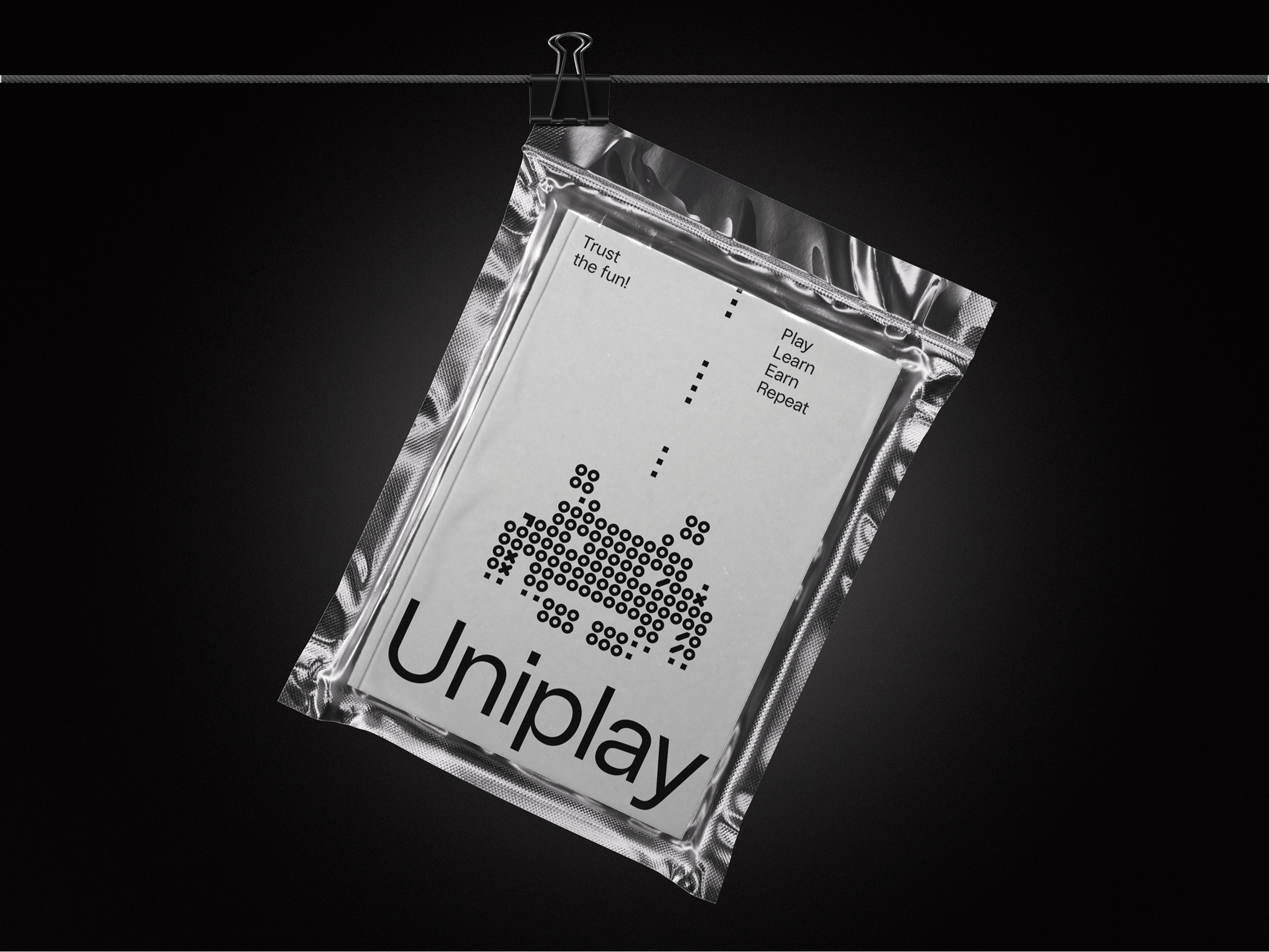
Our creative brief carried the same spirit of playfulness. The identity and website were designed around the idea “Trust the Fun!”, with four game-inspired shapes that expand into illustrations, infographics, and dynamic brand expressions. To ensure consistency while allowing endless variation, we developed a custom Processing tool that generates both the logotype and illustration style.
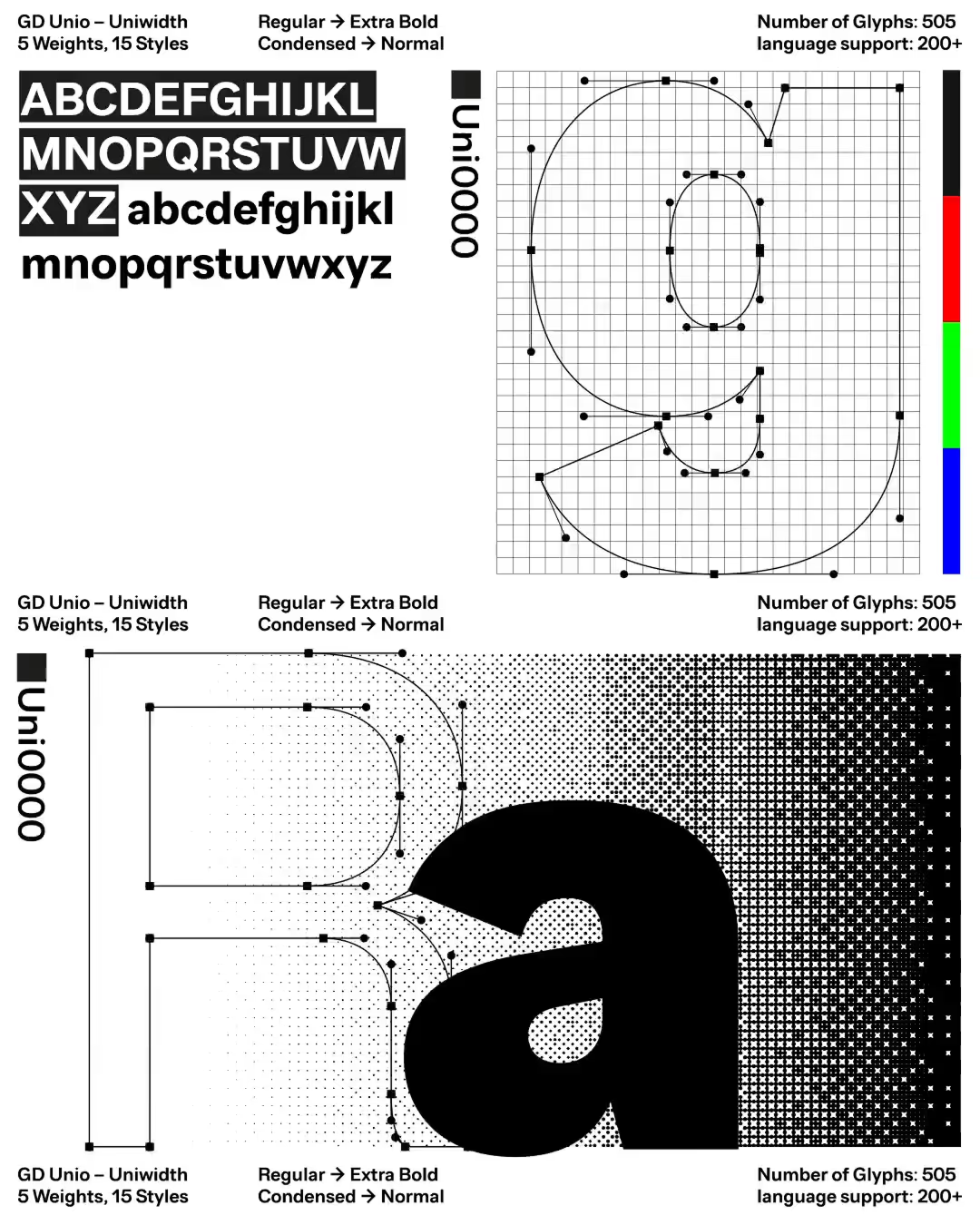
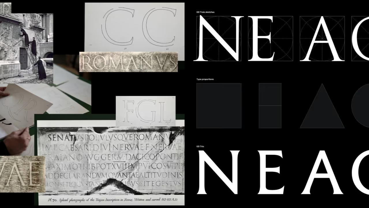
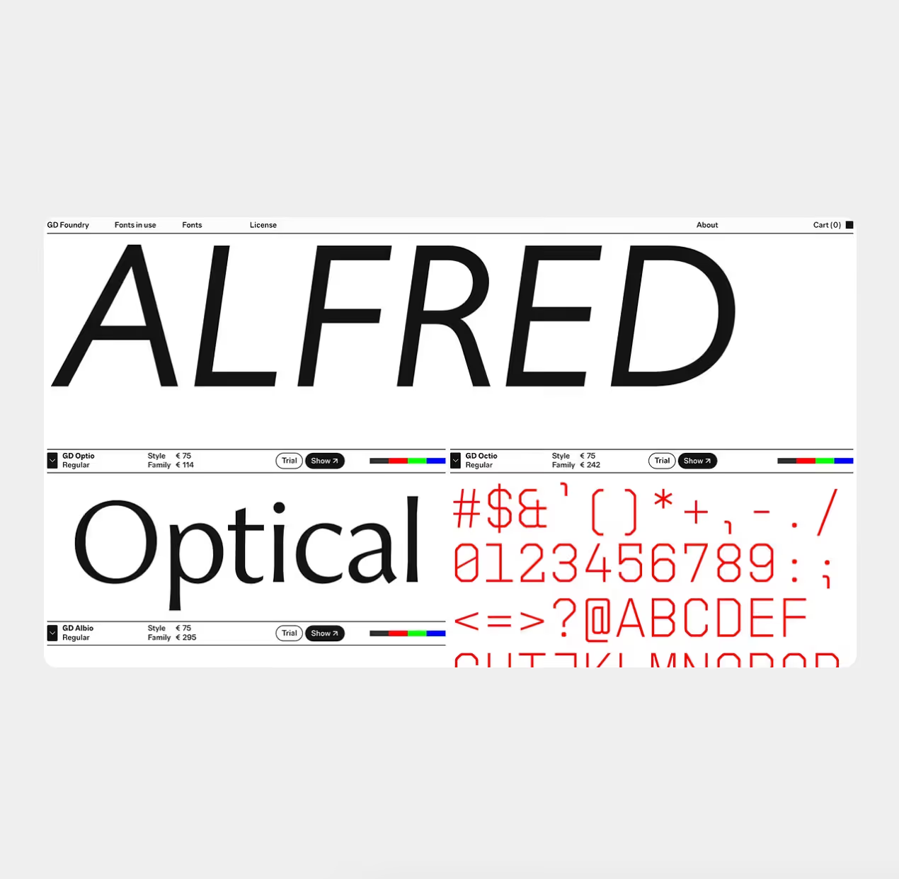
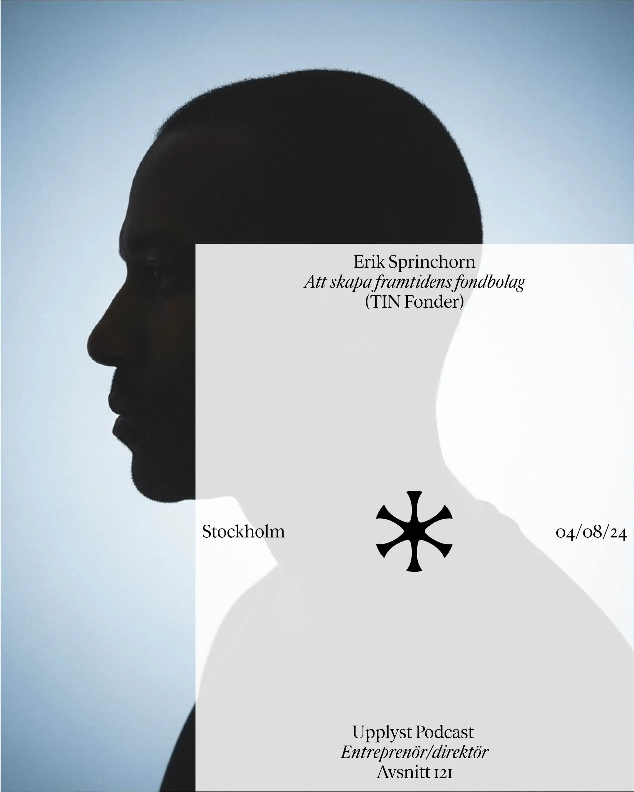
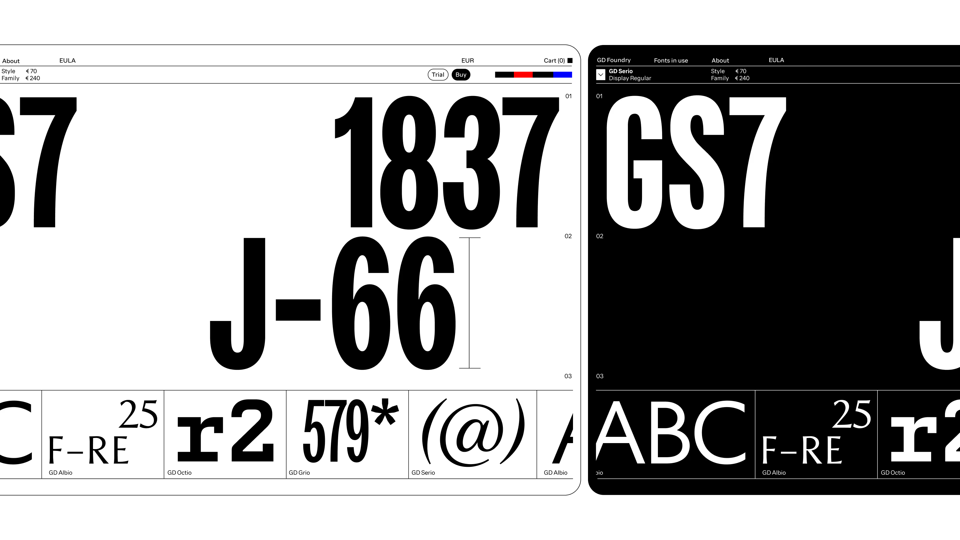
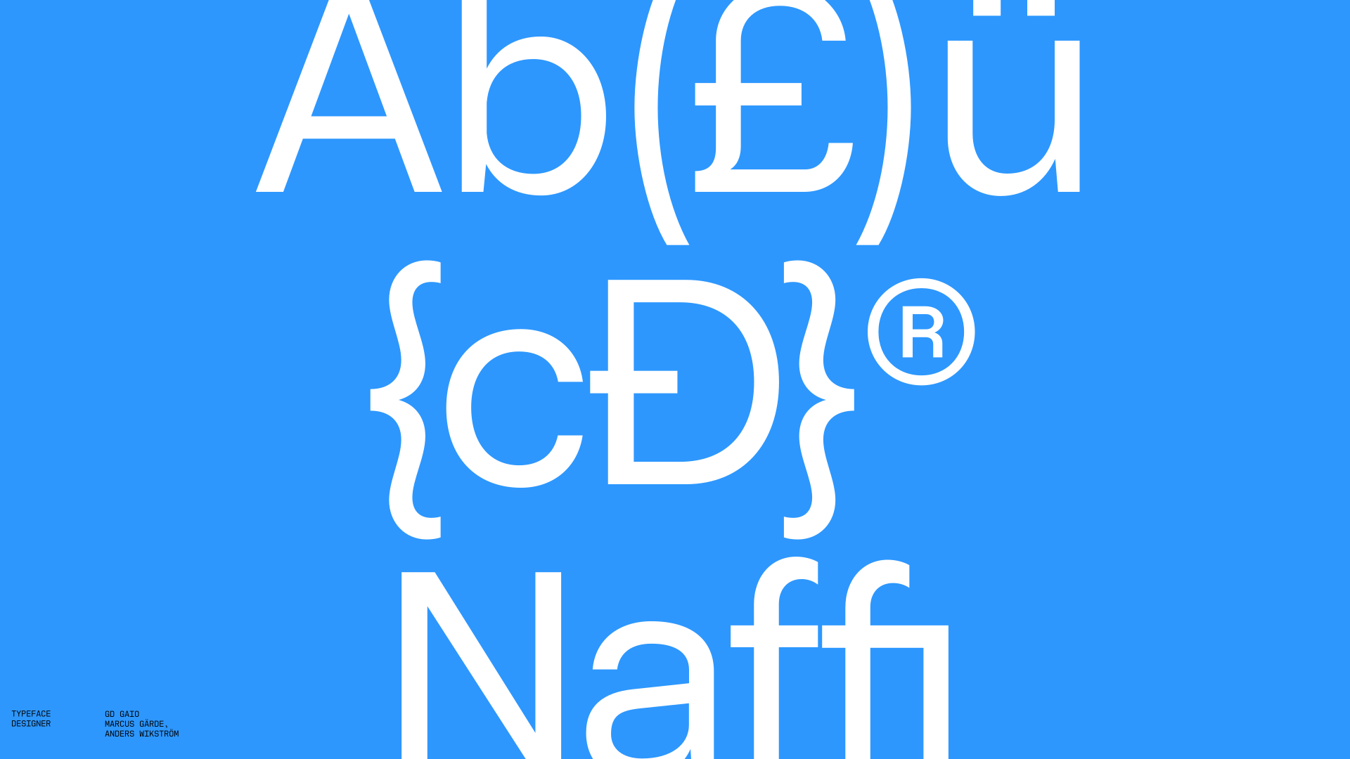
Even the language system reflects Uniplay’s unifying idea. The platform uses our house typeface GD Gaio — silent, unobtrusive, and adaptable across 300+ languages — providing an invisible framework that lets meaning speak for itself. In this way, every element of Uniplay embodies unity, clarity, and play.
Typefaces