


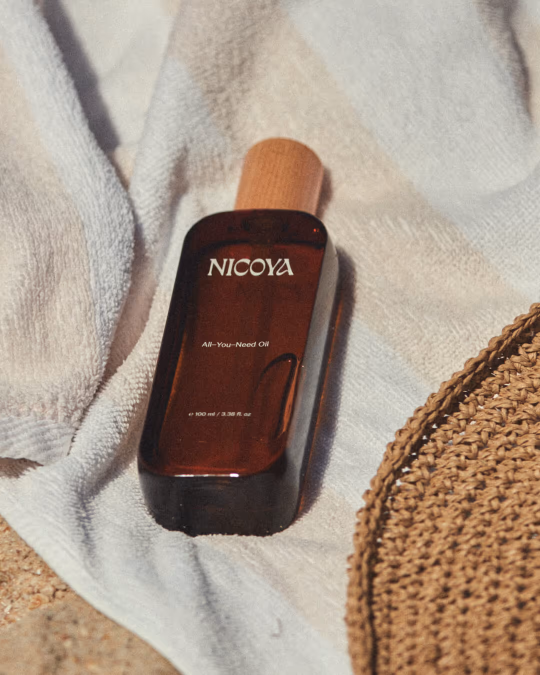
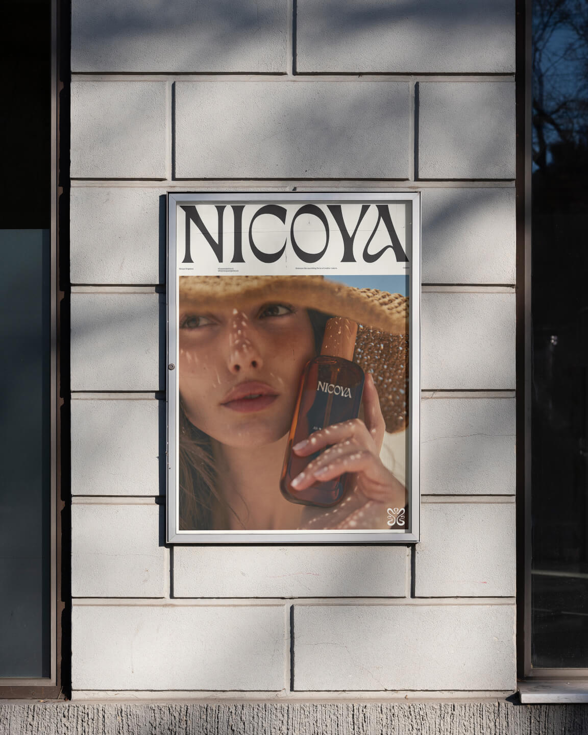
Pure and nourishing as nature itself. Nicoya creates skincare defined by balance, care and long-term vitality.
Year
2025
Program
Custom ↗Scope
Strategy
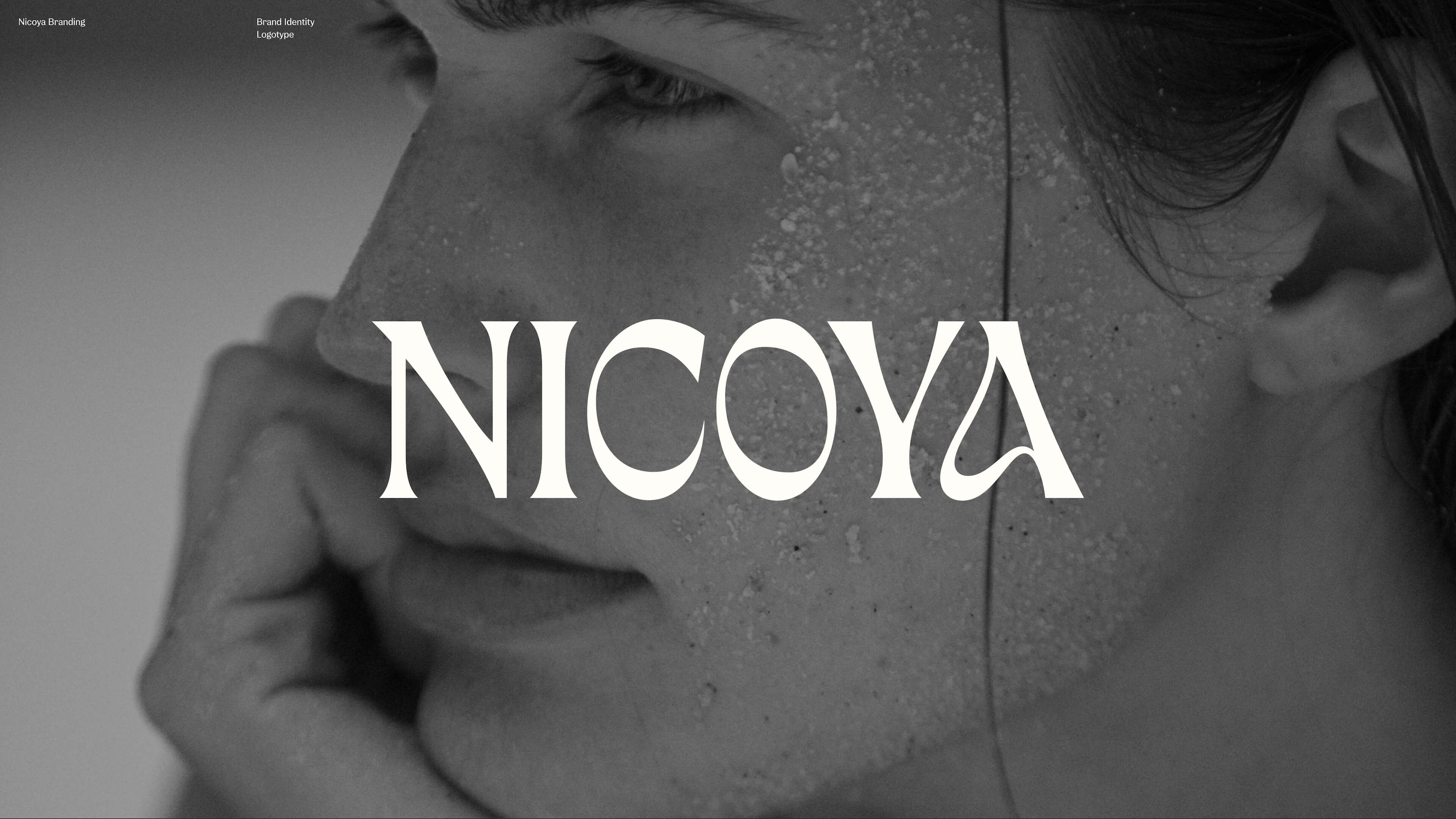
Visual Identity
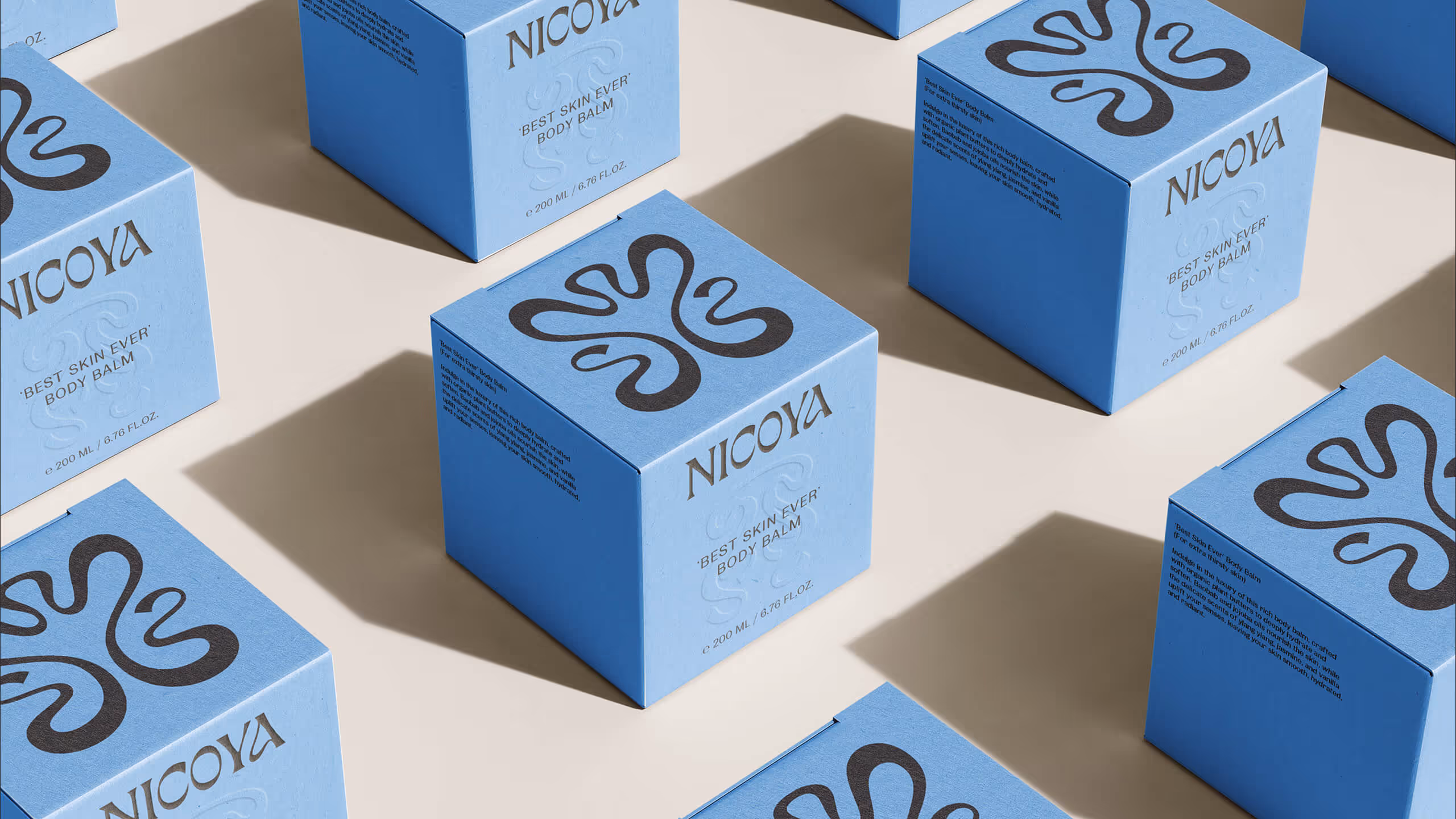
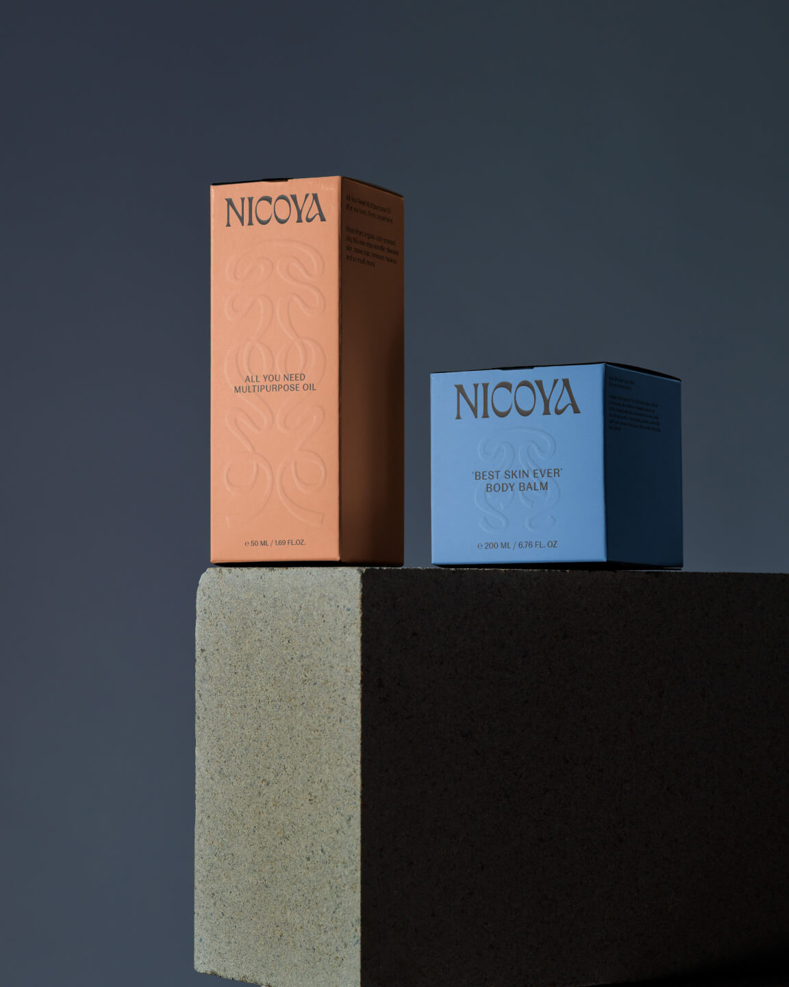
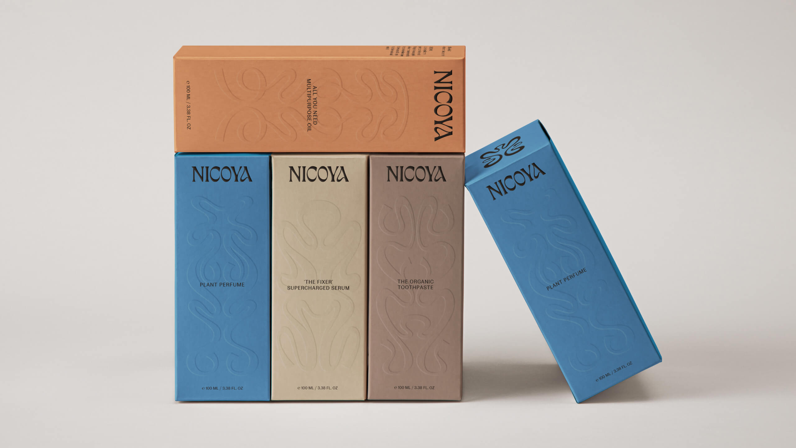
Packaging
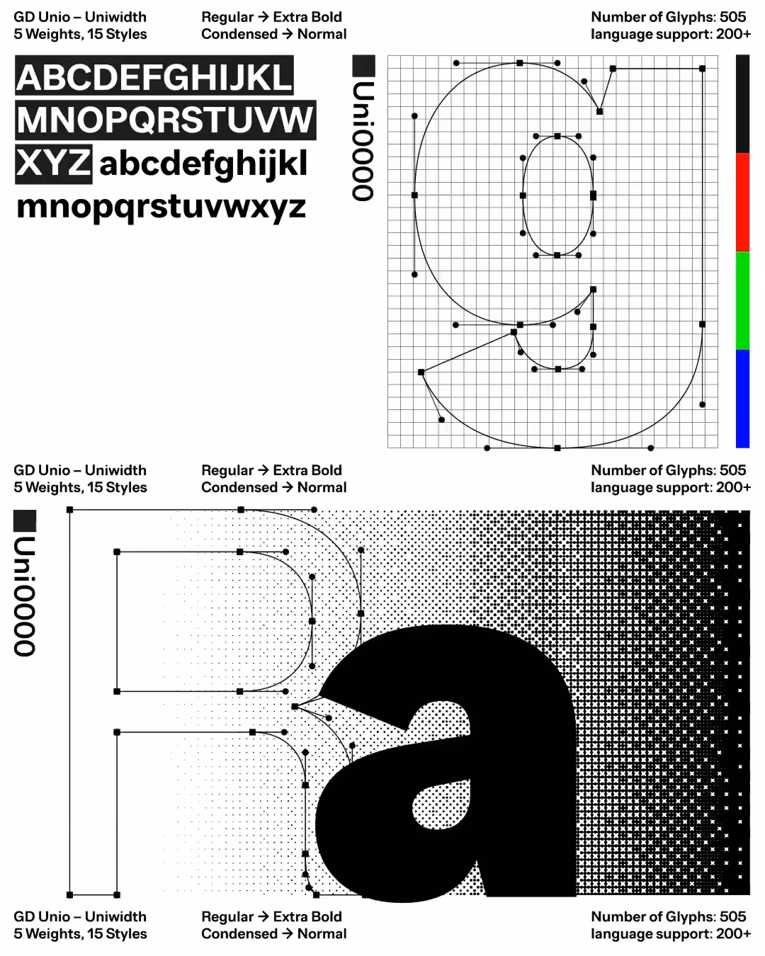
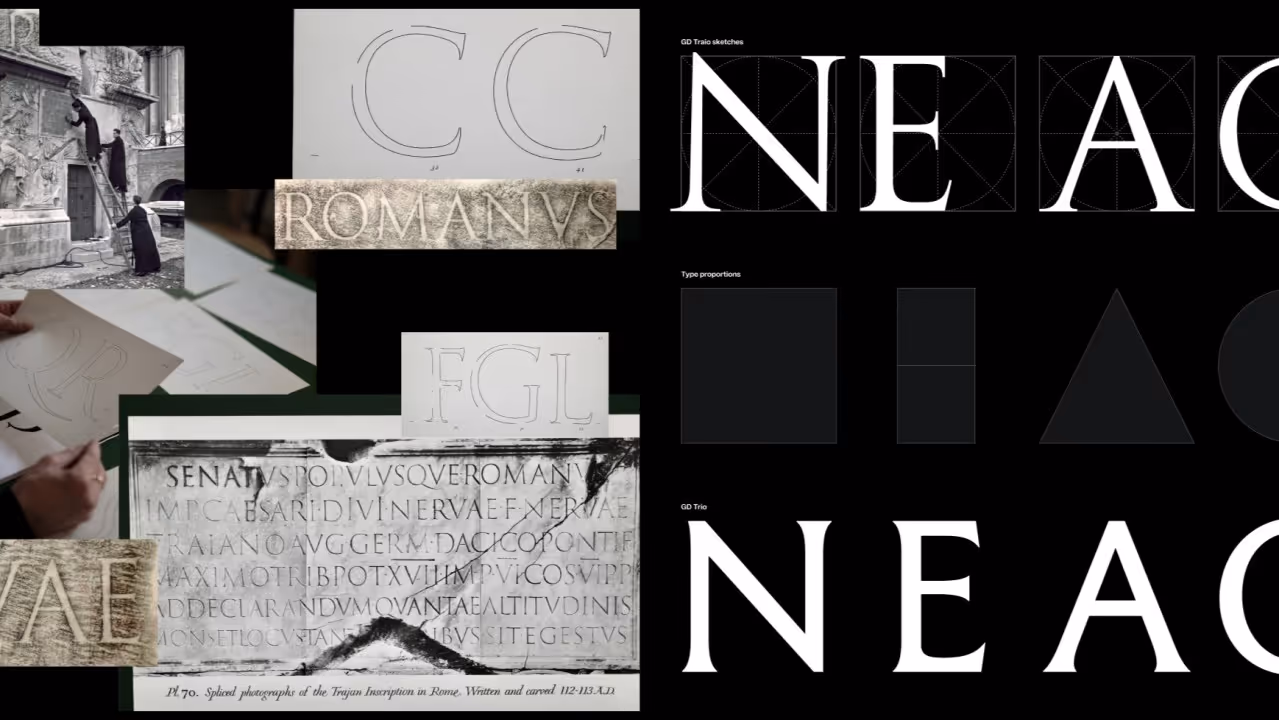
Type Design
Features
Visuelle
Full feature ↗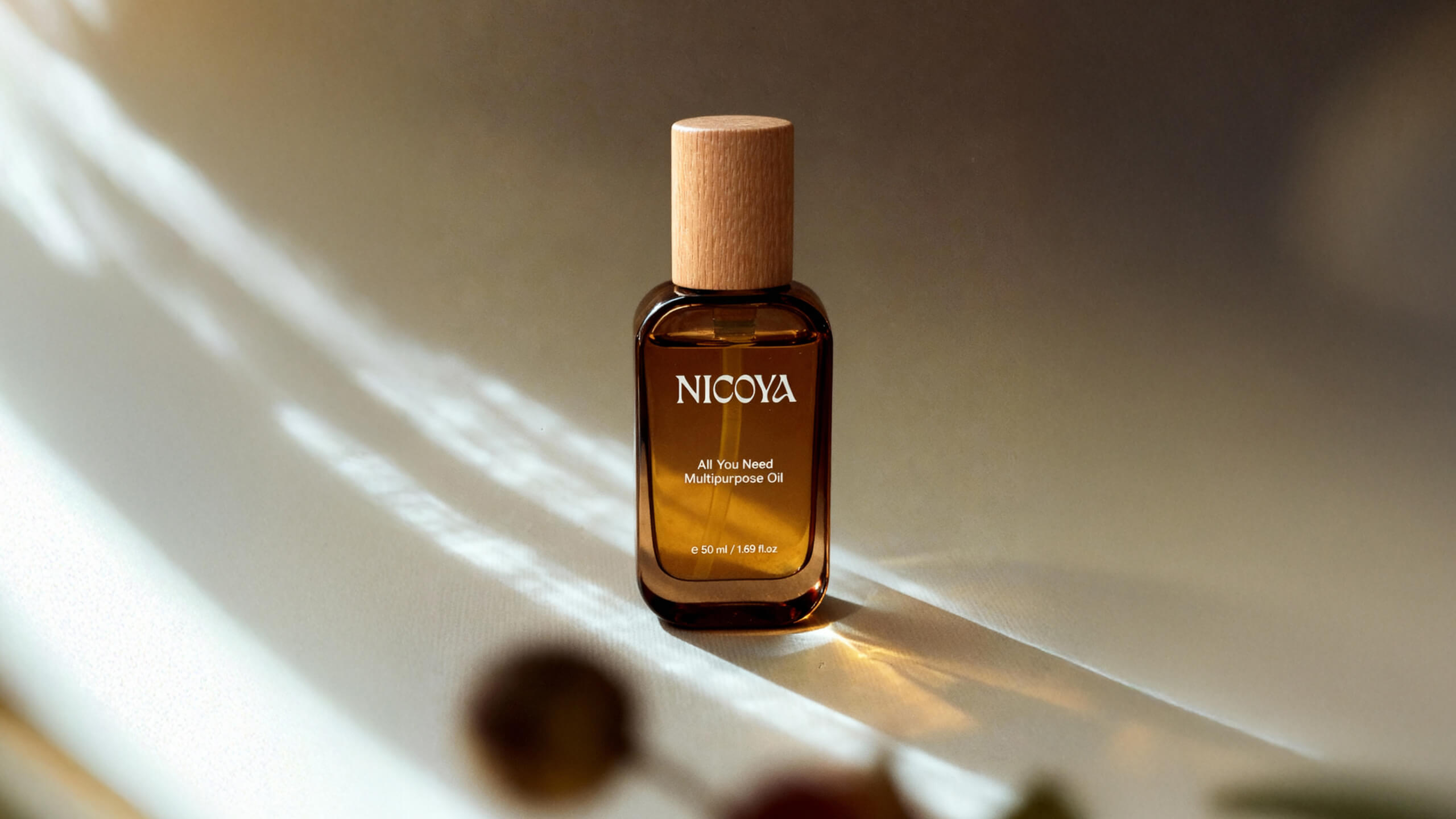


Info
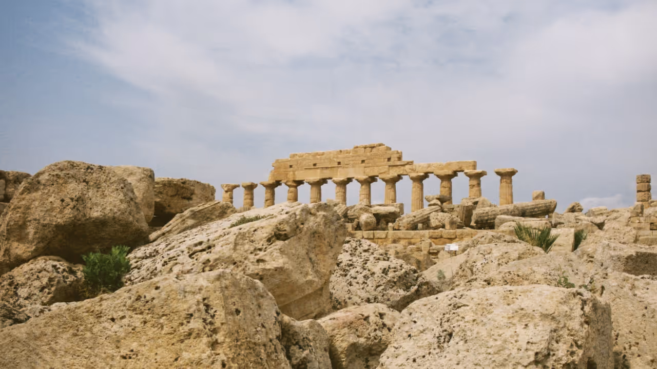
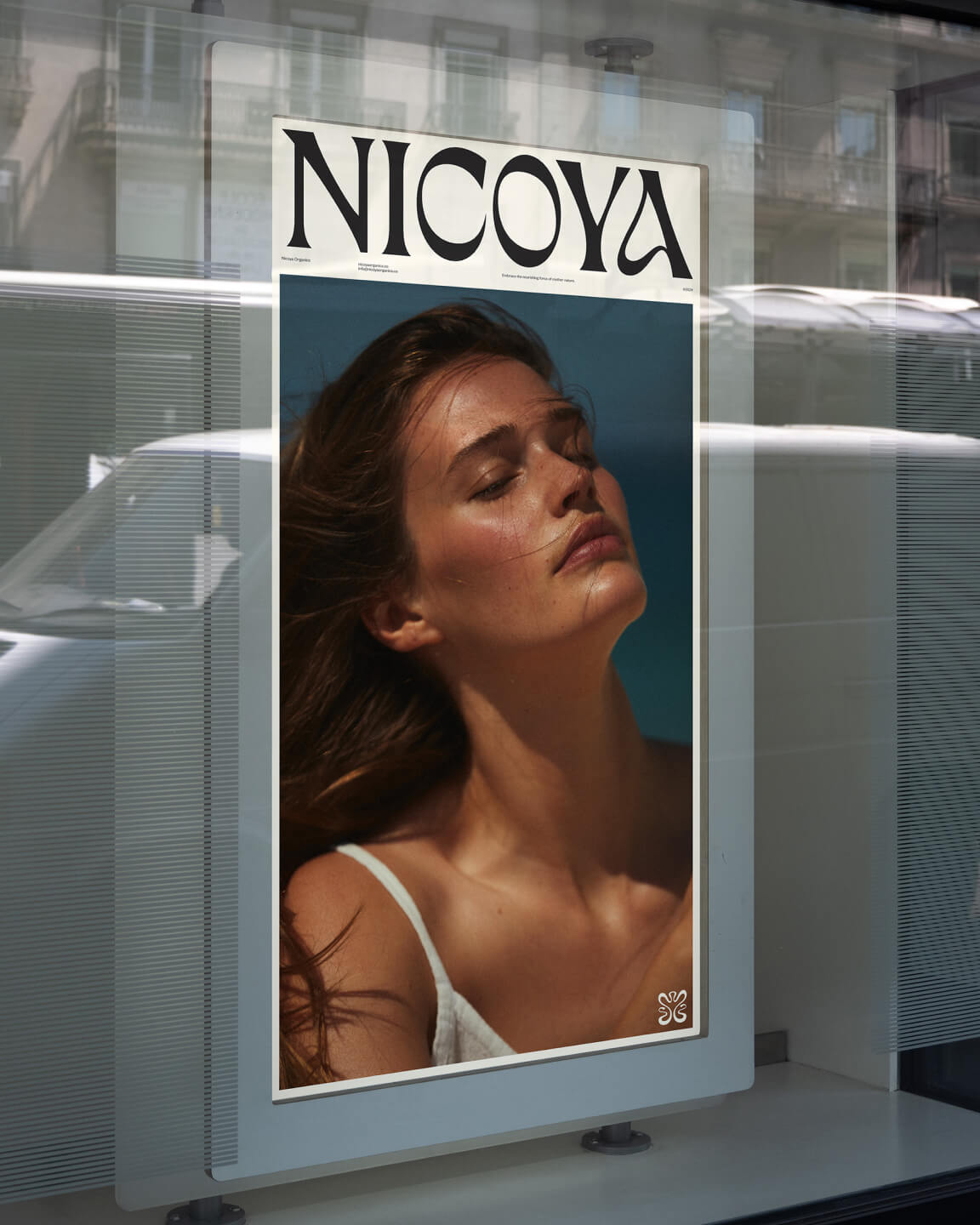
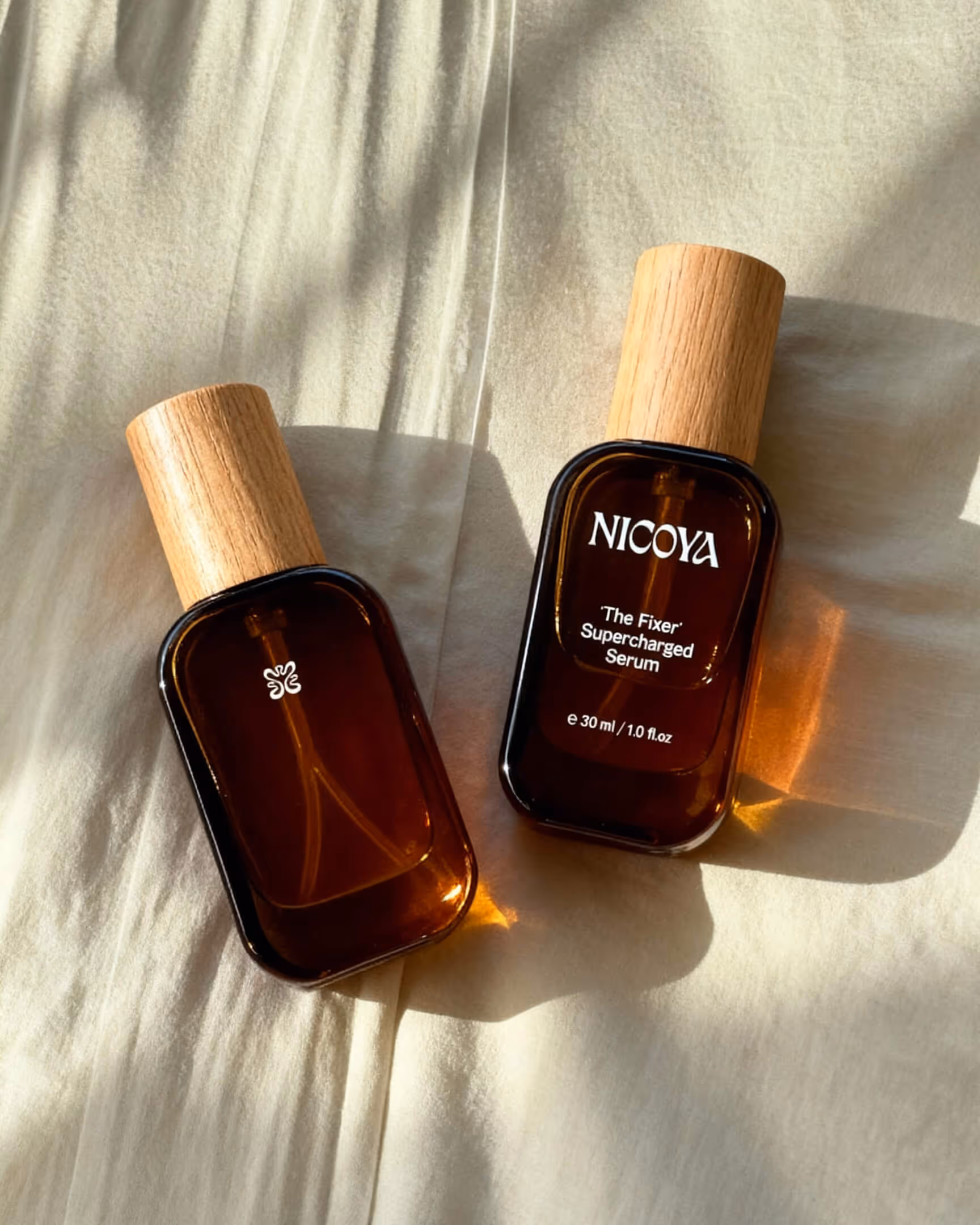
Founded by model Noel Capri Berry, Nicoya was born from a desire to create skincare that’s as pure and nourishing as nature itself. Inspired by Costa Rica’s Nicoya Peninsula — one of the world’s Blue Zones — the brand celebrates vitality, longevity, and balance.
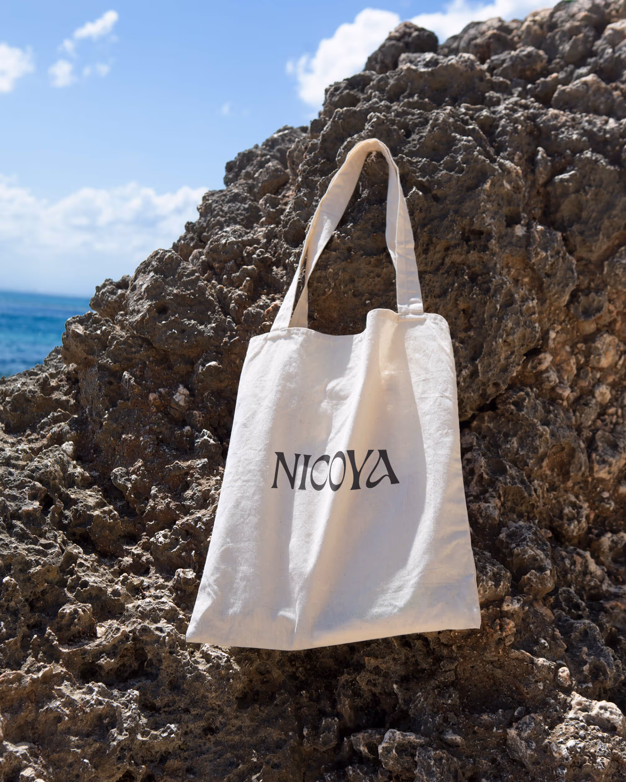
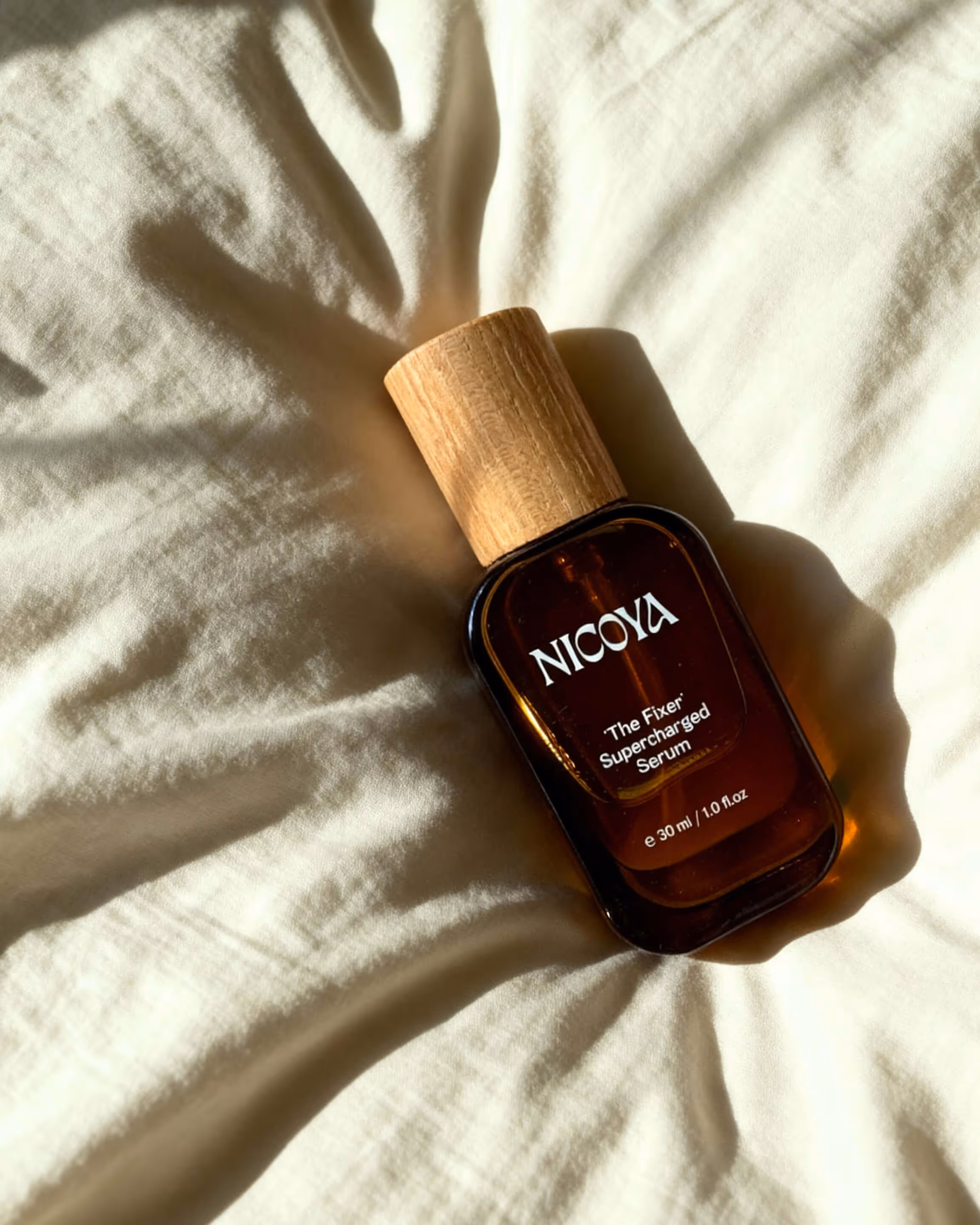
Our assignment included Visual Identity, Graphic Pattern, Bespoke Font, Packaging, Website, and Social Media Templates.
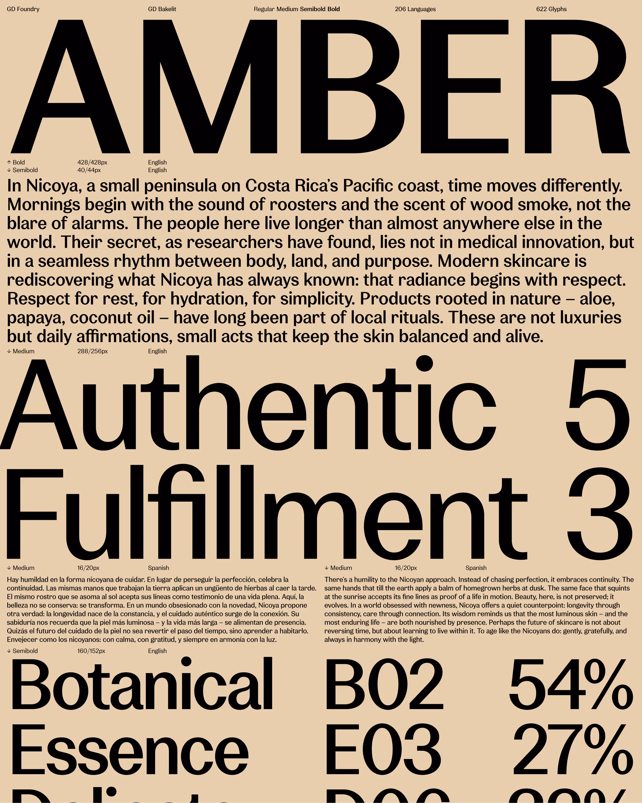
Drawing inspiration from Art Nouveau, we created a calm and organic expression shaped by soft tones, tactile materials, and flowing forms. At its heart are three custom elements, a distinctive wordmark, a gentle typeface, and a symbol that grows, forming a living system that reflects Nicoya’s philosophy: pure, vital, and alive.
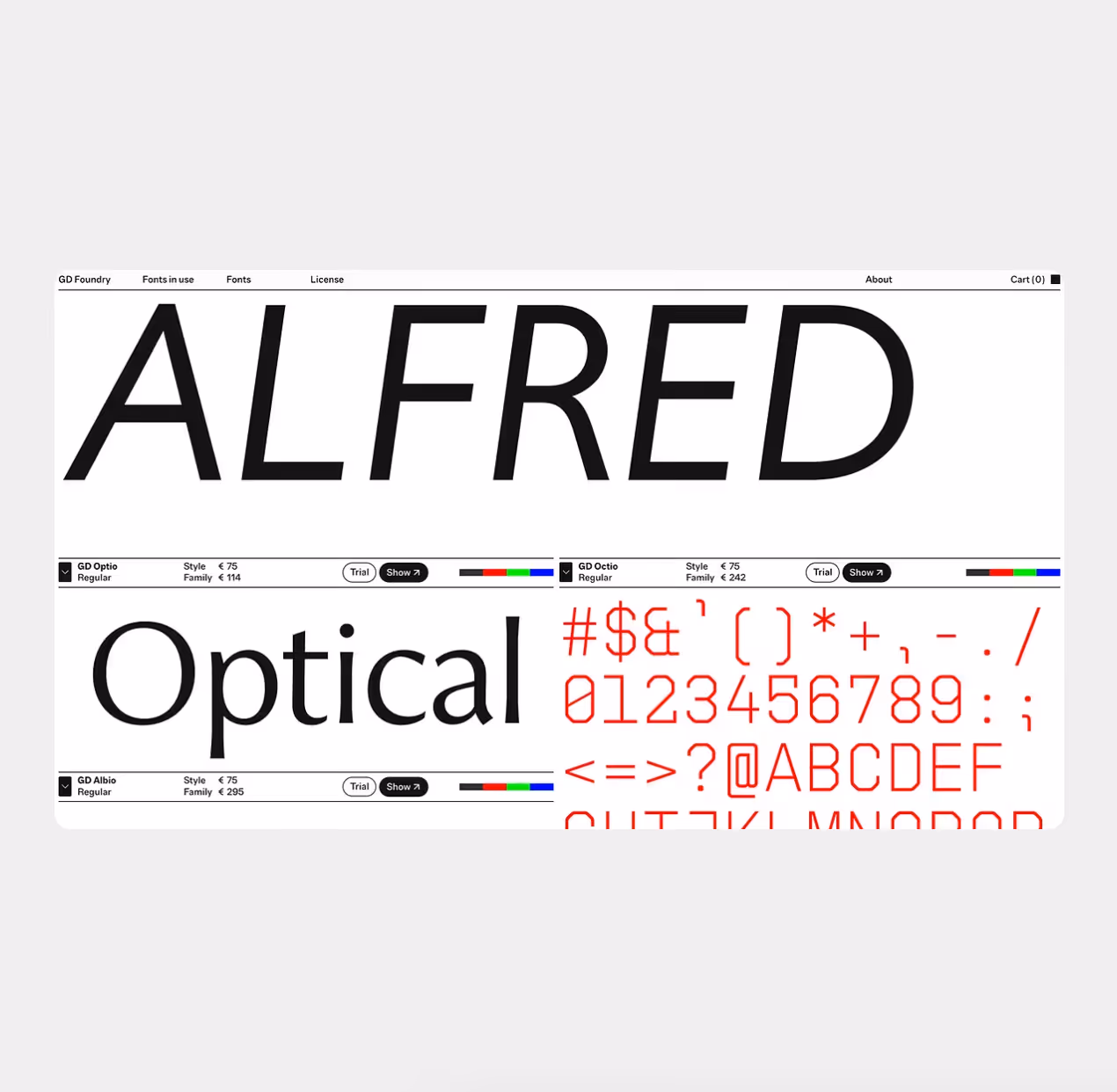
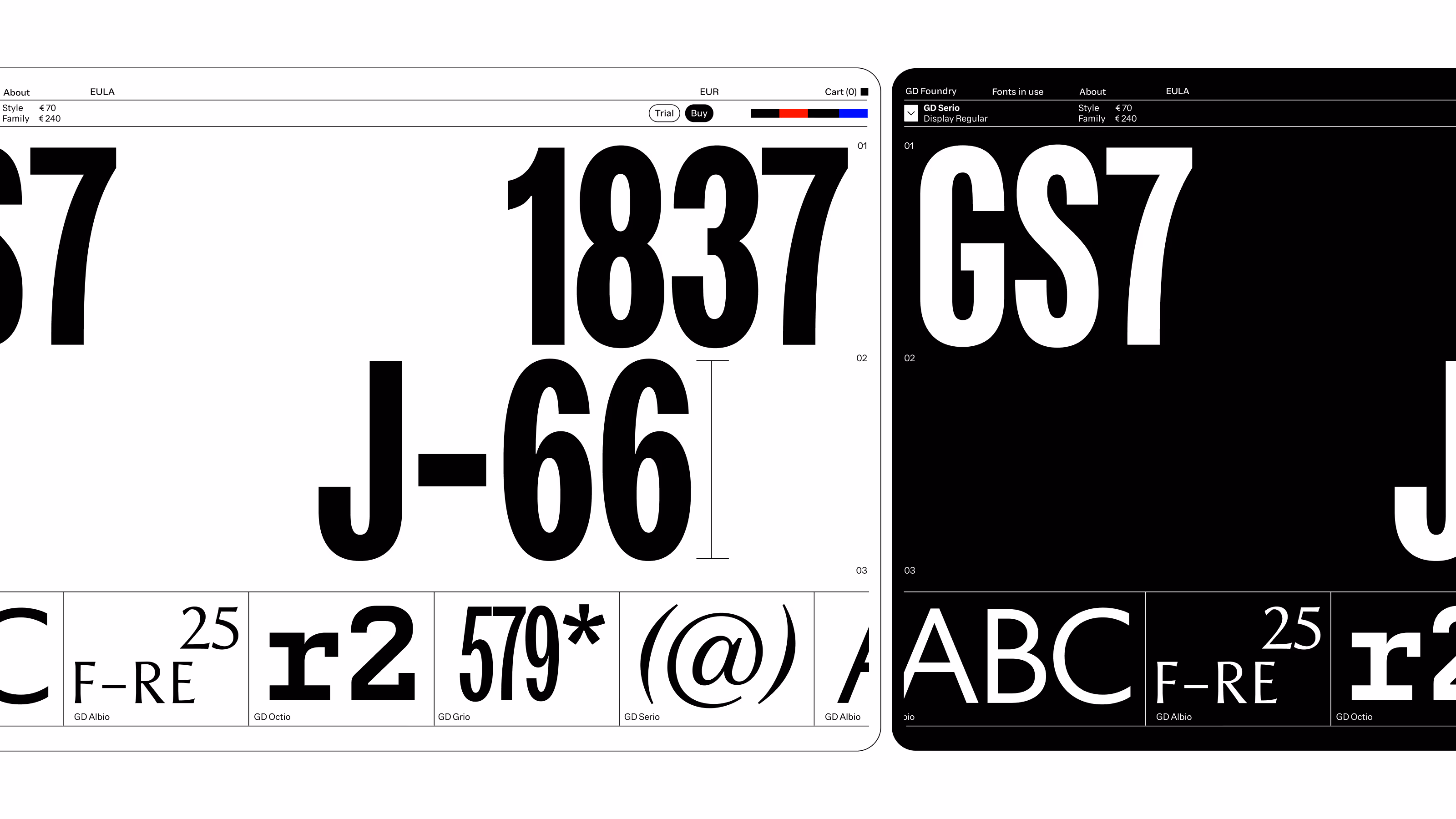
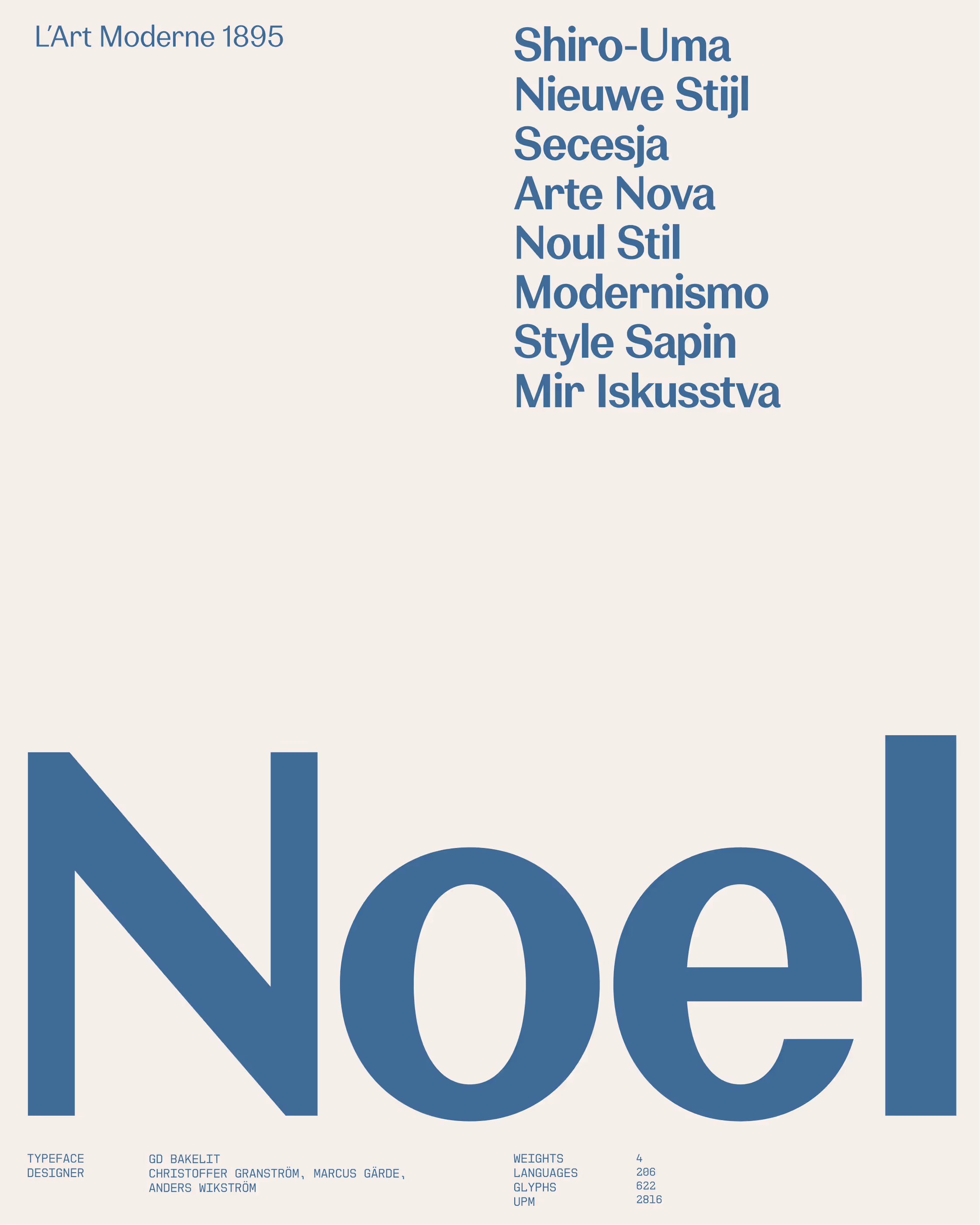
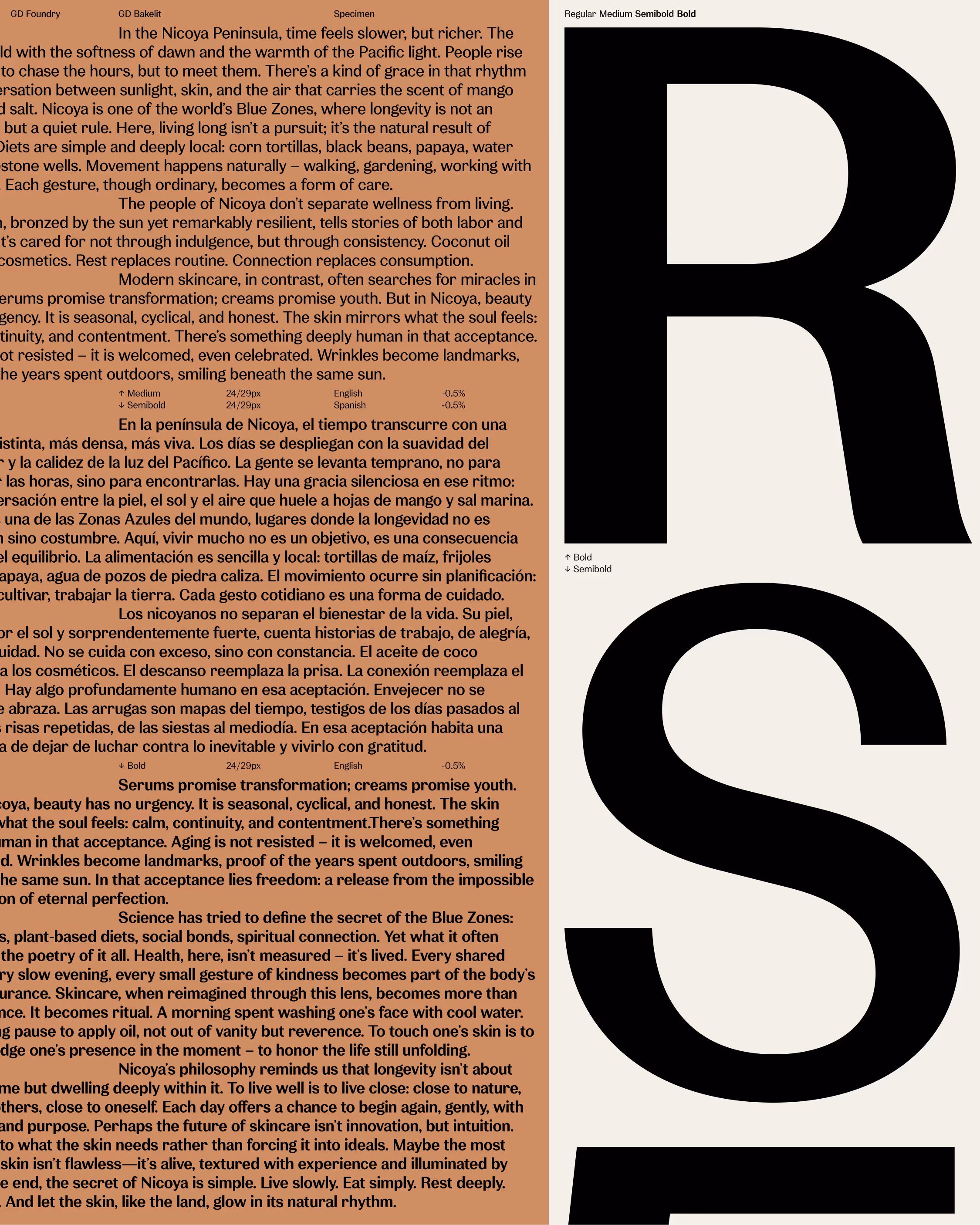
Typefaces
GD Bakelit