0TO9
Branding
Sweden
2025
Visual Identity
Website
Motion
Creative Direction
Communication
Pitch deck
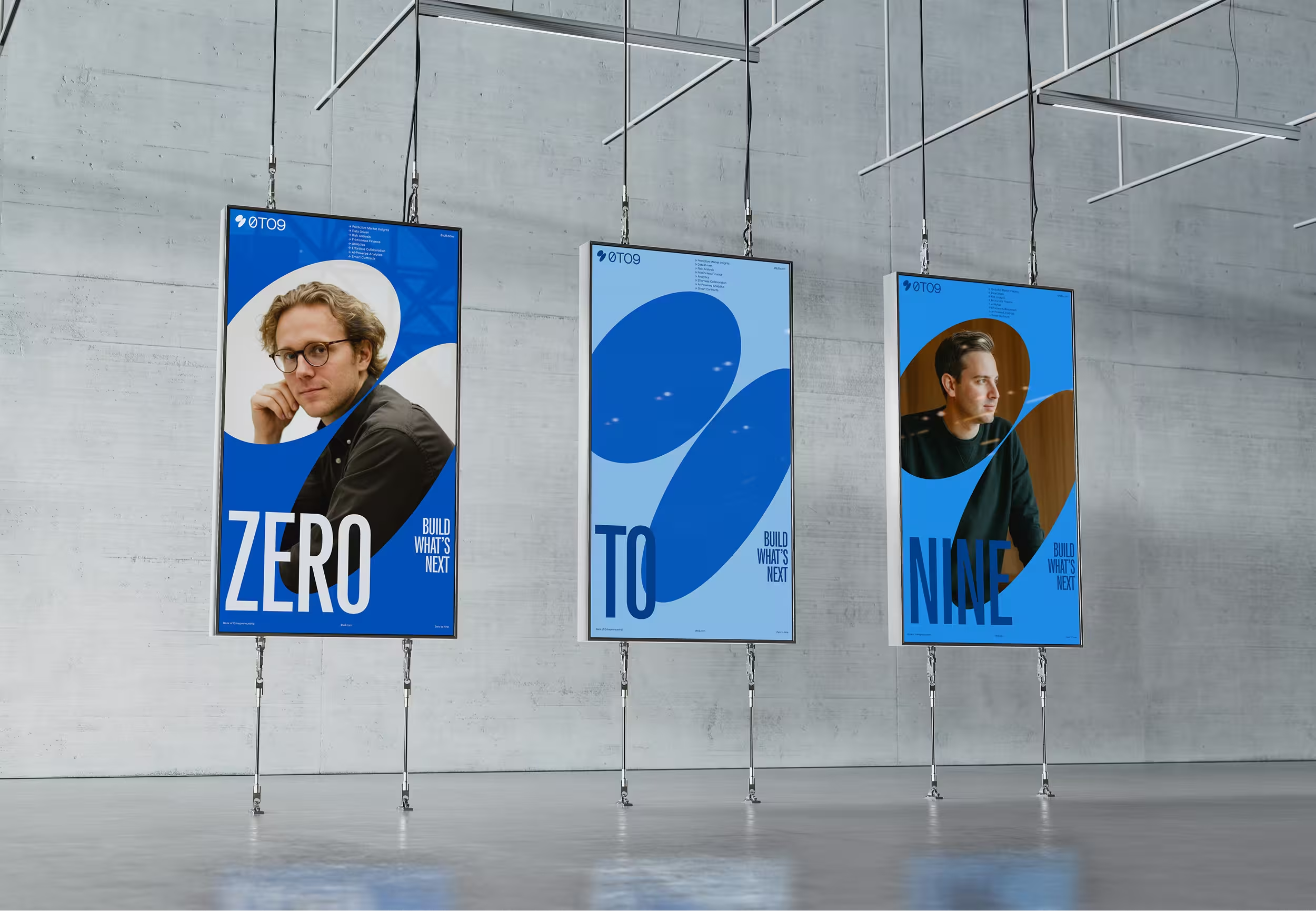
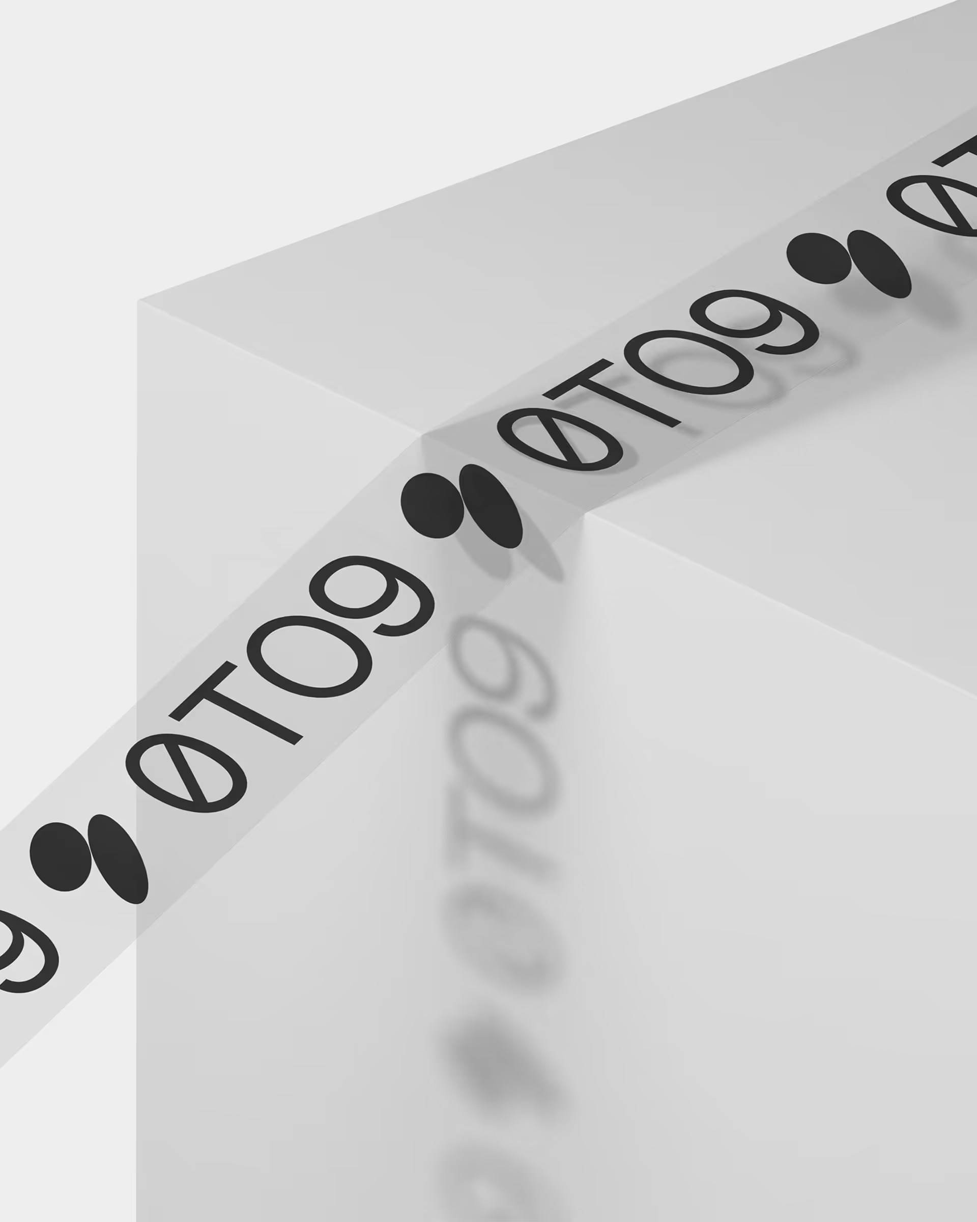
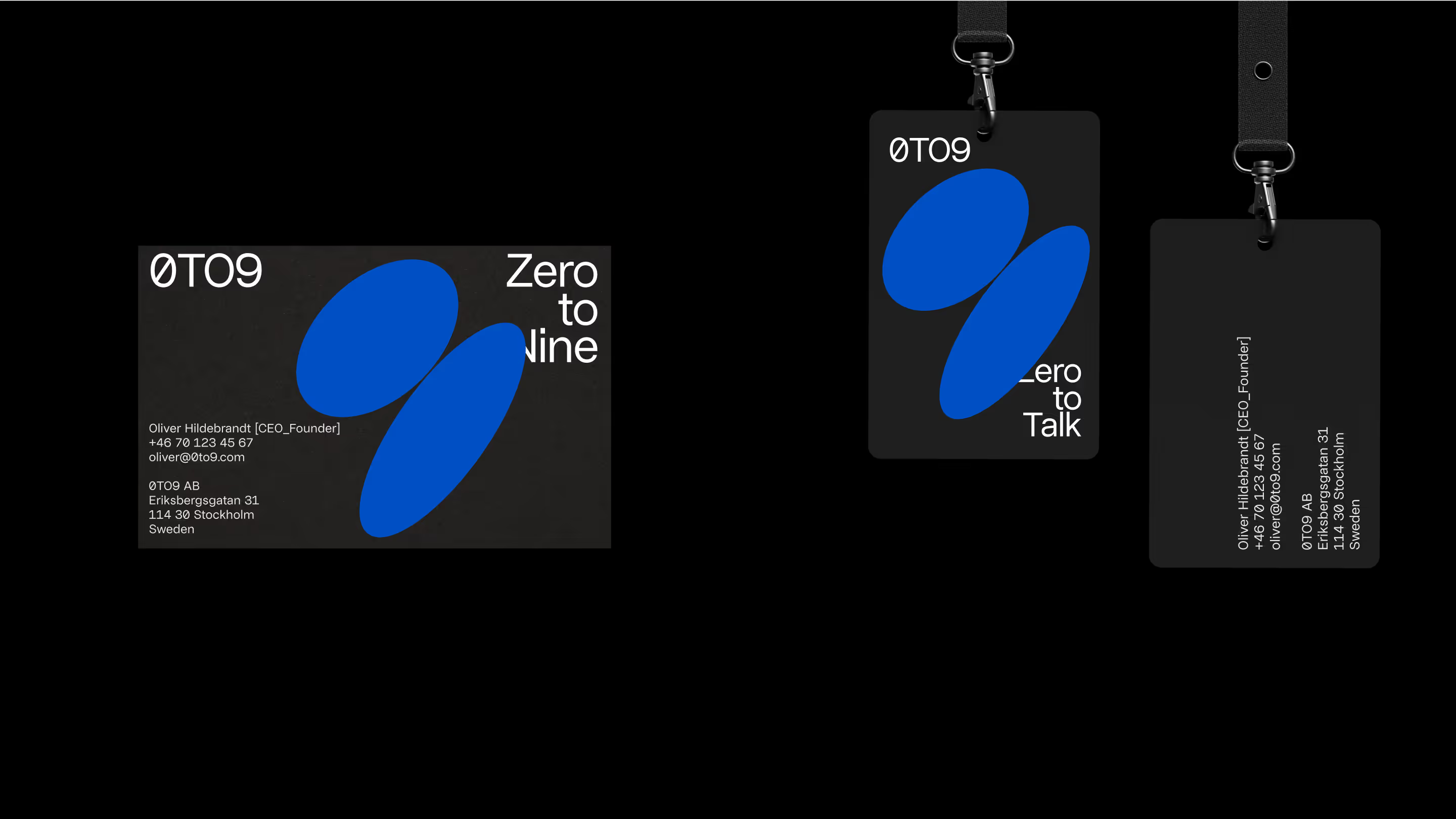
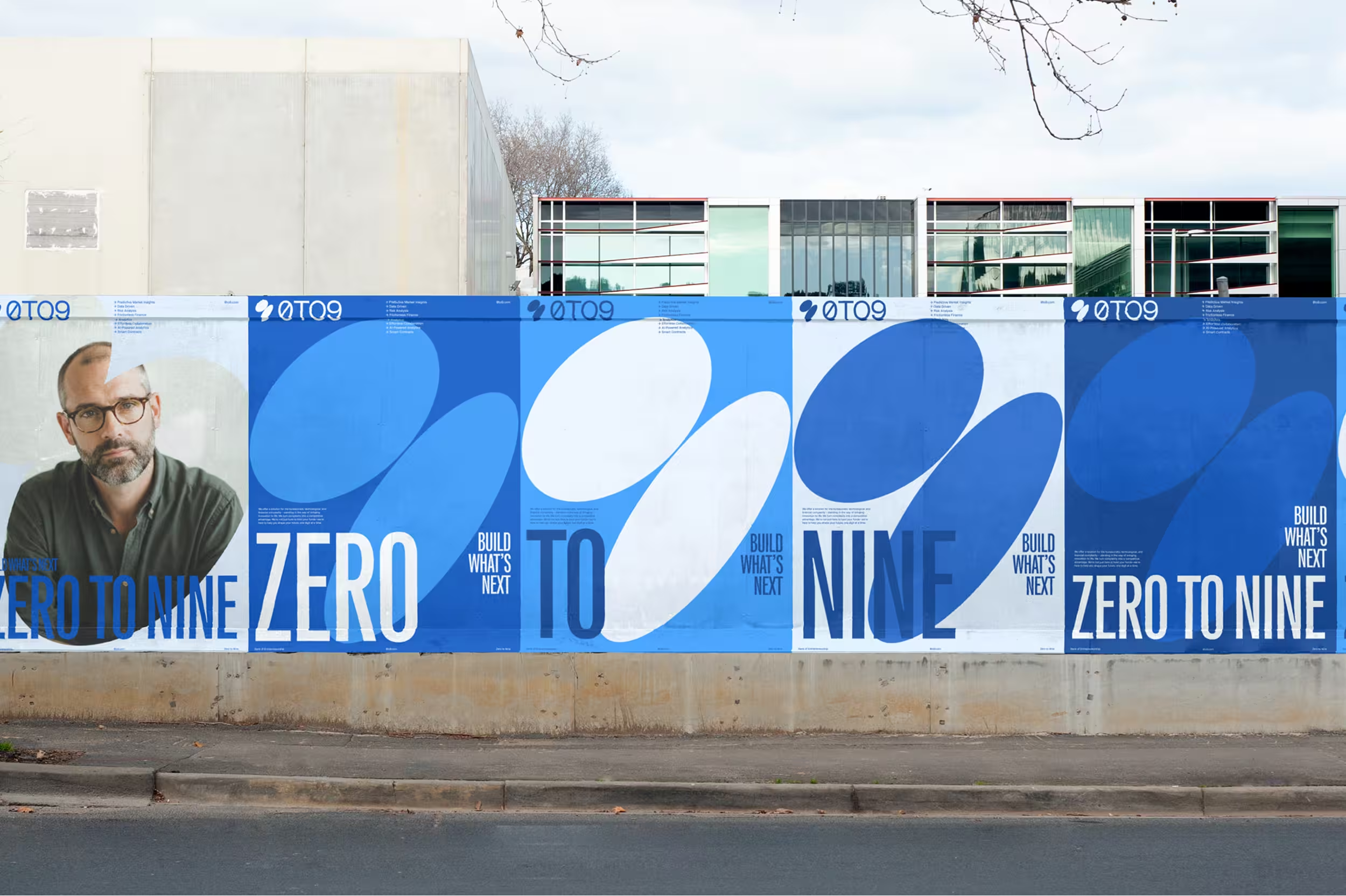
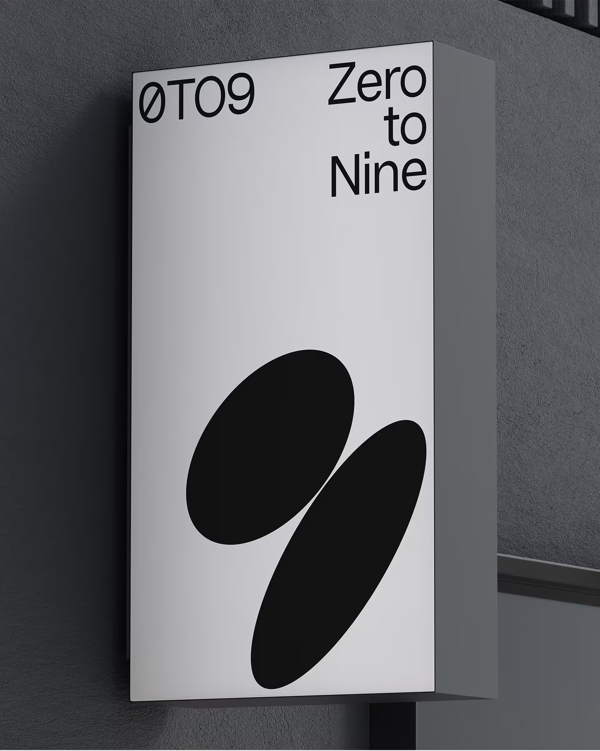
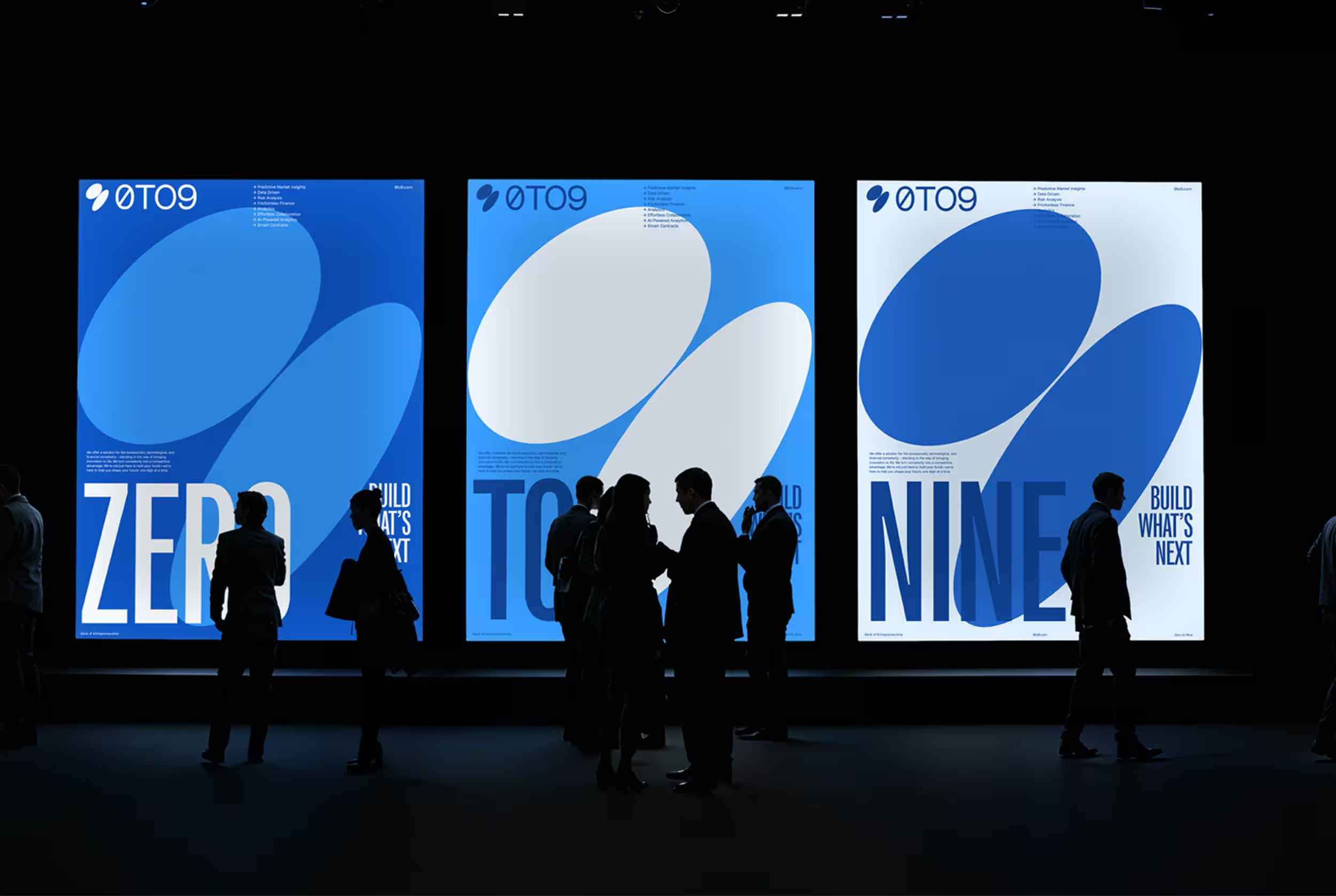
0TO9 supports entrepreneurs on their journey from idea to growth — from 0 to 9. Our task was to bring this mission to life through a full rebrand, website, and communication system. At the center of the identity is the 0TO9 symbol — two zeros forming a nine, representing the path from start to success. The rounded shapes suggest spotlights, used throughout the visual system to highlight people, ideas, and progress. The form also evokes movement and warmth, aligning with the brand’s human focus.
The blue color palette reflects the spirit of possibility — a nod to 0TO9’s belief that the sky is the limit. It brings both calm clarity and ambition to the identity. The website was designed to be clean, structured, and flexible — giving space to showcase stories, while remaining sharp and scalable.
Through design, we’ve helped 0TO9 express their core idea: to shine a light on entrepreneurs and support their boldest visions.
