


Aesthetic discernment, unbound by the confines of formal education, is an intrinsic facet of our being, an ancient inheritance that transcends epochs. The proportions revered as beautiful today echo the divine standards upheld by ancient civilizations like the Egyptians, affirming the timeless essence of mathematical beauty. While temporal variations may veil beauty's form, they are but fleeting manifestations of its eternal essence, a testament to its immutable presence throughout the annals of human experience.
Journal
Harmonic Proportions
Author
Marcus Gärde
Date
27.05.2023
The Timeless Beauty of the Golden Ratio.
In my quest for the eternal and enduring, I find myself immersed in the ancient mathematical proportion known as the golden ratio. Its significance and adoption within architecture are widely known, and the fascination for its beauty can be traced among masters throughout the ages, from Le Corbusier to ancient architects like Phidias, whose initials have given the golden ratio its symbol (PHI).
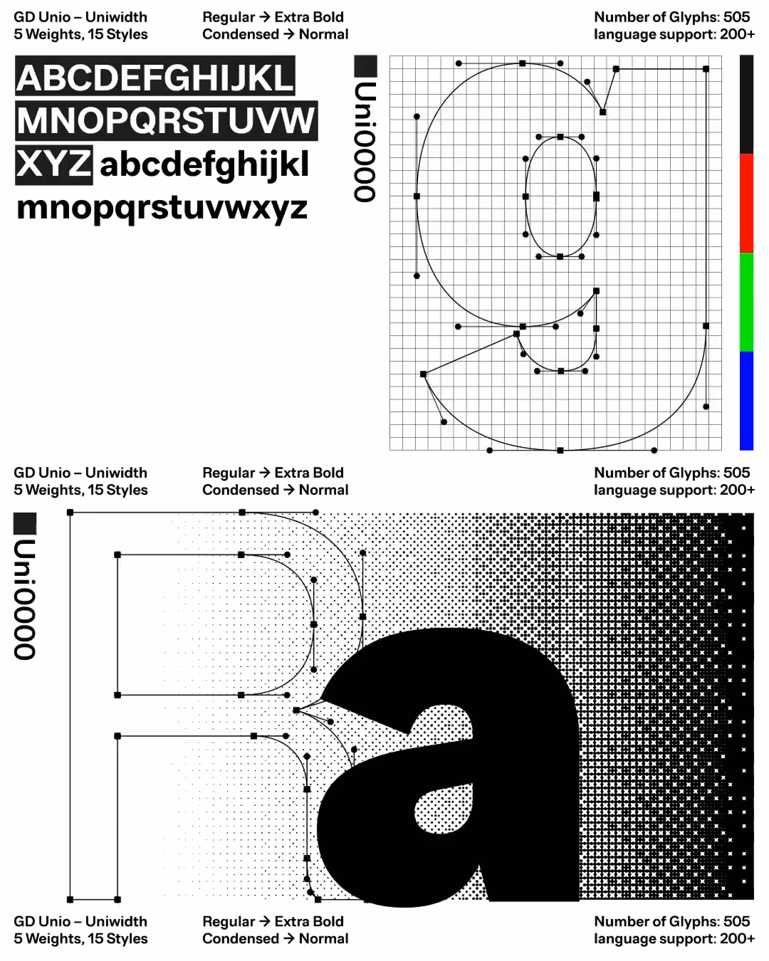
The utilization of the golden ratio (ϕ) is already evident within the realm of typography. Even the dimensions of our standard pocket book (British paperback size A), measuring 110 × 178 mm, adhere to this proportion. Yet, what captivates my attention most is the endeavor to comprehend the underlying rationale: why? Frequently, during my lectures, I am confronted with this inquiry: why does the golden ratio hold such sway? It is conceivable that its proportions awaken within us a subjective recognition of nature's creative impulse. Perhaps we can perceive visual proportions as a pursuit of harmony for the eye, akin to how musical harmonies resonate with the ear when arranged in meticulous mathematical order.
Is it that we recognize ourselves in these proportions, whether they appear to our eyes or ears, and that they remind us of our own pursuit of harmonious unity between opposites? This is something we experience rather than rationally explain.
Could it be that the golden ratio possesses another, more practical application that has carried it through history, akin to a mythical tale bearing witness to something concrete yet shrouded in the veil of myth? If so, this would elucidate its mystique and pervasive presence in numerous writings and expressions. Consider, for instance, how one might derive a close approximation of our current value of π from its proportion. If such knowledge was available to the ancients, the golden ratio could have served not only as an aesthetic principle but also as a practical tool for determining proportions and measurements.

Harmonic Proportions in Ancient Architecture
The geometry of the Great Pyramid of Giza reveals a fascinating relationship with both the Golden Section and the value of π. The perimeter of a square with sides equal to the pyramid's base length is almost identical to the circumference of a circle with a radius equal to the pyramid's height, demonstrating an impressive 99.96% accuracy. This highlights the extraordinary mathematical precision in the pyramid's design. Additionally, the pyramid's proportions closely align with the Golden Section, achieving a staggering 99.9% correlation.
To translate this precision into practical terms, consider the use of the royal cubit as a measuring unit in the construction of the Great Pyramid. The royal cubit is divided into 7 palms, each palm further subdivided into 4 fingers. If the pyramid were constructed using the Golden Section as a guide, its base would measure 440.24 cubits. This differs from the estimated original base length of 440 cubits by only 0.24 cubits, or roughly 7 fingers.
But it is not solely the irrational proportion of the golden section that has drawn our fascination throughout the ages. Other rational proportions, such as 5:8 (a Fibonacci number), 2:3, 4:3, and 3:5, have been employed since ancient times and continue to find practical application in book design and typography. The proportion 5:8 (1:1.6) bears a close relationship to the golden section (1:1.618...) while offering the advantage of being a rational number, thus allowing division into a square grid—a technique frequently utilized by Swiss and German designers in the 1950s. This ratio also corresponds to the Minor Sixth in musical tuning. It is similarly manifested perfectly in the Menkaure Pyramid, where the base correlates with the height of the pyramid in a 1.6 ratio.
The proportions 2:3, known as the Perfect Fifth in music, and 3:4, known as the Perfect Fourth, were esteemed by the Pythagoreans as perfect. These ratios, like siblings, naturally complement each other in book design: choosing one as the book's format leads the other to naturally follow for the spread. The ratio 4:3, together with 4:5, was the predominant paper format before the twentieth century, favored for the size of the deckle frame in forming of handmade paper. A sheet with a 4:3 proportion, when folded once, becomes a "folio" with a 2:3 proportion. When folded twice, it becomes a "quarto" with a 3:4 proportion, and thrice, it becomes an "octavo" (akin to our pocket books) with a 2:3 proportion. Starting with a sheet of 5:4 proportion results in a folio with a 5:8 proportion, making 5:8 and 5:4 proportions akin to siblings in the context of book design. The ratios 2:3 and 3:4 are also perfectly illustrated in the Chephren Pyramid in Giza. The 2:3 ratio can be observed in the relationship between the pyramid's height and its base, while the 3:4 ratio is evident in the slope of the pyramid’s sides, forming a perfect 3:4:5 triangle.
This geometric principle has significant implications beyond simple mathematics. The 3:4:5 triangle is a cornerstone of ancient construction techniques, used to ensure right angles in building foundations. Its presence in the design of the Chephren Pyramid in Giza illustrates the Egyptians' sophisticated understanding of geometry, enabling them to achieve precise and enduring architectural forms.
Additionally, the proportion 3:5 (1:1.666...) is prevalent in book design, particularly for smaller books, due to its tall and elegant form fitting well in the human hand. This proportion traces back to antiquity and is even referenced in sacred texts such as the Bible, where Moses is instructed to construct the Ark of the Covenant with dimensions in the proportion 2.5:1.5:1.5, essentially a 5:3:3 proportion.
These proportions reflect an enduring harmony, resonating through the fabric of our aesthetic and practical pursuits, demonstrating how these ancient principles continue to influence modern design and architecture.
Harmonic Proportions in Ancient Architecture
In the realm of attraction to objects or situations, there exists a mysterious allure, an ineffable pull that captivates our senses. When we bestow the label of "beautiful" upon something, we are attempting to articulate a profound experience, one that stirs within us a delicate harmony of tranquility and elation. Yet, this proclamation merely scratches the surface, for it is the intangible essence that ignites within us, compelling us to seek out more of such beauty.
In our artistic endeavors, particularly in the meticulous craft of typography, our pursuit is twofold: to establish order and to evoke beauty. The arrangement of letters must transcend mere functionality, resonating with the creator and, ideally, resonating with the observer, though such resonance lies beyond our dominion. Should our creation lack the essence of beauty, it becomes akin to lifeless stone, fulfilling its purpose mechanically but failing to enrapture with its hypnotic allure, leaving an unspoken yearning for beauty unquenched.
Are objects deemed beautiful because they serve as integral components within a grander composition, harmonizing in symmetrical or asymmetrical unity? Consider the mesmerizing spiral of the golden section, where each element seamlessly aligns within its square progression. Yet, could it be that true beauty arises from the synergy of diversity within unity, rendering falsehood imperceptible amidst its singular tone? Within us resides an innate capacity to perceive beauty, whether visually, audibly, or tactilely. In moments of sensory immersion, such as when we surrender to the enchanting melodies of Mozart or Bach, our consciousness surrenders to the mathematical perfection of their compositions, transcending thought to bask in pure sensation.
In his seminal work "On Beauty" within the Enneads, Plotinus delved deeply into the enigmatic realm of beauty, urging us not to linger merely at the surface allure, but to embark on a profound quest to unravel its essence and origin.
As we encounter beauty, we are stirred by what Plotinus termed an "Impulse," igniting within us a fervent longing for its recurrence. Yet, he cautions against complacency, urging us to transcend the immediacy of sensation and peer into the depths of its source—a manifestation of the eternal and intelligent.
In our encounters with beauty, we may find ourselves awash in a wave of recognition, akin to reuniting with a long-lost friend, for beauty serves as a mirror reflecting the essence of our soul. Whether it be the serene embrace of nature's harmony or the disquietude of discord, our souls resonate with the balance and order intrinsic to beauty, recoiling from chaos and disorder.
Through perpetual impulses, the soul begins to stir from its slumber, recalling its heritage of harmony and embracing its identity as beauty, an eternal facet of the cosmic tapestry. This awakening engenders a transformative knowledge—an unveiling of the soul's true essence and eternal state of being. In this recognition, the soul transcends mere existence, learning to dwell in harmony with the eternal beauty that permeates the fabric of existence itself.
Achieving Harmony: Mastering Elements and Rhythm.
In the realm of visual communication, elements like color, typeface, proportions, and graphics are akin to the instruments in an orchestra, with the designer serving as both composer and conductor. The aim is to orchestrate these elements into a harmonious symphony, where each component performs its role flawlessly, conveying a message that is both meaningful and aesthetically pleasing. As designers, we must deeply appreciate each element, much like a musician treasures each instrument, to harness its inherent beauty to its fullest capacity. This realization underscores the importance of a binding force—without a calming rhythm, all the elements would drift like fragments in space.
It's challenging for a composer to understand how all the tones blend together and create a harmonious unity without playing the piano. Few instruments like the piano train the mind to connect different tones through rhythm, volume, speed, and pause, creating a unified auditory piece. For a graphic designer, the art of typography and layout, encompassing geometry, is similarly fundamental. This practice trains the mind to perceive visual rhythm and proportions. Through constant training, designers develop a sixth sense for "feeling" the rhythm and tones in design, enabling them to create harmonious designs spontaneously.
In our quest to manifest and experience beauty, we are called to delve deeply into the well of our being, discerning the source of our longing and our mission. Consider what this profession would be without beauty: it would become purely mechanical, devoid of soul. As a designer in the 21st century, you have chosen this path and, hopefully, committed yourself to its pursuit, fulfilling your duty as a craftsman.
No longer can you claim to have been forced into this profession; such circumstances are rare in a world where creative work is often undervalued and underpaid. You have chosen this vocation, and thus it is your mission to master this craft. Your duty is to create designs that harmonize proportions and functionality, speaking to both the rational and emotional aspects of humanity.
Therefore, let us dive deep within ourselves, aligning our inner order so that we can perceive and communicate the unfolding story within our being.